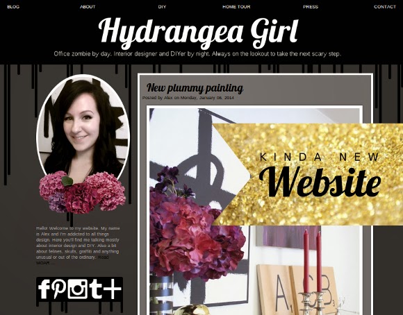
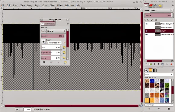
A couple of months ago I had some ideas for changes I wanted to make to my site. At first they were big changes. White. Everything was white. With black and white stripes. And super interactive. But the more I looked at the changes I drafted, the less I realized they were me, and the more I slipped back into my grey, drippy comfort zone. I liked my old website, but I wanted it to look a little more mature. Just a little.
Some new features I added is a home tour tab which will be updated alongside any tour-worthy pictures that I take and get added here on my blog. I’m working on getting a new profile picture too because that picture’s been out of date for a while now, especially since crooked fringe is back and with a vengeance.
And I know. New year, new website – it’s almost February, so I’m not exactly fast off the mark with giving my website a makeover the moment the clock struck midnight. I’ve been working on a new and exciting project that has been using up my website skills these past few weeks. I’ll share more of those details once I’ve finished working on all the yummy visuals and posters and whatnot! Tres exciting.
More on that little venture laters. But for now, happy Wednesday!- WHAT. I actually just typed Wednesday. And it’s Monday. How depressing is that? I guess that’s what working late on logos will do to your brain. Ughghgg. xx A


Fancy make over Mrs C. I likes it!
Look forward to hearing about the exciting new project! The new website looks great, and I like the Home Tour tab – great to see your lovely home pictures all in one place. I have been thinking lately that I need to share more home stuff on my blog – nothing ever feels finished, though – but I guess I can show little bits and bobs!
Maria xx
Thanks ladies xx And deets on my new project will hopefully be blogged next week. Exciting times EEEEEEK.
xx A