Today it’s a Bank Holiday Monday here in Ireland [all kinds of yes], so with my extra morning I decided to switch up the living room a bit. Not much, just a little to freshen up what we’ve been sitting staring at for over five years.
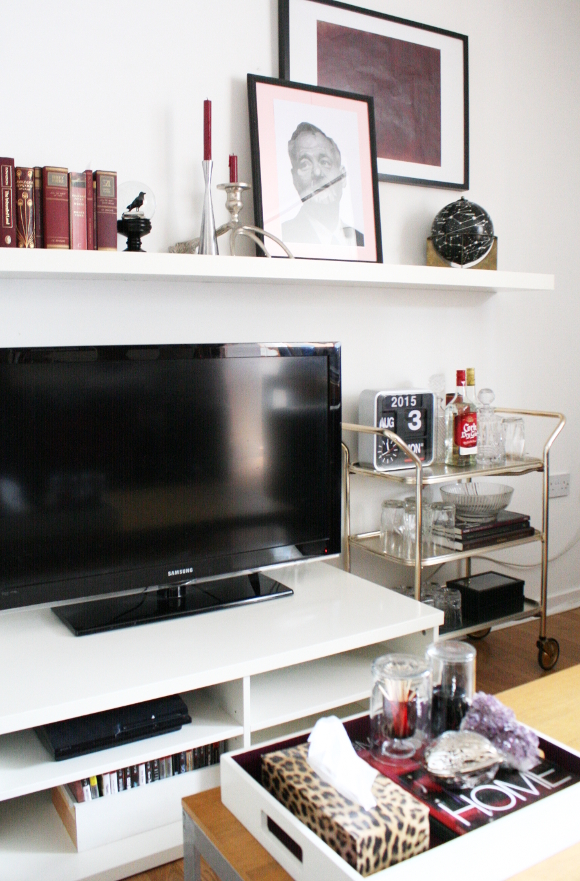
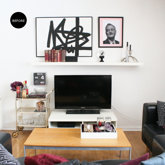
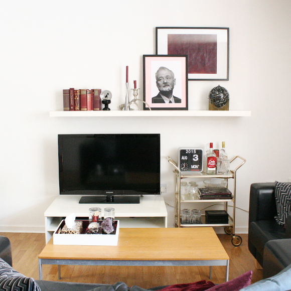
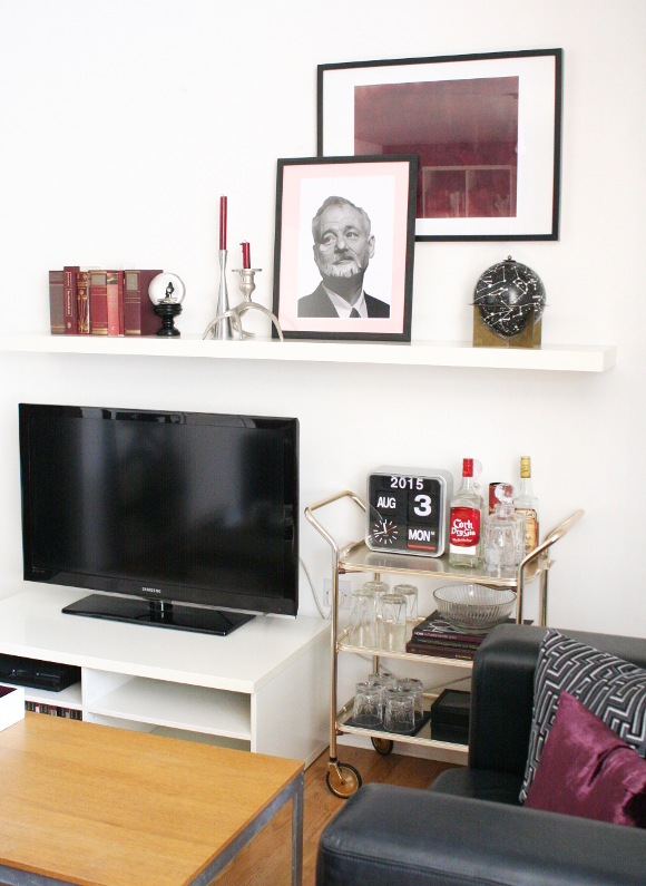
The wall behind our TV had been bothering me for a while in regards to unbalanced things were at this end of our living room. Bad unbalanced. Not chic asymmetrical. The TV stand is in the same place as when we first moved in – smack in the middle of the wall. So to mix things up, I swapped the TV stand with the bar cart, aligned them a bit better under the shelf, and moved some of our artwork and accessories around …
So far, this is a temporary set up. A work in progress. There are a few things that still need to be fixed, changed, found and hung. Some of which are …
– artwork for over the TV
– hang more artwork / frames in general
– hang up our Karlsson flip clock
– possibly find some artwork for behind the bar cart
– paint the TV cable white
– possibly update our landlord’s coffee table [that can be easily reversed]
After repainting our living white last week after it being beige for 4 years, my black and white artwork hanging above the TV didn’t stand out as much as it used to. I’m on the lookout for adding some big, dark pieces above the shelf to balance the weight of the TV and make this wall feel a bit more finished. I’m half thinking of stretching some velvet onto a canvas, or just painting another piece myself. I also want to get an old ladder to display all our blankets and throws to place on either the left or right adjoining wall, because we have a hella lot of throws.
With the changes I made this morning to our living room, all I did was simply move around things we already had. To me, the pictures don’t look like a big enough change to warrant a blog post, but it definitely feels cosier and a better thought out layout. I find it strange [and disappointing] when you photograph something and it doesn’t capture the feeling that goes with a space. I guess you’re just going to have to trust me when I say it feels much cosier and put together in real life. Almost as if adults live here xx
p.s. For anyone who’s extra observant today, no, I didn’t travel back in time between the before and after photos. Our flip clock tends to show the wrong date, so I made an effort to fix it for the after photos to today’s date, the 3rd. Not the 4th. Such detail. Big wow.


I love doing stuff like this and I totally agree that in person, the impact is SO much more than it tends to look in pictures. But saying that, I really like the barcart on the opposite side, totally does give a more balanced look!
I was thinking (and you probably already thought of this) – could you not hang the large abstract vertically above the books? I really LOVE that piece and it's a shame it had to go so just thinking if you still wanted to include it, it's a possible option! 😉
xxx
YES! Thank you! Even Robert mentioned that he prefers the bar cart on that side! For me, that's how I know it looks right – when Robert not only acknowledges it, but compliments me on it 😛
Hmm, I might actually try hanging the b&w piece horizontally – I hadn't thought of that at all. I actually have a sneaky plan for hanging it elsewhere in our apartment, but moar paint has to happen first. And it's not white. Sneaky, sneak! xx
A change is as good as a rest, isn't that what they say? I love both looks. In the first I love the big abstract painting and feel it anchors the space. In the second look the bar cart looks great on the right too. Ah, that bar cart…! J'adore…
That's so true! I've started making these changes and refreshes around our apartment as there's not much we can do as renters. Mixing it up makes it feel like we have a minuscule amount of control over the space 🙂
I'll be definitely including another big abstract painting. I agree, it's needs it to anchor the space. I just don't know what just yet! So we're in a bit of design-limbo until something lovely this way comes.
p.s. I think I'll have that bar cart until the day I die.
I love it! It looks so balanced with the bar cart on the other side and the TV moved along to the left. It really works! And the maroon picture hung with Bill layered in front looks really good – adds depth and interest. Very much liking these changes!
Although… I'm disappointed that no time travelling occurred in the making of this blog post!!! 😉
xx
I spray painted a piece of paper maroon about 30 minutes before taking these photos, and I'm pretty pleased with how it turned out! Hahahah. I'm an absolute chancer. But thank you! I too really like the changes.
That clock just ran out of battery this morning, so it's still the 3rd of August. Does that count as time travel? 😛