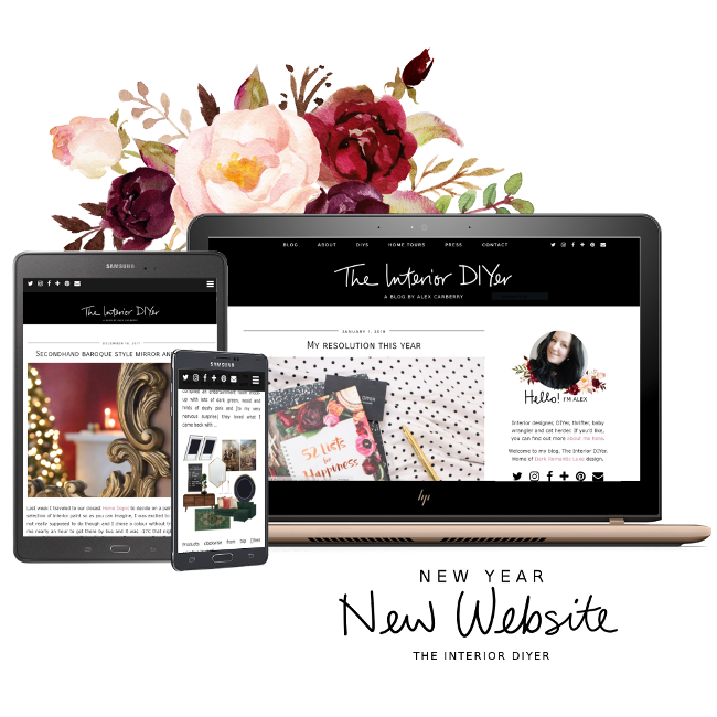
I’ve been wanting to update the look of my blog for a long time. I took my time and over the past few months I thought about what I wanted and what changes I’d like to make. I decided to make the switch over the Christmas holidays as Robert would be home with Cora which meant I’d have some time to sit down and get all the hours of painful details done (oh, the pain. Moving something by a few pixels, saving, uploading, hating it, removing it, resaving, moving again and then wine).

I also moved from Blogger to WordPress.org this year. Blogger was wonderful and saw me through many years, but I wanted to move onto something a bit more design friendly. Looking back at my blog design and comparing it to my shiny new one here, my old blog looks like a truck full of hot diapers set on fire.
I’m very happy with my new site and I hope it’s a bit easier to navigate than my last one (especially on phones and tablets!) and I hope it’s a bit easier on the eyes too. Despite having to redesign it twice and then accidentally deleting my blog (eternal thank you Kimberly for helping this inept WordPress newbie), I really loved giving my blog a new look to more closely match how I feel these days; a bit brighter and attempting to look a bit more professional. An internet version of putting on a bra, if you will.
If you are so inclined, you can check out my collection of screenshots of what my blog has looked like over the past 7+ years. Some of my designs were eh, interesting.

Oh my god, I love it!! It really does look so professional! I didn’t see a problem with your last blog design, but now that I see this I can appreciate how much better and sleek it is!!!
And the design is perfect for you! I think the white background makes everything stand out more, but you’ve still retained the dark romantic luxe look. The flower details are so you and I absolutely love your hand-written heading!
It all looks so good, so polished, so together! You’ve really got me tempted towards WordPress!! I just need a better blog name before I start making changes. (Hmmm, how many times have you heard that in our years of friendship??!!)
Love this blog!!!!!! xx
Author
Aww thank you so much, Maria! I think you know all too well some of the headaches I had putting it together though … I’m so happy with how it turned out. I’m much happier with how my blog looks now. Someone even might be tricked into taking me seriously!
WordPress is so much more design friendly but I found it a bit overwhelming at first. There’s *a lot* to it and I’m still navigating it all, but it works so much more smoothly than Blogger. I think it makes more sense behind the scenes too. I mean, as long as you don’t temporarily delete everything, it works fine.
And that new blog name will find its way. But TBH, I love Dinki Dots! But that’s just because that’s all I’ve ever known (Dinki Dots and Hydrangea Girl do London).
Oh, MASSIVE congratulations my dear! I know how hard it all is having gone through it myself but seriously, the new site is so gorgeous and so you and I LOVE your logo design. It really does reflect your style so so well and I love the dark florals illustrations too! Oh and you didn’t have to thank me – my goodness, I did like 2 minutes on it! Ha! WordPress takes a little while to get used to but I promise, you won’t regret moving over, it’s amazing! xxx
Author
Yeah but those 2 minutes saved me another day of trying to figure it the hell out. Emphasis on the word another.
Thank you so much, Kimberly. For both your kind words and all your help and WordPress wisdom and knowledgeable knowledge!!! All hail Queen Kimberly.
This newly designed website is so beautiful Alex, and very much you! Everything about it is great, well done!
Author
Aww thank you so much, Yolene! I put a lot of thought into it and while it doesn’t seem too over the top (because for a long time I wanted MOAR THINGS AND MORE PRETTY AND BIGGER AND BETTER), that’s kind of what I like about it.
It looks amazing, I love it! Very swish 😉 I keep hearing that I need to move to wordpress but tbh it was so traumatic designing my blog first time around that I don’t know if I could live through a change.