I haven’t shared much of our dining room I’ve been selective with the aspects of our dining room I’ve shared so far. Most of the room I quite like, but unfortunately the largest part of the room makes me feel like this:

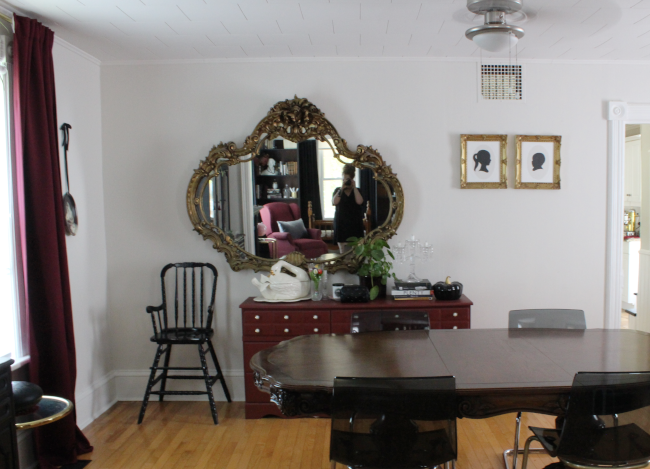
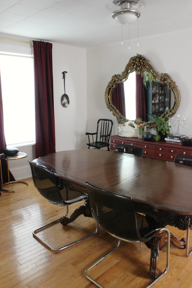
The other four sections of our dining room [broken up by the many doorways] work well by themselves; the plate corner, the bar-cart-shelf, the little floating shelf island, and the corner with our hutch. The only part of the room not pulling its weight is this wall:

It’s so … meh. And since it’s the largest wall in this room, it’s M E H on a bigger scale.
I originally hung the mirror off-centre to actually line-up with our front room [I’m standing in the opening between the dining room and the front room in the photo above], which probably only makes sense to me. The burgundy dresser holds all our crafty things; crayons, paper, glitter, paint, you name it. I rescued that dresser from a snowbank two and a half years ago [as my friend Kimberly said, “I don’t think there’s any phrase that’s more you than that“.] It was in horrid shape. We had just moved into our home and we needed the storage. As soon as I put it in our dining room I had every intention of replacing it. It was a total placeholder for a real piece of furniture. The only thing that could be done with it was to paint it.

Here is what I’d like to do with this space …
STUFF I’D LIKE TO CHANGE IN OUR DINING ROOM:
– New dresser / storage unit [possibly paint it? It depends on the piece]
– Move mirror [center it on the wall]
– Have more intentional artwork around the mirror
– Paint the dining room table like this
– Source better dining chairs [maybe … we’ll see]
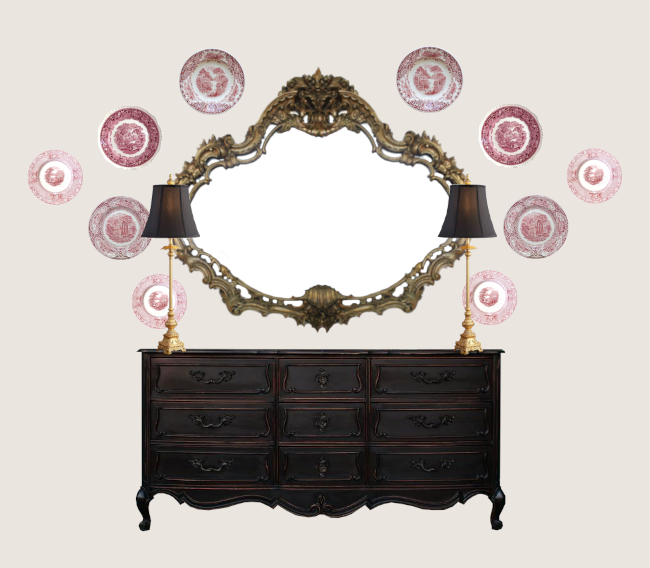
I had a boost of inspiration the other night and created a mock-up of how to add a bit more purpose to this end of our dining room; a lot more symmetrical and intentional.

I have enough plates to make some sort of plate display, and let’s face it, I can thrift a lot more if I need to. I’m not sure if they’ll all match in this way. This is where I think I can add a bit more spice to our dining room by adding more unusual plates to this formal style of plate display.
I’m excited to work on this space as it’s not going to take too much effort to make a big enough change. Have you worked on any smaller projects like this lately? Where just moving a few pieces of furniture has given a new feel to a room?
Chrissy Teigen awkward face image via ET.

this furniture is an eye-catching and stress-free view.