I’ve been wanting to update the look of my blog for a long time. I took my time and over the past few months I thought about what I wanted and what changes I’d like to make. I decided to make the switch over the Christmas holidays as Robert would be home with Cora which meant I’d have some time to sit down and get all the hours of painful details done (oh, the pain. Moving something by a few pixels, saving, uploading, hating it, removing it, resaving, moving again and then wine).
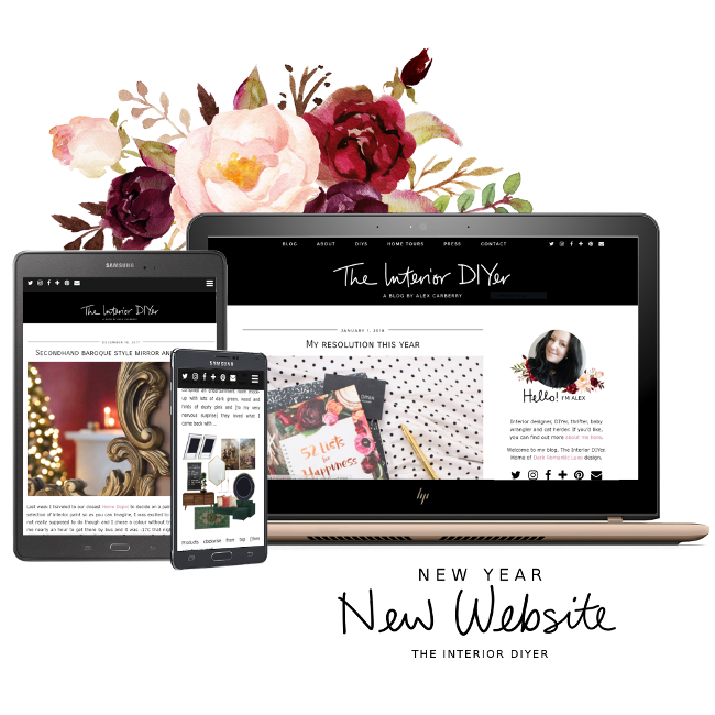
I also moved from Blogger to WordPress.org this year. Blogger was wonderful and saw me through many years, but I wanted to move onto something a bit more design friendly. Looking back at my blog design and comparing it to my shiny new one here, my old blog looks like a truck full of hot diapers set on fire.
I’m very happy with my new site and I hope it’s a bit easier to navigate than my last one (especially on phones and tablets!) and I hope it’s a bit easier on the eyes too. Despite having to redesign it twice and then accidentally deleting my blog (eternal thank you Kimberly for helping this inept WordPress newbie), I really loved giving my blog a new look to more closely match how I feel these days; a bit brighter and attempting to look a bit more professional. An internet version of putting on a bra, if you will.
If you are so inclined, you can check out my collection of screenshots of what my blog has looked like over the past 7+ years. Some of my designs were eh, interesting.

