I’m tore up from the floor up excited to share with you today a new project I’ve been co-piloting.
Emily approached me last week about a project that was sent her way. Derek of
Localise got in contact in regards to a room they were looking to redesign in
Sophia House for the local teens. Emily asked if I’d like to jump on board and I think I answered her before she finished typing her sentence. For a much more detailed insight into the workings behind and how Emily was approached for this great project, you can read more on
Emily’s post here.
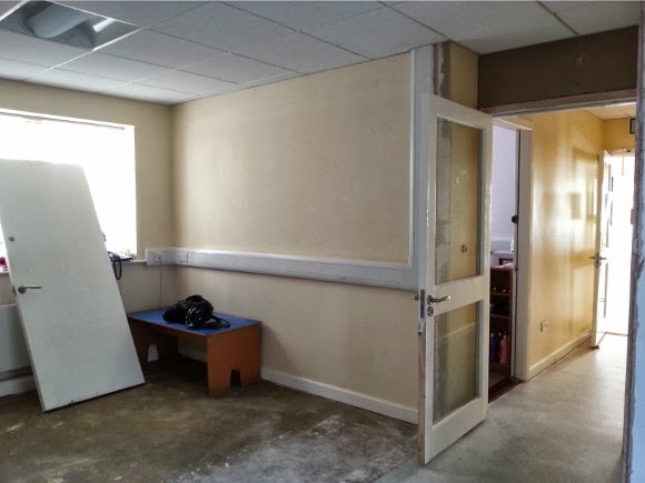
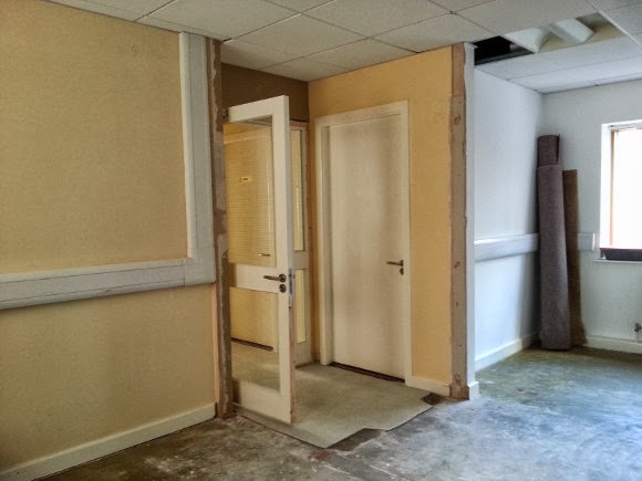
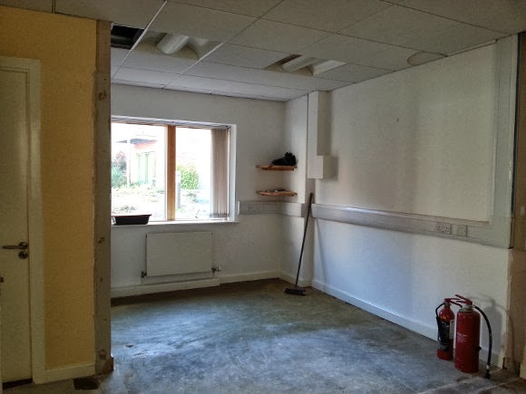
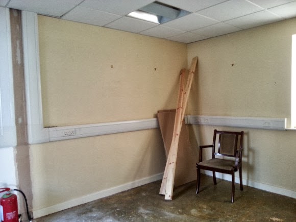
To give you an idea, here are some shots of the space as it is now. It used to consist of 4 rooms – a very small hallway {you can still see the outline in the lino}, two offices, and the boiler room which will remain …
The space is much bigger than I was anticipating, which was the cherry on top. It’s a really bright space, and for the days {like today} when it’s not so nice out, the overhead lighting is warm and inviting and not your typical florescents. We had the opportunity to sit down and get input from the teens who would be using the room, and I’d like to say my mind was blown. Some of their ideas were amazing – multi-functional furniture, well defined areas, interactive walls and even somewhere to do homework. When I was their age, I wanted to kill homework with fire. And on that subject, one of the guys noted a first aid kit should be included in the room too. I’m horrified to admit I was nowhere as tuned in at their age.
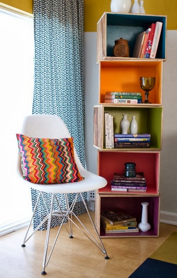
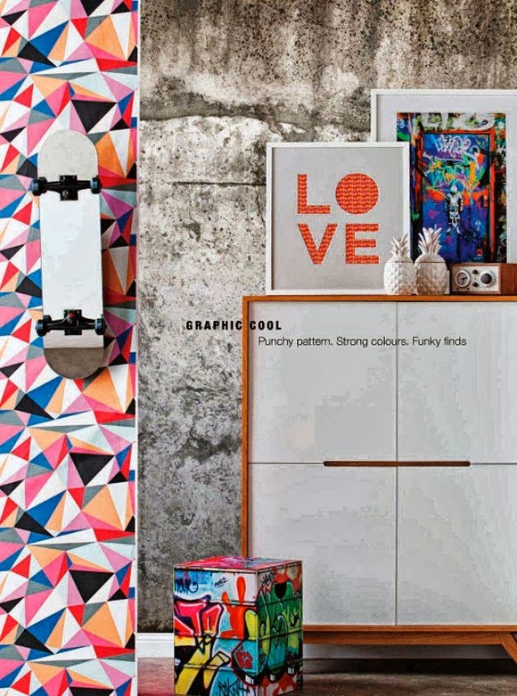
So off Emily and I went with our heads in the clouds. We started a private group board on Pinterest which was a big help as we could see what route the other was going down. Here are a couple of the images that inspired us the most …
Inspiration image cred
1,
2, and
3.
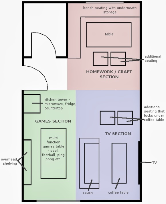
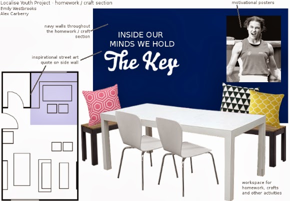
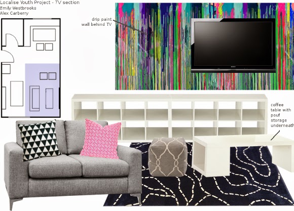
We were on a very tight turn around and had less than a week to send in our design proposal. We put a plan in place and divided the room into 3 sections – homework, games and TV. Here is the very rough initial plan we came up with …
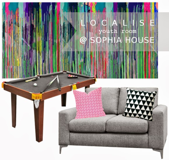
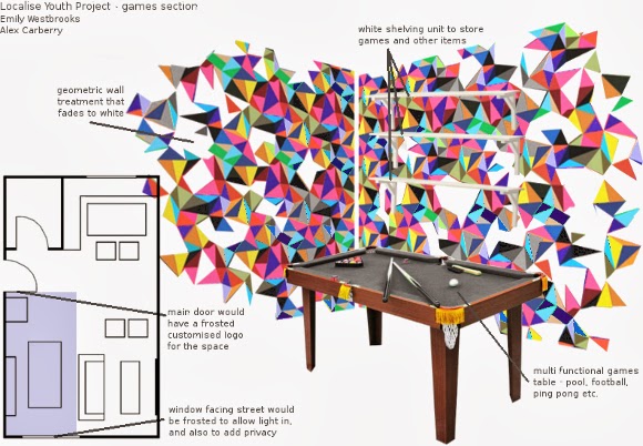
I whisked up some visuals to go along with the plans, and this is what we sent off bright and early yesterday morning as part of our design proposal. Did I mention they were rough images? Please do not make judgement on my skills …
That last image for the games section is to represent a geometric wall treatment in the corner of the room that dissolves into the surrounding white walls. I’m not sure how well I depicted it though. Just goes to show what a brain at 2am thinks is a good way to depict a corner. But it must have worked, as we got their feedback and not only do they love it, they couldn’t fault any of our ideas or designs! I cannot wait to start, and have a couple of DIY projects in mind that I’m hoping to work on with some of the teens. Also – writing the word ‘teen’ makes me feel really old. Am I the only one who still thinks I’m 18?
This project has a very tight turn around and the official opening is November 9th. Slight
eek, but we can handle it. I hope. I also have a couple sneaky projects lined up between now and then, so the next couple of weeks will be chock-a-block. Not to mention tonight is the second
Lifestyle Blogger Meetup as organized by the
guru herself, so for the local bloggers out there, I do hope to see you later! I apologize in advance if I make awkward conversation or my potty mouth gets the better of me.
xx A


