Little living room updates – cast your vote

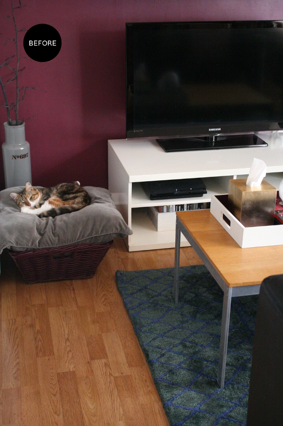
Back in November while I was editing the photos I took of our new rug, the first picture I included in that post kind of made me uneasy. It was all the colours. And that end of the living room. It didn’t really work anymore. There was too much burgundy, there was too much wood that didn’t match and the rug made it more obvious. It all looked too thrown together and nothing worked. 

Since we’re renting our apartment and are stuck with our landlords furniture [I wish I could burn it to the ground and start over trade it in for more comfortable and practical pieces], I’m forever hitting road blocks in our own home. Of the many pieces of furniture, our landlord’s coffee table has been driving me up the wall. It’s not the same colour as the ‘wood’ floors and it’s quite distressed thanks to previous tenants. And I don’t mean the good kind of distressed that’s trendy. The bad kind. 

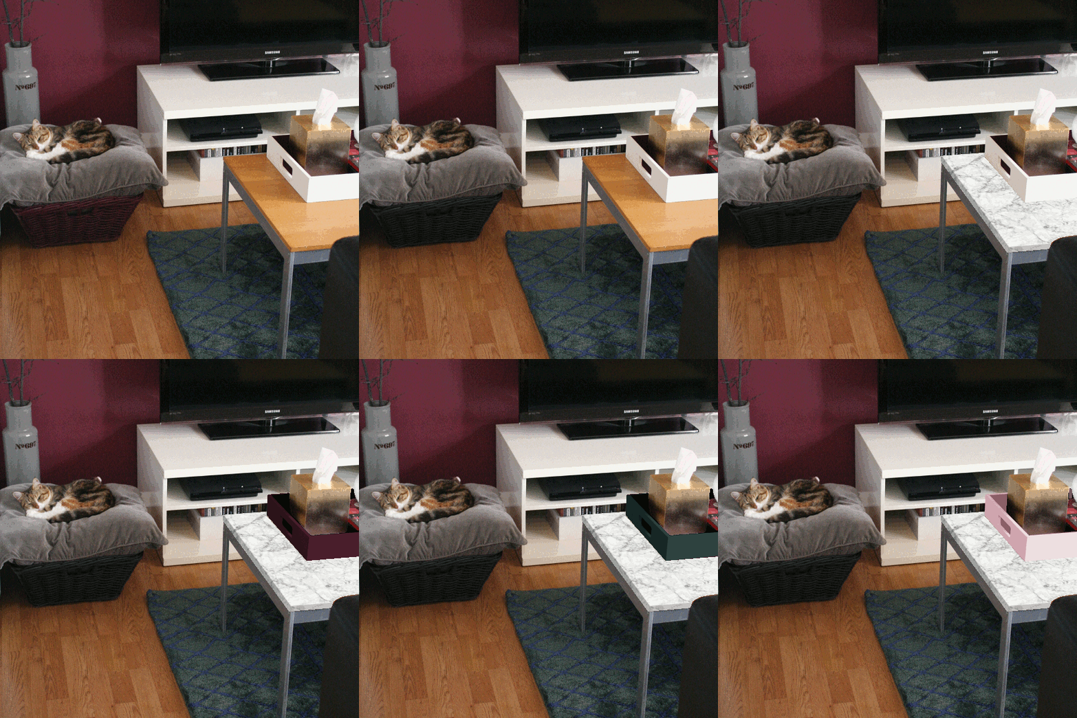
When Kimberly updated her vanity and then Linda updated her kitchen counters, both ingeniously using faux marble contact paper to do so, I filed that nicely in my brain [even check out my comment on Kimberly’s post. Ha!]. Contact paper is beyond perfect because when we move out, I’ll simply peel it off and it’ll be immediately reversible. As with most things I’m a bit unsure of, I did a mock up to help me make up my mind. I edited the cat basket to black, slapped some faux marble on the coffee table, and as anyone who has updated their home will know, the design domino effect came into play so the tray on our coffee table got edited too. Many times. 

Here’s what the above GIF is showing, frame by frame …
1. Original living room as it is now
2. Cat basket edited black 
3. Coffee table marble-ised
4. Tray edited black 
5. Tray edited burgundy
6. Tray edited viridian
7. Tray edited pink [for the hell of it]
And to think, this was all done without disturbing Juniper in the slightest.

Here’s where I need your help. Genuinely. Tell me what you think. Marble? Yes or no? A solid colour coffee table instead? And what colour tray should I go with? Or just leave it all alone? Srsly. I’ll be thinking about this one for a while, but a change is defo going to happen. At the moment I’m going for the black basket + marbled table + black tray. But nothing’s set in stone. Or faux marble. 

Hybrid moments

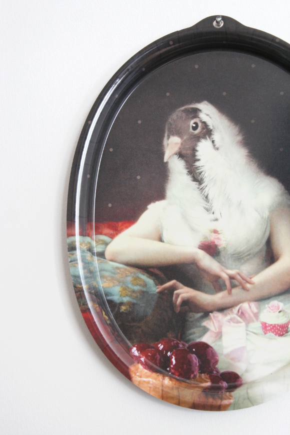
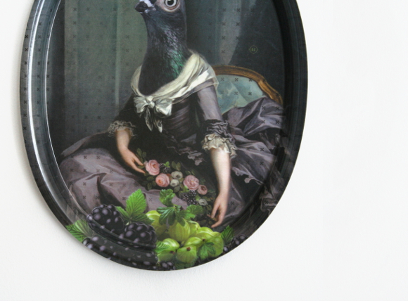
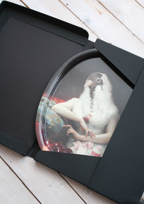
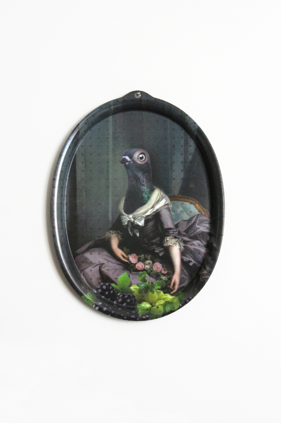
For Christmas this year Robert was particularly shnaky. He delved into the search history on my laptop and found my over-zealous creeping of all things iBride [pronounced like the French for hybrid]. Back in June of 2015, two particular items Robert found were ibride’s Rosita and Isild trays. There was much clicking. Fast forward to Christmas morning and what did I spy under the tree? Only just these two birds. Without sounding too dramatic, I think it took a full 3 days for me to realise these trays were in my possession and that they were for real.  

I don’t like the idea of gloating about things I got for Christmas, but these are too damn fabulous to not [p.s. Robert and I got just one present for each other this year. Well, mine was actually two, but you know what I mean. This year was very paired down]. In a strange and not-so-strange way, these two trays have a very special meaning for me. They’re reminding me to get back to what I love about interiors and that’s about having fun with design and to take things less seriously. I think back to how our apartment was before I started putting it online, and how my past bedrooms in my parents place looked before then. They were unusual, a bit fun and had unexpected things dotted around the place. They weren’t too dissimilar to what I have now, but I have noticed as of recently I’m missing the fun. I’ve gotten too bogged down with the “will this look good?” side of things. 

So here’s to Rosita and Isild – reminding me to get back to the fun side of design and to be less serious [as if I even was all that serious to begin with]. 

Cardboard monogram, round 2

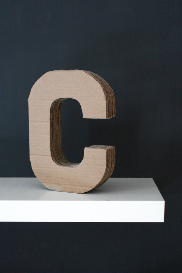
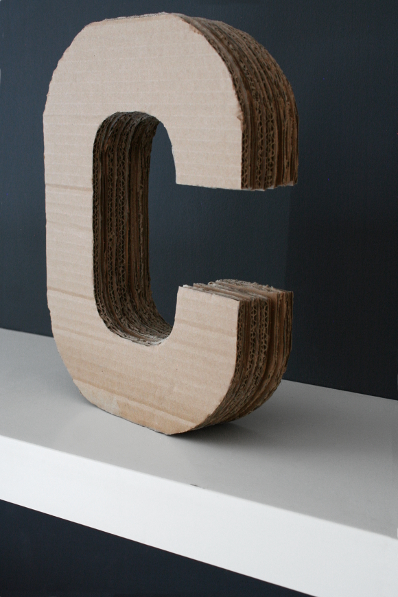
Way back when I worked on my broseph’s Canadian man cave one of the many things I made for his room was a cardboard monogram that I carved from a giant cardboard box I had laying around. I really liked the way his turned out so I made a mental note to make one for our own home. And then a year happened. Quite possibly exactly a year to the day [I blogged the office reveal on January 9th 2015, photographed it the day before and would have worked on the last few projects the days leading up to it]. I love when coincidences like that happen. 

I wanted to make a monogram ‘C’ for our own home after I made my broseph’s. My maiden name began with C and so does my married name so it conveniently represents both. A giant lump of cardboard may not be to everyone’s taste, but it’s something I like and enjoyed making. I had set aside two cardboard boxes that were just the right size to make enough C’s. If you’d like to make one of your own or for someone else, feel free to check out my full tutorial here! Happy reducing, reusing and recycling xx