#WCW – The Makerista

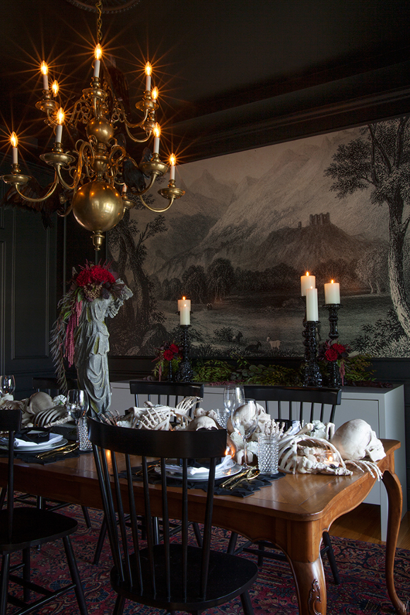
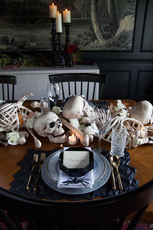
I’ma let you finish, but first I want to share something with you that’s been on my mind since I saw it earlier this week. Can we take a moment for the dining room of blogger Gwen Hefner, aka, The Makerista. I was made aware of it earlier this week and haven’t been able to stop thinking about it since. I mean srsly you guys … 

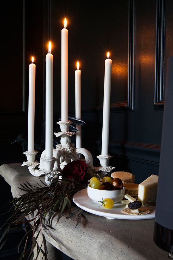
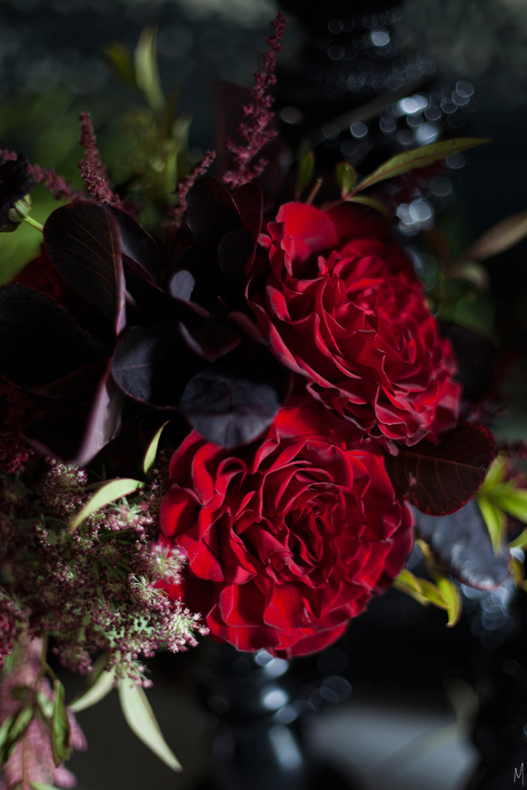
Black walls, bright accents, that mural, the romantic lighting, panelled walls, the deep reds, geometric table mats, sleek chairs coupled with an antique table, gold accents and a perfect juxtaposition of old and new design all melded into one. Let’s not forget, it’s decorated for Halloween. 

I now know what I want to be when I grow up; Gwen’s dining room. Yes. A dining room. 

All images are via Gwen’s A Spooky Supper Setting blog post on The Makerista. Although, truth be told, I’d friggin’ love to claim them as my own. In a hot second. I’d have no shame in that whatsoever, but you know, internet rules. 

#DublinDesignNight

This evening, thanks to Image Interiors & Living and Yelp, Dublin had its first ever #DublinDesignNight. A wide range of design shops across Dublin had special access for the Design Night pass holders. From screen printing to floral arranging to cocktails and delicious grub, it was a bustling evening of exciting trips back and forth across Dublin. 

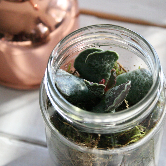
I had only an hour to see as much as I could, so it was a bit of a design-drive-by. First up, I stopped into The Garden to make a little widdle terrarium. I ran into Rincy and Nathalie while I was waiting in line and then [finally!] met Hilda outside on the steps. You couldn’t swing a cat without running into someone you knew! [please don’t swing cats]. 

A photo posted by Alex C – The Interior DIYer (@interiordiyer) on Sep 30, 2015 at 2:30pm PDT

After our terrarium workshop, I popped into Designist, then looped back to Industry and the Irish Design Shop before heading into Article for Clover Rua‘s screen printing session.

Before I cycled home I dropped into Find for a good snoop around, then hopped on my bike, precariously balancing all of the things as I went, and made my way home [good news – my succulent survived the after-dark bicycle ride down Thomas Street with its characters]. 
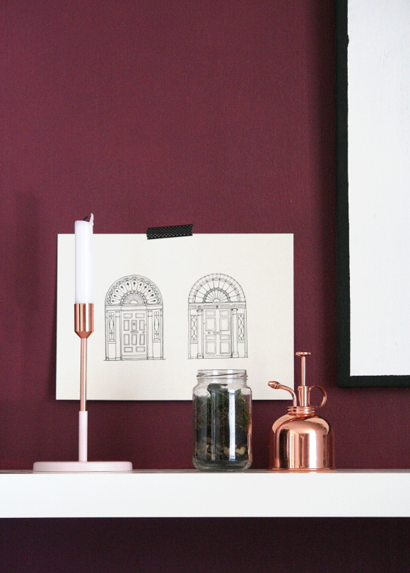
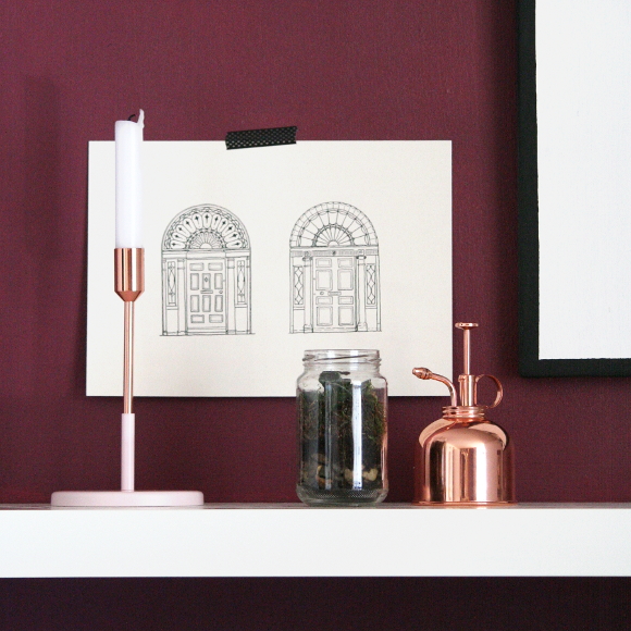
While I was in Article I couldn’t resist one of their copper and blush pink candle sticks that I had spied on their Instagram a couple of weeks ago [plus my OTT comment]. At long last, I have a use for my copper atomizer! Welcome home, little succulent. I hope you don’t die. 
So in short, #DublinDesignNight was such a wonderful night, to be jumping from place to place with like-minded design enthusiasts and nerds alike, and I cannot wait for the next one. 

Feature this – (a second) burgundy wall

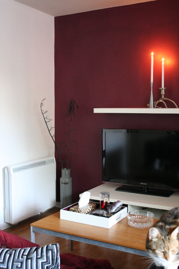
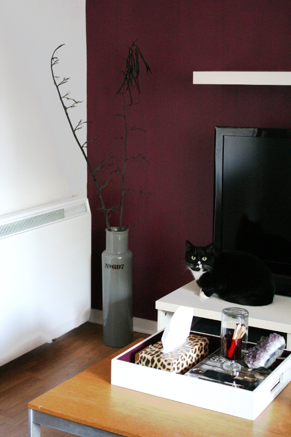
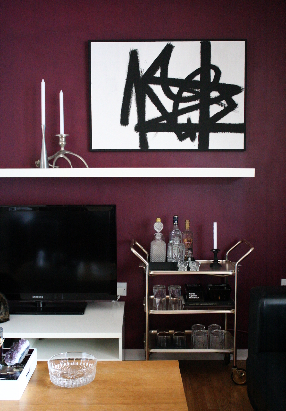
I’m forever amazed when a coat of paint changes a space so much. Within 2 hours you can change the feel of a room for under €25. Or in my case, for free as I already had the paint. Yesterday, to the dismay of Robert who wanted nothing more than to MGSV to his hearts content, I painted the wall behind our TV in the same berry colour as the wall behind our shelves. Yes, another feature wall. I quite resent that that term is used with such hate by some people, but feature wall it is. To them I ask, what did a feature wall ever do to you?

I LOVE A GOOD FEATURE WALL. 
There. I said it.

I am so, so, so, so, so in love with this end of the living room again. I don’t care how lame that makes me sound. The wall behind our TV was just too much boring and too much bland for my liking and for too long. White on white on white. I do like simple and bright design, but not in my own space as I’ve come to realise over the years. 
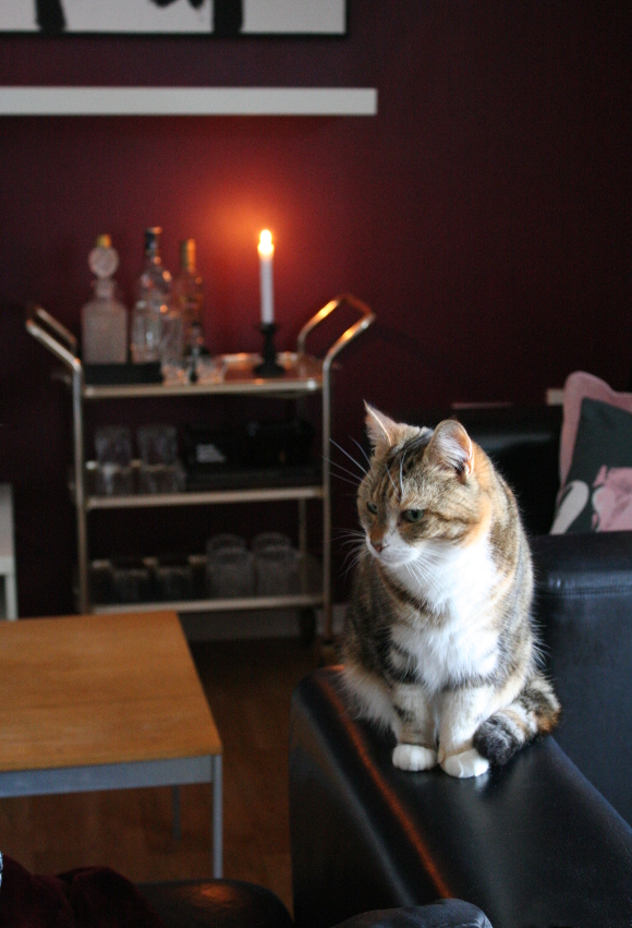
As I realised with the test patch I painted last week, I think this paint colour looks all kinds of amazing in candle light. Tiger are going to make an absolute fortune in candles from me this year. I know it’s a bit early to be mentioning the C word, but I cannot WAIT to decorate our mantle / shelf for Christmas [this time it’s Christmas Pat :P].

Another reason I wanted to paint this wall dark, aside from the fact that I love this colour, is because I really like the contrast of stark white pieces on dark backgrounds. I don’t know why I took so long to paint this wall because [I think] it looks amazing and really ties the room together. My abstract painting is back up [yay! o/] and I added some simple white candles to offset all the dark. It’s a quick change that made a big impact on our piddly little rental living room, which can easily be undone in an afternoon. 
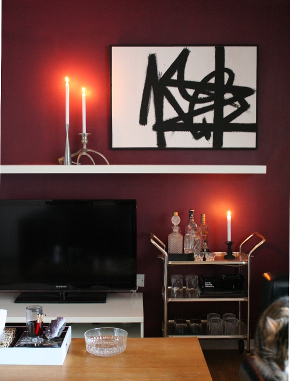
p.s. Anyone else notice there’s a cat in every. Single. Photo I took? Juniper and Toshi were very needy this weekend. Sorry / not sorry 😛