Living room shelf shuffle

I have a thing for asymmetry. Perfect symmetry can be good, but 9 times out of 10 I find it to be a little boring. I just like things a little off. Maybe it’s because it’s less predictable, maybe it’s because it makes you take a second look, but I just prefer asymmetry. Case in point – have you seen my fringe? 

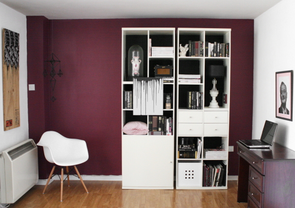
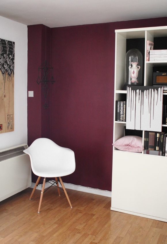
To give you a rough idea, here’s what the ‘burgundy end’ of our living room looked like before … 

… this picture was taken a couple of months ago before I updated our shelves to look a bit schnazzier. You may ask yourself why the shelves are placed here? And that far apart? Because a long time ago, there used to be another set of shelves in the middle [as seen here]. And the reason they stayed there is because, well, our landlord put them there. Classic amateur renter move. 

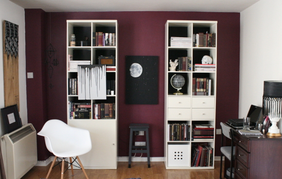
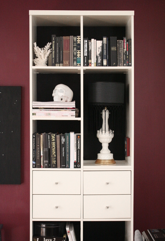
This weekend the weather was horrific and we were stuck indoors, so I decided to mix things up a bit. I took everything off the shelves [they hella heavy otherwise] and scooched the left shelf closer to the right. I didn’t place them right next to each other. That looked a little too obvious that they weren’t all one unit, so I left some sought after thigh gap between the two shelves …

It’s a small change when I look at it here on my screen, but the feel of the room is definitely one of slightly more sophistication. I’ve paired things down a bit and gotten rid of some of the extra clutter too. 

I’ve found that making little changes like this are immensely helpful, especially as a renter. We’re very limited with what we can do to our apartment, but changing things up like this has made me less stir crazy about having a rental. These are simple things that can be undone over the course of an afternoon for when we eventually move out.

I think it’s an Irish thing though – not disturbing things for fear of causing a fuss. Well, fuss that. I’ma do what I want [she says, after not doing anything the past 6 years she’s been living here]. xx

p.s. That lovely ‘scalloped’ finish along the skirting board is not down to shoddy painting skills on my behalf. That is thanks to a double wire lead from the storage heater to its socket located in the middle of the next wall. It would make too much sense to have it, you know, right next to the heater. I’d love to know what that builder was thinking. 

The Happiness Planner

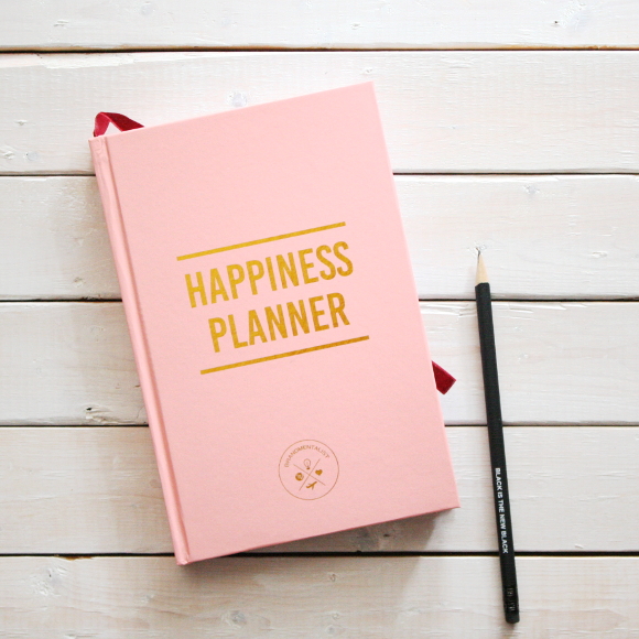
I first spied the Happiness Planner on Holly‘s blog a couple of weeks ago. It popped up in my blog feed at just the right time. Within 20 minutes I ordered myself a pretty pink copy and patiently waited. 

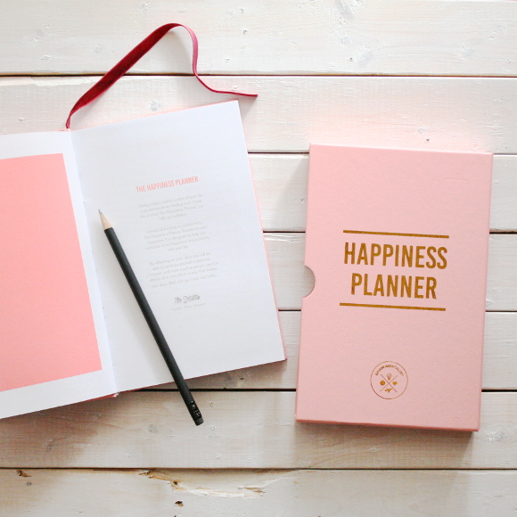
The Happiness Planner is a personal book that is filled out daily for 100 days. You start by listing details about yourself, both positive and negative, personal goals and a few exercises to list out your qualities and achievements. You then start your hundred days by setting yourself little goals or personal daily achievements, just for you. 

… I want to help people who are struggling to learn to be positive and happy. I want to help people move on from the past and live in the present. I want to help people shift their focus and mindset from the negative side of things to the positive side. I want to help people stop searching for validation from outside and start looking from within …

It’s something I am forever debating whether or not to write about here on The Interior DIYer; mental health and depression. I’ve battled with / against depression for a long time. The truth is I don’t like writing about it because I feel people don’t believe me*. I think it’s because I’ve become very good at distracting people from what’s really wrong with jokes, four letter words, excessive eye liner, big hair and even bigger hand gestures. It’s my Chandler coping mechanism
I’m getting a bit older and I’m realising that you have to be your own best friend. Slowly I’m hoping to get into a healthy and daily routine of positive thinking and setting goals for the future. Not only will the Happiness Planner be perfect for this, but it also appeals to my animalistic urge to collect ALL OF THE CUTE STATIONERY.

This week I’m feeling like me for the first time in a long time, and with the most epic of timing, my Happiness Planner arrived yesterday morning. And it’s SO PRETTEH. Pink and gold and a solid piece of stationery. But as with most things, I can’t help but mess with it a little. I removed the neon orange bookmark that came in the Happiness Planner [sorry, Mo] and replaced it with a dark red velvet ribbon. Yum, yum. 

As someone with a black belt in Self Depreciation, I’m hoping my next 100 days will be a little kinder, more mindful and goal oriented. At the very least, updating my Planner daily will hopefully help me spot my problems and acknowledge patterns, keep me on track of reaching goals, and find that silver [or gold foil] lining. 


*I also don’t like writing about it because I have this ever niggling paranoia that if I do write about it, someone / a company won’t think me capable enough to work with. It’s something I worry about a tremendous amount. I am at my best when I’m busy working and haven’t enough time to think about myself, so rest assured that it never effects my work. Or is it ‘affect’? I never bloody know. 

Working on my shelfie

I recently vented about wanting to paint over our burgundy feature wall. I love burgundy, but for some reason it was really getting to me. I was being driven insane [I know, total #FirstWorldProblem]. It was, dare I say, too much burgundy?

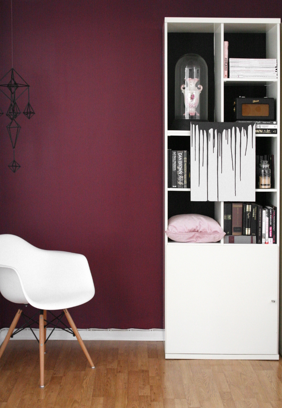
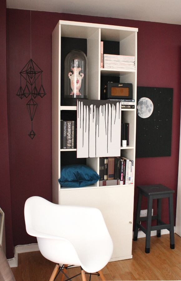
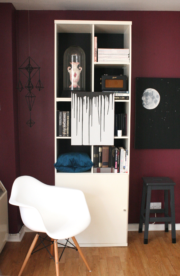
But in reality, the last thing I want to do was to paint over it. Even though feature walls are a bit of a faux pas these days [I’m not one to stick to trends], I still love ours. I sat down and stared at it; trying to figure out what irked me so much about it. Then I realised there was simply too much – a burgundy wall, burgundy books, red books, purple books and burgundy accents all over the shelves [which you can see a bit here]. It was too much of the same colour in such a small space. So I gave our wall one last chance before getting my paintbrush out. On Monday evening I took everything burgundy off our shelves and went strictly black and white with little pink and viridian highlights …

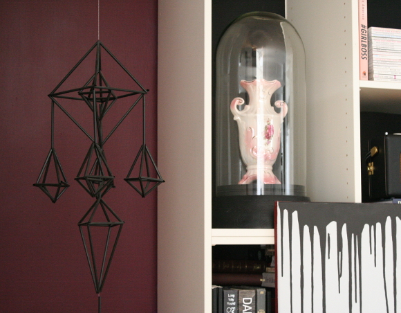
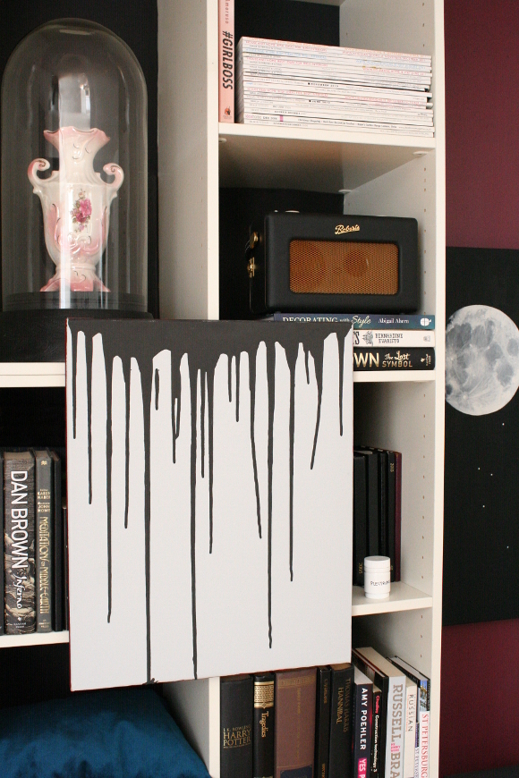
While I was de-burgundying, I tried to take a fresh look at our shelves. It’s tough though when you’ve been staring at the same shelves for 5 years [and can’t do much because they’re your landlords], so I tried mixing up the monotony of the layout by removing a couple of shelves to fit in larger pieces [cloche and desk lamp]. I wish I did this years ago …

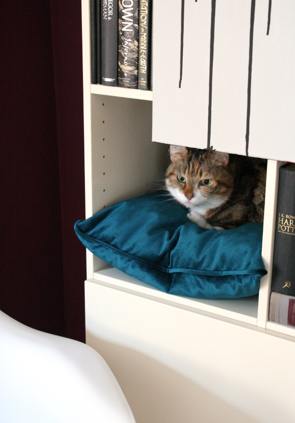
I of course had to reintroduce the kitty nook back into the shelves as part of making the layout simpler and sassier. It was quite sad when I got rid of the kitty nook by putting books on that little shelf; Juniper would walk up to it and stare at it longingly. To say she was excited when it returned is an absolute understatement. She clambers onto the chair and up into her cosy nook once again.

I’m hoping you’ll also pay special attention to my obvious pairing of the pillow with the spine of Abigail Ahern’s Decorating with Style book under our Robert’s radio. Marvel at my sublime coordination skills and including a new colour in our home! I’m breaking out. Aren’t you impressed? Next I’ll be trying socks with sandals.

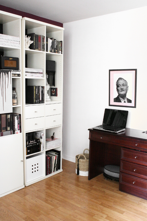
I’m not sold on the layout of the right shelving unit yet [as seen in the second picture]. I need to put a bit more effort into that one, but as for the left unit, I am completely game. The burgundy wall no longer fights with what’s on the shelves. The pink and minuscule amounts of viridian compliment it nicely.

You’re safe for now, burgundy wall. I’m glad we’re on speaking terms again.