At long last, I’ve sat down long enough to share my latest project with you guys,
#PicadoMexican! It’s been a busy couple of weeks for me in both my office job and my design project job side of things {still haven’t managed on deciding what to call it}, which is why I’ve been a bit MIA on the old blog lately. But I’m really thrilled to be able to
finally show you guys what I’ve been working on.
The lovely
Lily {who I met when I worked on the
Localise Youth Room at Sophia House volunteer project, and we immediately clicked} approached me a couple of weeks ago to say herself and her husband
Alan were about to take a hugely awesome step from turning their online virtual shop,
My Mexican Shop, into a shop that you can actually walk in to and touch a buy things. And they asked me to help along with the design process. Woah. They now have the keys to this gem of a shop and we’re all so excited to get stuck in to Picado!


Not only do they sell authentic Mexican food and ingredients, but Lily teaches classes on how to prepare and cook incredible Mexican dishes from scratch {there is nothing this woman can’t do}. So they wanted not only a shop, but a kitchen space to carry out presentations and demonstrations for their classes. We spoke a lot on the lovely side of things like how the shop should flow and the slightly less sparkly details like how many sinks we’re going to need to meet health and safety regulations. But that’s all part of the journey. For those of you who are curious, Picado gonna need 3 sinks.

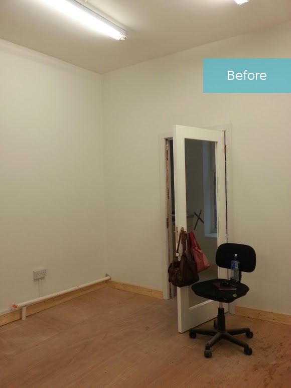
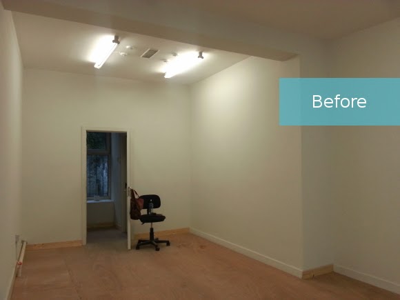
We sat down over the weekend and finalized the design of the space, which I’m really excited / nervous to share. Let’s crack on. Here is a sneak peek at Picado, and apologies in advance for the cruddy Google SketchUp screenshots, but it gives you the idea!
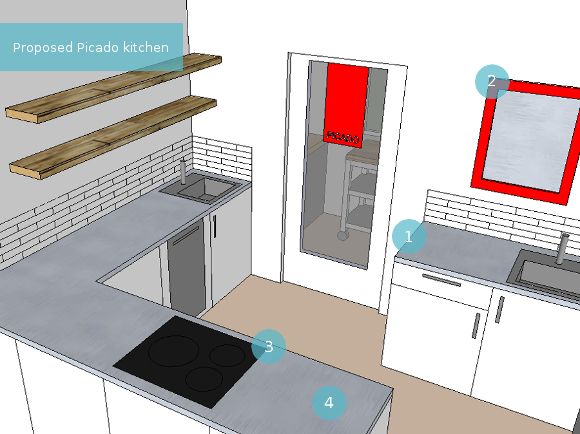
1. Lily and Alan need a packing station dedicated to packaging foods on a daily basis. It had to be separate from the kitchen section to adhere to health and safety regulations so this corner was the ideal spot.
2. Since they had their backs turned to the shop, I suggested adding
Carolyn Donnelly’s Eclectic Asha Mirror to the wall above the packing station so they can keep an eye on the front door and the rest of the shop easily.
3. The heart of the shop – Lily will be teaching her cooking classes in the evenings so it’s vital that the stove and oven be here as opposed to along the wall, so she can face her class {not pictured – extractor that has to hang above the stove}.
4. We’ll be enlisting in a helping hand from IKEA for the kitchen. We’ll be using the
METOD kitchen unit range and possibly topped with their
HALLESTAD stainless steel effect counter top.
We haven’t finalized all the details on the kitchen just yet so it may change in places.

Keep in mind the retail area may look a little bland, but remember all their beautiful, colourful products will be on display here, so the display units by themselves are quite muted.
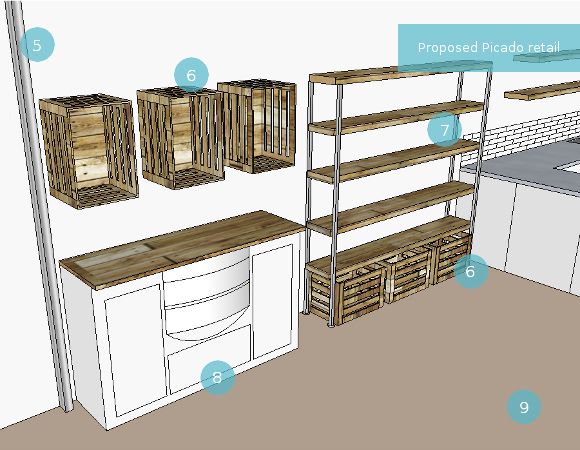
5. The security shutters could only be installed within the shop, so they in a way act as a separation between the shop and the window display. We’re making it work to our advantage!
6. Lily and Alan have 10 amazing industrial crates that they had made up for their My Mexican Shop market stall. We’re going to reuse them as display cabinets as well as floor storage units.
7. Some industrial shelving will be added to the space for displaying their products. I have some tricks up my sleeve so keep your eyes peeled for this number!
8. It was important for me to incorporate pieces Alan and Lily have used throughout their markets, so I’ll be upcycling a vintage side table of theirs to incorporate into the display area. I was working on it last night – you can get a
sneak peek of it here!
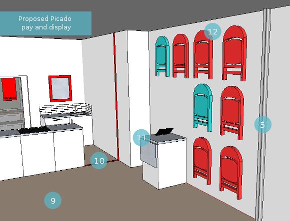
9. The main floor space is reserved for when Lily will be teaching her classes. A table will be set up along with chairs for people to sit at, takes notes, and get their NOM on. During the day it can be used as additional display use.

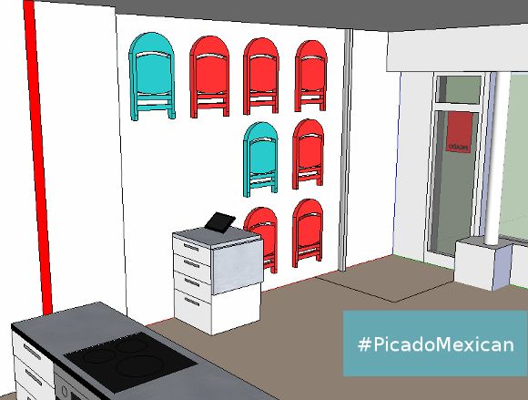
10. In stead of installing a physical barrier to prevent people from walking into the kitchen area, I thought to run a red stripe from the edge of the cabinets up the wall with some text along the lines of ‘staff only’ at eye level. A simple idea that will hopefully keep people from wandering into the kitchen.
11. The till area will match the kitchen and may have additional fold-up counter space.
12. I think it’s safe to say we’re all pretty excited about this area. Since Picado is a bit tight on space, there was no better way to add a bit of sass to their walls and double up on storage by displaying and hanging 8 FRODE folding chairs. Easily within reach for Lily’s cooking classes.
We have some more ideas in the works, but I didn’t want to inundate you with crappy Google SketchUp screenshots. So there you have it,
#PicadoMexican! I am so very excited to not only be working with such enthusiastic, encouraging, positive and awesome people like Lily and Alan, but the fact that they think I’m good enough to help design their shop = I still can’t get my head around that. I kind of suck at confidence. Having said that, I’m so very excited and a ball of nerves right now as we’re starting to bring everything together. Arhghghg! 🙂 xx A
