The internet and I this month

October was a busy month for me [not complaining] and while I wasn’t able to stick to the unhealthy level of pressure I put on myself to blog 3 times a week, I was busy so I’m going to make like Taylor and shake it off and possibly cut myself some slack. October was great as I was given the opportunity to be part of a wide variety of features and blog posts. I thought there was no better place to share them than here …
– I [somehow] made it onto Plumworld UK’s 100 Interior Design Blogs you MUST Read! list. There are proper people on that list. Emily Henderson is on that list. Design*Sponge are also on the list. I don’t know how I managed to get in there, but I am excited to be on it.

– I was interviewed by Floor Coverings International based in Alberta, Calgary, over on their blog. They asked me a quite tough question that I’ve never been asked or had to think about before. Until now – how would you describe your design style? I had to enlist in help to answer that because brain fart. 

– Then Me and My Home were featured on the Image Interiors website including all sorts of little details about our home and how I like to put my spin on it. It’s crazy to see how much our apartment has changed since I submitted those photos! Also, in my interview you can see which Instagrammer gives me the most interiors inspiration, and it’s not someone you’d immediately think.

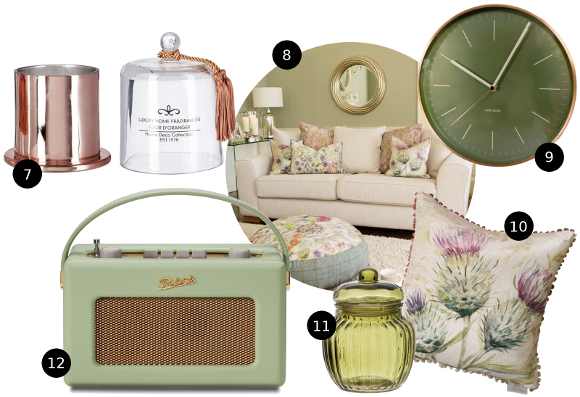
– I was asked to team up with Harvey Norman for a trio of posts for their interior design and tech blog. Yes please! My first post was about 6 of my top tips for how to Love Your Rented Home, as it’s safe to say I have a few tricks up my sleeve for making a place feel less rented. I then wrote about Using Colour to Update Your Space where I created a collage of 3 different looks – bold and bright, country cottage and retro geometric. Which would you say is your favourite? I know I probably shouldn’t pick, but the Country Cottage combo was for sure mine … 

If I could start my design all over, I wouldn’t hesitate to go for this style of decor. I grew up in cottage country in Canada so this colour palette mixed with natural accessories really hits home for me. Fishing on the lakes, skiing along the local trails, lazing on the beach in the summer in the park and general just being outdoors. Very different to how I am now, but it’s a huge part of me growing up.

– And last but not least, I was asked by the lovely Nathalie for my thoughts on hygge in yesterday’s Sunday Independent business supplement [hygge – the Danish concept of comfort. And lord knows I love to be comfortable] …

I haven’t been able to blog as much as I’ve wanted in October as I had a few plans and projects on the side as well as some ghost writing gigs too [unfortunately, it’s not as spooky as it sounds!] It’s been a while since I worked on a DIY project of my own for our home and I can definitely feel it. I’ve had a couple of ideas for projects rolling around in my brain that I’d love to make [one of which = knitting a hat], so fingers crossed that in November I’m back in my usual swing of things. 

Fighting the fight against ‘landlord walls’

Another slow but sure improvement I’m making to our apartment is hanging up artwork. I have a hoard curated collection of about 50 picture frames in our hall storage cupboard. Of those, we have at the most 10 frames hanging up. My excuse? I suffer from ‘landlord walls’ …

landlord walls
/’lan(d)lo:d/ /wa:lls/
noun

  1. moving into a rented space and feeling the need to conform your artwork to the preexisting nails in the walls left by the previous tenants or the landlord him or her self. 

Oh look, there’s a nail up there in that really awkward place. I’ll find something to hang there, even though it’s wildly unsuited for my framed artwork. I don’t want to disturb the landlord walls.” 

It’s a difficult thing for me to admit, but the first step is to acknowledge the problem and be able to talk openly about it. Our landlord walls were pretty intense when we first moved in. There were nails everywhere. I’d say at least 60 throughout our apartment. In the beginning, I succumbed to landlord walling. With the help of the internet and being bombarded by beautiful walls, I was able to self-diagnose my problem start curing myself. 

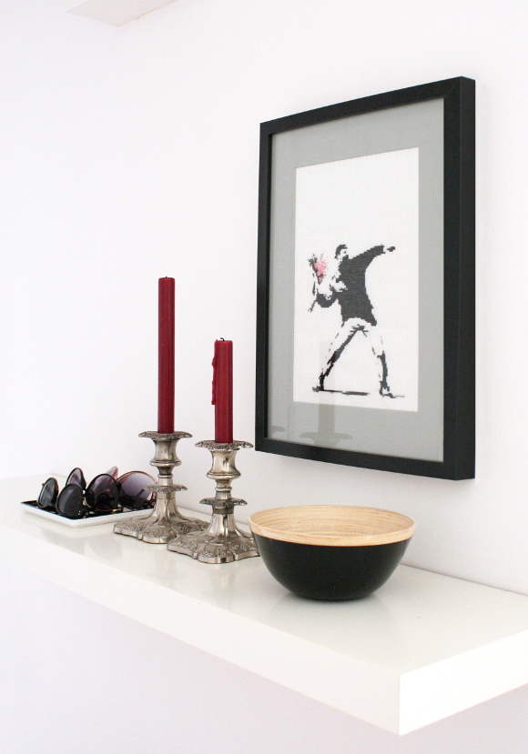
For the past few months we’ve had pretty bare walls. Our hallway, bedroom, and most of our living room are empty. I needed time to mentally wipe the slate clean before I started to reintroduce things back onto our walls. It’s a slow process, but I’m considering each wall as I go and ACTUALLY HANGING THINGS WHERE I WANT [which nowadays is easy to undo with a patch of filler and some paint]. So far, Banksy has found a new home in our hallway and I added some of my favourite Instagrams to our kitchen. Slowly, but surely, we’re getting there and together we’re fighting against our landlord walls. 

So what about you? Are you a fellow landlord waller? Are you guilty of hanging things on random nails just because they’re there? It’s a tough thing to defeat. But remember, you’re not alone. It happens to the best of us xx

Kitchen update – reveal!

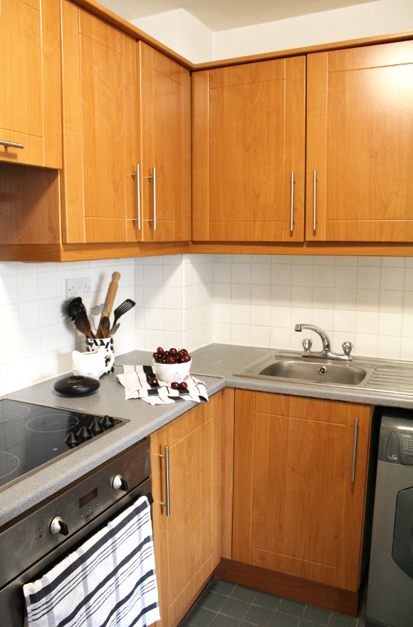
I’m actually quite excited to at long last share decent photos of our kitchen. For the 6 years we’ve been living here, I’ve rarely taken photos in our kitchen because, well, it was embarrassing. It was a classic case of trying to work around landlord [and builder] stuff and as much as I tried to make it pretty, it just didn’t work. To get you up to speed, you can check out what our kitchen looked like before, and then see the first round of changes I made to our rental kitchen. 

A few weeks ago Harvey Norman got in touch when they read my blog post about our kitchen and very generously offered to give a helping hand with adding some pizzazz to our kitchen. Um, woah. I had worked with Harvey Norman in the past when I was working on the Localise room at Sophia House, and to say they were a huge help is an understatement. They’re an incredibly down to earth group of people behind the name, and they have killer sales. Which is a giant plus. They’re a company I’ve been a fan of for a long time so I was incredibly excited when they got in contact to work with me directly. 

After all my work overhauling the kitchen last Saturday, I rewarded myself the next day by heading to Harvey Norman to accessorise our kitchen in style. And it was tough, I’m not going to lie. Because I wanted ALL OF THE THINGS … 

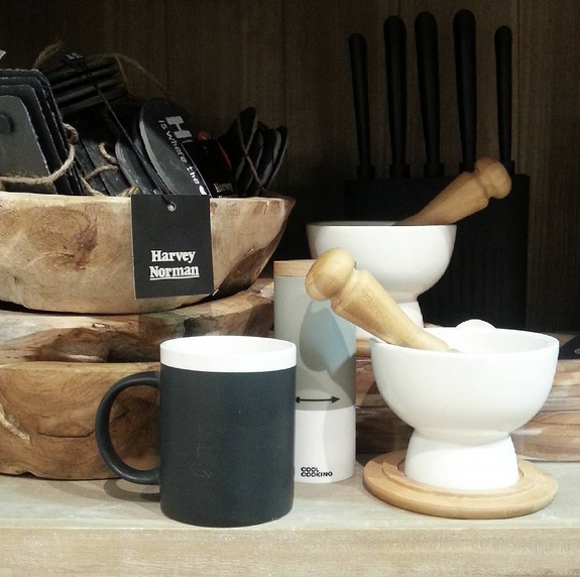
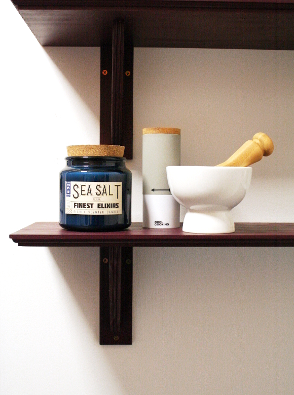
To the horror of poor husband, I spent almost 2 hours in Harvey Norman Blanchardstown last weekend. For our shelves, I couldn’t resist the sleek pepper mill [which we actually use for sea salt] and a mortar and pestle. Husband is a curry aficionado and has mentioned rather frequently, “hey, remember that mortar and pestle we had 5 years ago? That was nice. Before it smashed“, so Harvey Norman’s sleek porcelain and bamboo mortar and pestle was a must. 

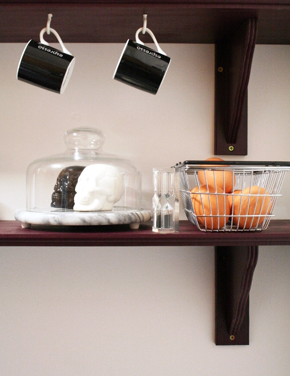
I’m a big fan of mini versions of every day things, so when I spotted their mini shopping baskets, I had to get two. One of which is perfect for eggs. I also spied some mini espresso cups to support husbands caffeine interest. A perfect little black and white accent to our shelves.
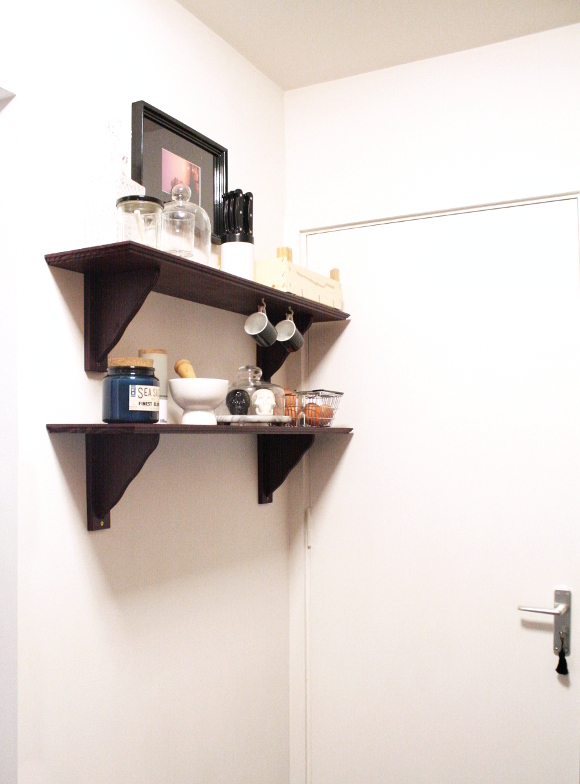
I didn’t make any drastic changes to the shelves in our kitchen, I just paid a little more attention to them as they had been lacking some for quite some time, thanks to the yellow door taking the spotlight … 

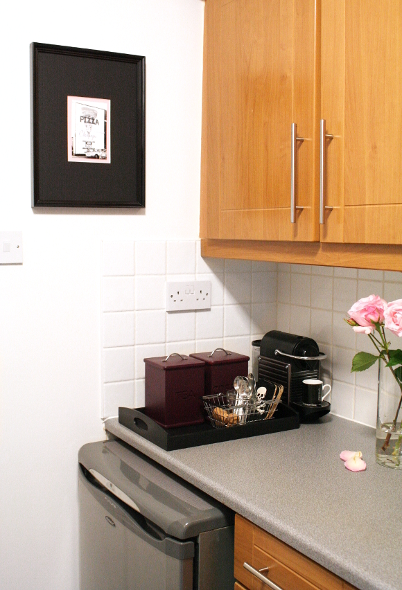
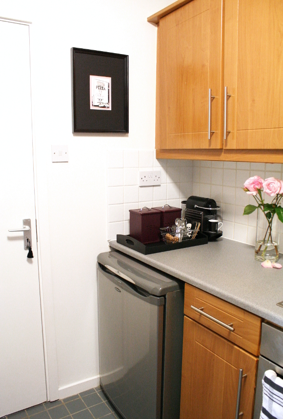
I think the biggest change I made to our kitchen was removing the microwave. Our kitchen is tiny therefore we have very limited counter space, so removing the microwave gave us SO much more room. We didn’t use the microwave much anyways, so we can simply use the stove or oven to heat whatever we need, old school style. 

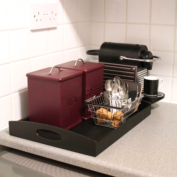
In place of the microwave, I created a little hot beverage station for husband. I had had my eye on the DeLonghi Brilliante kettle in black, but it was out of stock when I was visiting Harvey Norman. But to be honest, our old kettle [not pictured] works fine. It’s just ugly as sin and I was over excited at the idea of having a really fancy kettle. I mean look, it’s so angular

Both the tea and coffee boxes I found in charity shops over the years and spray painted in my favourite Montana winegum [the tea box was actually one of the centre pieces in our wedding]. I couldn’t resist picking up another mini shopping basket in Harvey Norman to perfectly keep all husband’s beverage accessories in line. 

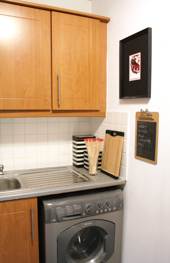
Another change I made to the kitchen was that I removed the kitchen-roll-and-tin-foil thing that hung on the wall previously, as we only used it because it was there. To cover the wall studs in its place, I framed and hung one of my favourite food themed graffiti Instagrams. I think it looks much better, no? 

And on the far side of the kitchen, I simplified everything again. I got rid of our 8 year old chopping boards [ew] and replaced them with this bamboo and rubber board from Harvey Norman. It’s been a while since rubber got me this excited. When we’re preparing food, the chopping board doesn’t go all over the place like our previous boards did. It’s such a simple thing, but makes a huge difference with food preparation. 

I also couldn’t resist those giant BBQ matches I rather excitedly found in store. I bought 4 boxes of them, but immediately justified it because, well, look at them! I have more on display in the living room. I also picked up a bamboo bowl for the keys in our hallway and a giant vase that looks kind of like a bomb shell, for our bedroom. Both of which I’ll be sharing along with updates on our hallway and master bedroom. Speaking of which, that room is next to get the paint treatment. More #DIYDominoEffect!

Kitchen update – beforemiddleafter

Disclosure – Harvey Norman generously supplied kitchen accessorise free of charge for my mini kitchen makeover, but of course as always, all words and opinions are my own. I only work with companies I like and of course, think that you will like too! Thank you for supporting the companies that support The Interior DIYer.