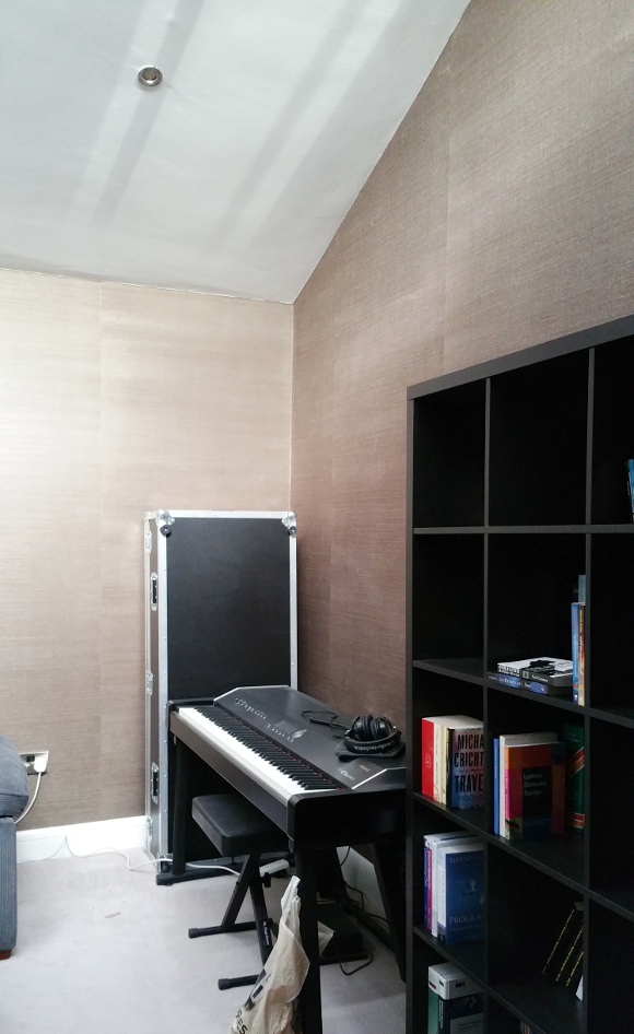
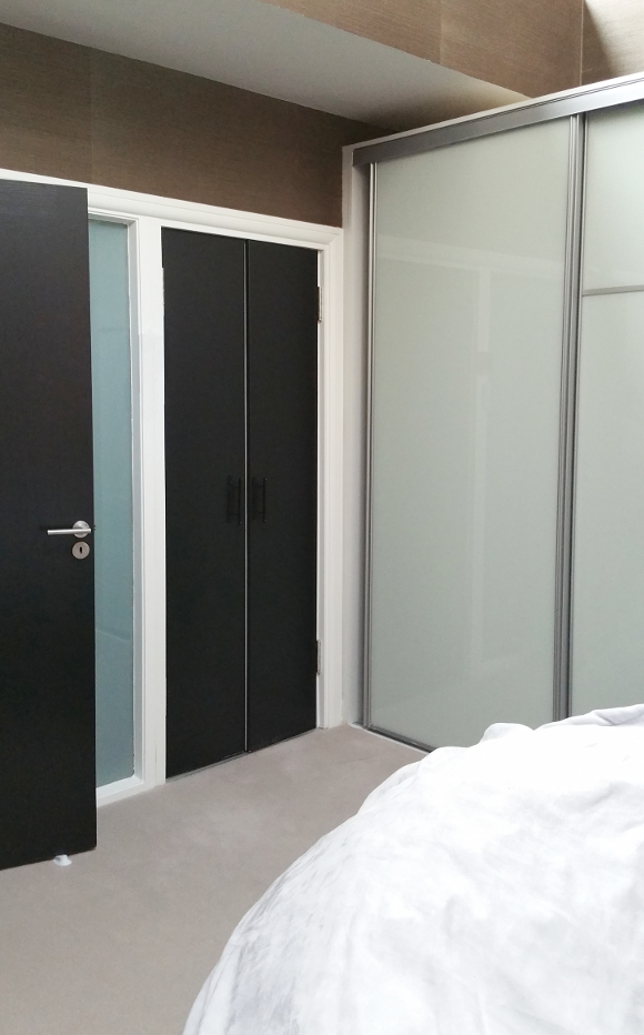
A few weeks ago VELUX contacted me about collaborating on a blog post. Like with any posts I work on with a company, I wait to see if a project will arise for me to include them in something I’m working on. A few weeks passed and our patience paid off when Camilla, a long time reader, got in contact with me about updating her entertainment room. And would you believe, she had two VELUX skylights that were a key part of the brief. Perfect!
I visited Camilla’s house two weeks ago to talk with her and her fiance Wayne about what they were looking for. They weren’t looking to undergo a huge change; a few updates to turn the current bright space into a cosy entertainment room. Both Wayne and Camilla are homebodies, so it’s a room that will get a lot of use. They’ve ordered a projector for the room, but in order to be able to use it, they need to install blackout blinds to their two existing VELUX skylights [which is a pretty vital part of the design, and segues nicely into our collaboration!].
In keeping with darkening the entertainment room, they were considering going dark with the design and I actually managed to convince them to go nearly-black on the walls [like in our bedroom]. I assured them that with the right accessories and accent pieces, a dark room won’t seem as overwhelming as they may think. It’s a room that gets a lot of sun during the day thanks to the skylights, but with the press of a button, the room can be transformed into a cosy Netflix snug thanks to electronic blackout blinds.
We talked about their design likes and dislikes, textures and finishes they preferred, and even about the more abstract things they like. I went away, compiled an entertainment room mock-up with lots of dark green, wood and hints of dusty pink and [to my very nervous surprise] they loved what I came back with …
Products clockwise from top [then spiraling inward] …
– Blackout blinds from VELUX
– 1830 Rue Chapal nearly-black paint from Fleetwood
– 4 seater VIMLE sofa from IKEA
– Dusty rose velvet cushion from Dust
– Gold printed fern leaves cushion from Harvey Norman
– Green vintage rug – still on the hunt for one!
– Bonsai tree from IKEA
– Rose gold and dusty pink candle sticks from Article
Both Camilla and Wayne like unexpected twists in design [a couple after my own heart], so after sneakily learning about their favourite movies and TV series, I found some Labyrinth and Rick and Morty themed parody prints that at first glance give a strong level of sophistication to the room. They like mid-century modern, natural and nature inspired fabrics and finishes, as well as a hint of gold. It’ll be a few weeks before we can start updating the room and ordering products, but once the work does start, I don’t see it taking long to finish. I particularly can’t wait to live vicariously through their purchasing the likes of that green couch. Anybody? No? Just me? I’m fine with that.
DISCLOSURE – this is a sponsored blog post from VELUX. As always, all words and opinions are my own. I only work with companies I like and of course, think that you will too. Thank you for supporting the companies that support The Interior DIYer.

