Paper and paint

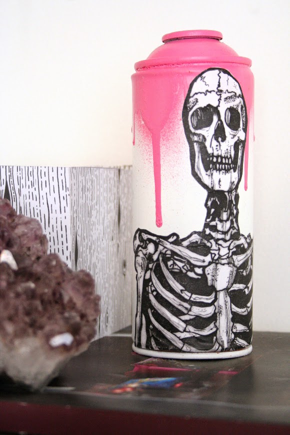
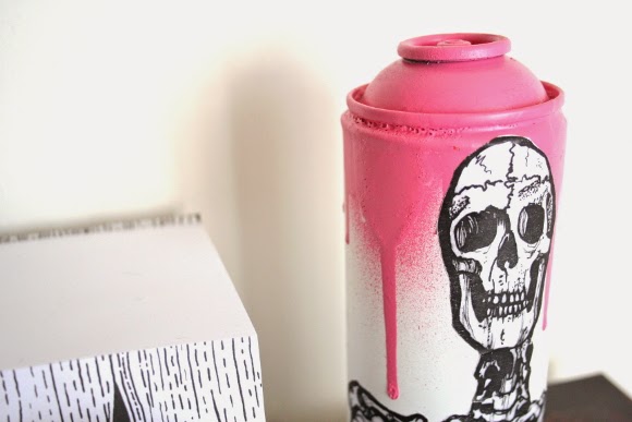
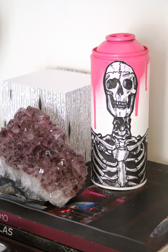
Have you ever had one of those moments where you see something that completely stops you in your tracks? As I was passing by White Lady Art on the way to my bus stop after work one day, what should I see in the window but this amaze-balls piece of urban art. It was a perfect combination of some of my favourite things – skulls, drippy spray paint, graffiti and my new affection for pink. I kinda had to have it. 

I went straight into the shop. There were loads more pieces of spray can art in the shop, all handmade by the intrinsically talented Irish designer, Eric Davys. His creative process is so beautiful and detailed. It reminded me so much of before I was into interior design and was heavily interested in becoming involved in either comic book artistry or special effects makeup. I’ve contemplated blogging my work from my previous life, but as it doesn’t really fit into design, I kinda don’t think it would be appropriate. But that’s a story for another day! We’ll see. 

For the moment, cansy, that’s what I like to call him, sits on our desk and beautifully matches and juxtaposes against my My Fair Lady print which hangs over our desk. I should have taken a photo of the two together, but I’m a bad blogger and didn’t think of it at the time. Shame on me. 

I did miss my bus that day when I spotted cansy, but it was so worth it. 

The man with no manager

I don’t even remember how I heard about it, but at the end of March husband and I attended the Bill Murray: Chasing the White Whale OFFSET Exhibit. We’re both pretty huge Murray fans so we were excited to go. And as it happens, so were about a thousand other people. Rightly so. The event was held in The Library Project and housed prints of all shapes and styles from talented designers and artists, all of which of course were paying homage to Mr. Murray. 

During the exhibit, I spotted Sean Cummins‘ piece Lost in Tranglation. I loved everything about it. Its geometric structure and composition and form and stuff. It really captured Bill’s nonchalant attitude, but he also looked happy in it {some of the prints were a bit scary. Is that rude? I don’t mean it to be. But a small few were}. 

There were also Murray masks going around and I couldn’t resist picking one up for myself. It’s currently hanging up in our living room, but I’m waiting for an opportune moment to scare husband with it. I’m not sure how just yet. 

Sean’s print is originally in multiple shades of blue. I asked if it were possible to get a copy of the print in grey-scale. I know, that’s a pretty cheeky thing to ask for, but when I went to collect the print last week, there it was with the original copy. I’m really glad I got both the original blue as well as a grey scale copy, because you never know, one day soon I may redo the living room around blue. 

I reused an old charity shop frame I had and backed the print with some pink paper that was laying around. I think Bill pulls it off well. Down came the plummy painting {I was feeling a bit meh about it anyways}, and up went Bill. He now takes pride of place above our TV and is a pretty stellar addition to our living room. 
Thank you Sean, and your incredible work.

UPDATE: you too can order Sean’s Bill Murray print for your own home! Yay!

Bolder shelves on a budget

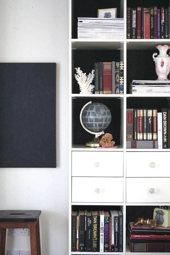
A couple of weeks months ago I shared a snippet of the changes I was making to our monstrous living room shelves. I started to make changes just after we took down our Christmas decorations at the beginning of the year. I really think monumental changes in our home go hand in hand with the new year – starting over and putting away all the Christmas decorations really encourages me to make changes. 

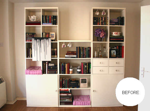
This year I really wanted to work on making our living room shelves sleeker and bolder. They’re large, cumbersome shelves that take up one end of our living room. For a long time, our shelves looked like this – 

And before that? Yeesh. Not to mention my previous photography ‘skills’. MINE EYES. So, it was time for a change.

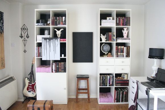
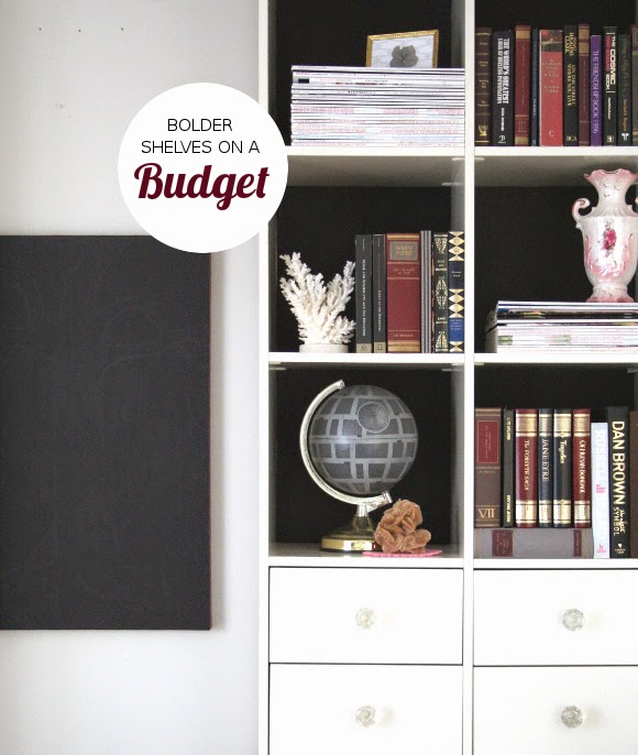
I wanted to make a bold statement, but because these shelves belong to our landlord, it had to be a statement that could be easily undone. And let’s face it, done as cheaply as possible. I loved the look of black-backed shelves, so I thought, hey – black construction paper. A perfect way to update our shelves! I bought two A2 pieces of black paper {for under €5 total}, and got cutting.

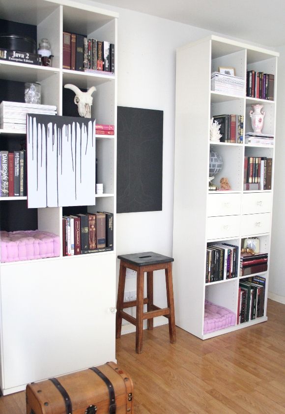
TIP – rearrange and style your shelves before adding paper to the back of them. Once I was happy with what was in each cubby, I added the necessary amount of paper to the back. For example, the top right cubbies on each shelf had tall books, so I only needed to tape paper to the top half of the back of that shelf. The same with the cat cubbies. Very few shelves had paper on the entire back of the cubby.
I also took my sweet-ass time rearranging our shelves. It’s April and I started this project in February. I didn’t want to do a sloppy, rushed job on it, and I wanted each shelf to look minted. I put lots of thought into balancing and contrasting the shelves and some quite severe downsizing {for some tips on decluttering, you can check out my blog post and top tips here}. 

The biggest change I made to our shelves was removing the middle section. And it took a long time for me to make that decision. Those middle shelves drove me insane. It was impossible to style them and they caused a lot of heartache. So one Sunday when I was doing some serious spring decluttering, I just pulled that section of shelves out and immediately fell in love with our living room all over again. I know, a bit too gushy and overenthusiastic for a Monday, but it really changed the feel of our living room.
Not to toot my own horn, but I’m really over the moon with how our shelves turned out. And of course, stay tuned to see where those middle shelves went! They really look top drawer in their new home. xx A