Work space reveal

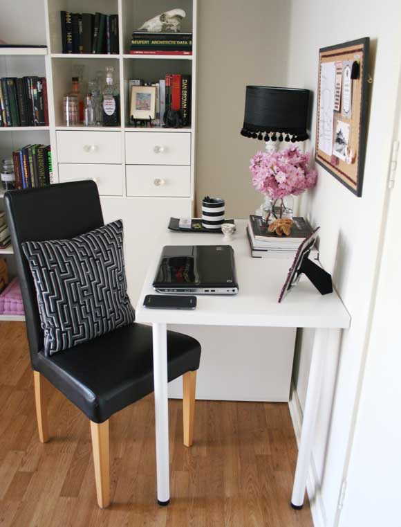
Before now, we didn’t have a work space in our apartment. We would sit in front of the TV with searing laptops on our laps and hazily go back and forth between staring at the TV and the occasional burst of work on the laptop. Enough was enough and I felt we needed a work space area in our living room. No more TV distractions. A place to sit and pound on the keyboard. So one lazy Sunday we traveled to IKEA where I scoped out options, measured, made decisions, stuffed my face with Swedish delights, swore at flatpacks, assembled, tweaked, designed, snapped branches, and finally, sat down. And here is what I ended up with … 

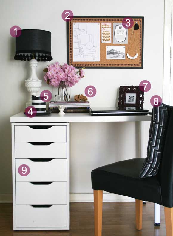
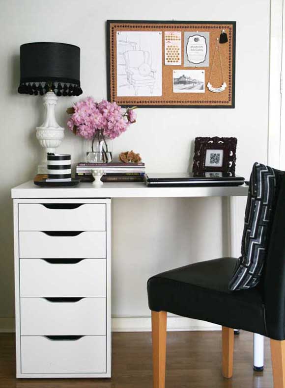
Our very own mini office nook! What was in this space beforehand was a tall shelving unit holding our vast DVD and game collection. This corner got a lot of neglect, but it was a great spot to add a little work space. It’s more so perfect because it is easily hidden behind our living room door which is always kept open {as seen on the right}, so you don’t see the work space until you walk right into the room. 

Thanks to my inspiration pictures, there were some basics / key pieces I had in mind for our desk to make it feel more encouraging to sit at …


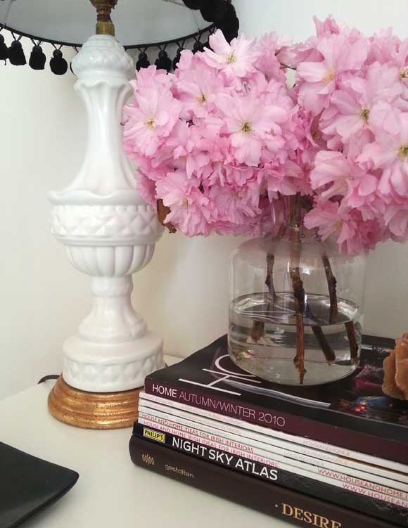
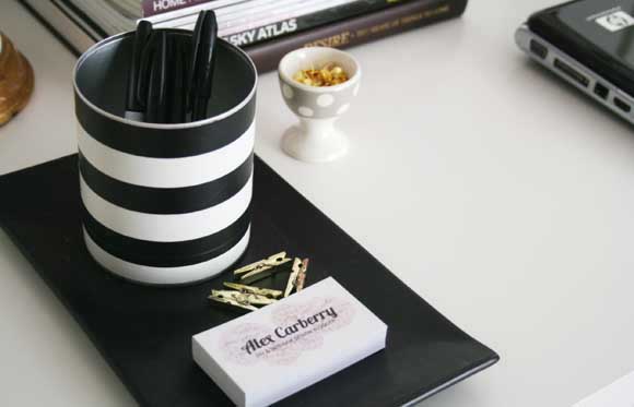
1 – I added a bulletin board to give height to the desk space as well as somewhere to pin {the real meaning of pin my friends} my favourite stuff up. I decorated the bulletin board itself by spray painting thumb tacks / push pins and adding them as a decorative border as well as painting the wood trim in a deep charcoal colour.  2 – One of our wedding invitations gets pride of place. 3 – Our new lamp, especially thrifted for the new nook. 4 – My new business cards {that I still can’t hand out in a professional manner. So much cringe}. 5 – My fool-proof quick and cheap revamp – an empty hot chocolate tin covered in electrical tape6 – I added a stack of my favourite books and magazines. Some are for visual purposes only {that top one is a catalogue and is going on 3 years old, but I love the colours on it}, along with some of my favourite magazines. Along with a desert rose I picked up on our Tunisian travels. 7 – My framed QR code cross stitch, perfect for any desk. 8 – Stay strong as one of my favourite pillow sets, picked up from TK Maxx. 9 – I went with the ALEX desk from IKEA. It was the perfect size for the limited amount of space we had in our living room, and I mean really, do I have to state the obvious? It’s called ALEX. Plus it was on sale for €79. Hells yes. 

I’m pleased as punch with our mini office nook and I feel like such a grown up sitting at it. All we need now is to frame both our college degrees and hang them above the bulletin board. Too legit to quit.

xx A

DIY Friday – I love lamp

Ah, Friday. You are here at last, which means I can share my DIY Friday! This weeks DIY is a lamp revamp to {hopefully} convert those of you who may be a bit paint shy when it comes to DIY. Don’t be scared. I got your back. 

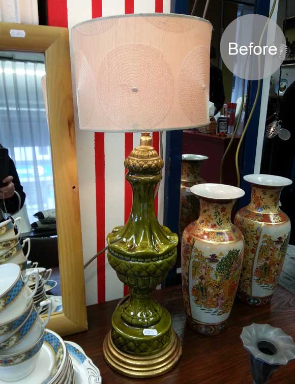
As I hinted earlier this week, I sorted myself out with a small work space in our living room. I immediately started day dreaming about decorating my new desk space, and one of the key pieces on my list was a statement lamp. I preferred the idea of DIYing one, so I took to the streets of Dublin and below is what I found. Behold, the ‘before’ picture. Take it all in … 

I spotted this green giant in Age Action for €25. I immediately knew it would be perfect. Once I got home I was a bit uncertain with what I wanted to do with the lamp. I knew I wanted a black lamp shade, and that’s about it. So I took to Photoshop to design my lamp revamp without tearing my hair out and having to go back and repaint anything copious amounts of times {I know Maria will appreciate this level of design planning!}. 

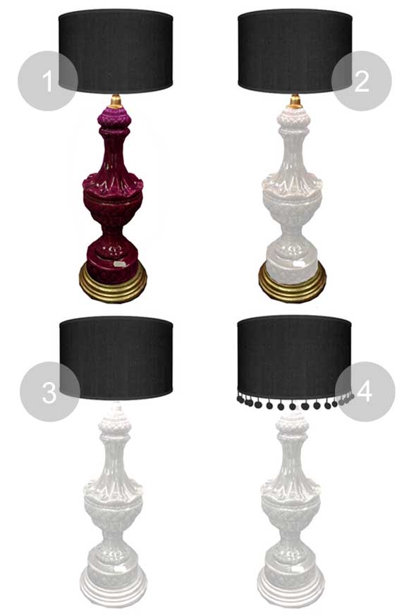
I edited the above image and here are the options I came up with … 
1 – My usual favourite ‘Winegum’ spray paint popped into mind, but I thought slight overkill. I spray everything with that colour, and I also wanted something a bit more uplifting / less dark for my desk. 
2 – This time with white. Better. I liked the idea of keeping the original gold base and keeping the gold fixture at the top. But it was still a bit blah …

3 – All white for the sake of my Photoshopping spree. A bit too boring for me though if I’m honest. 
4 – I then focused on the lampshade and added a bit of sass. I like where this is going.
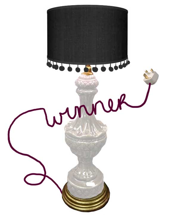
I then combined my two favourite mash ups {2 and 4} and thought to hell with it. Why not add my favourite winegum hue? There was no better place to use it than to cover up the current Exorcist-pea-green-soup cord. And here is what I came up with … 

Yeah. I got a bit carried away with Photoshop on the cord there. That’s what happens when you’re stuck at home sick for a couple of days.

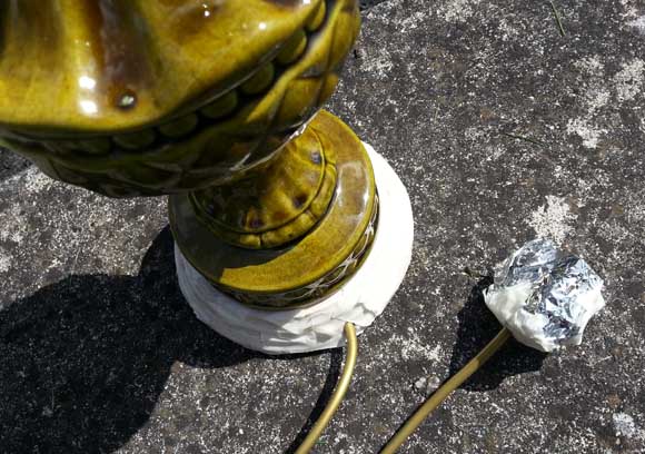
I was very happy with my result and got to work. I taped off the gold base, the gold light fixture at the top, as well as the plug at the base of the cord. I used masking tape and tin foil to cover all the important bits. 

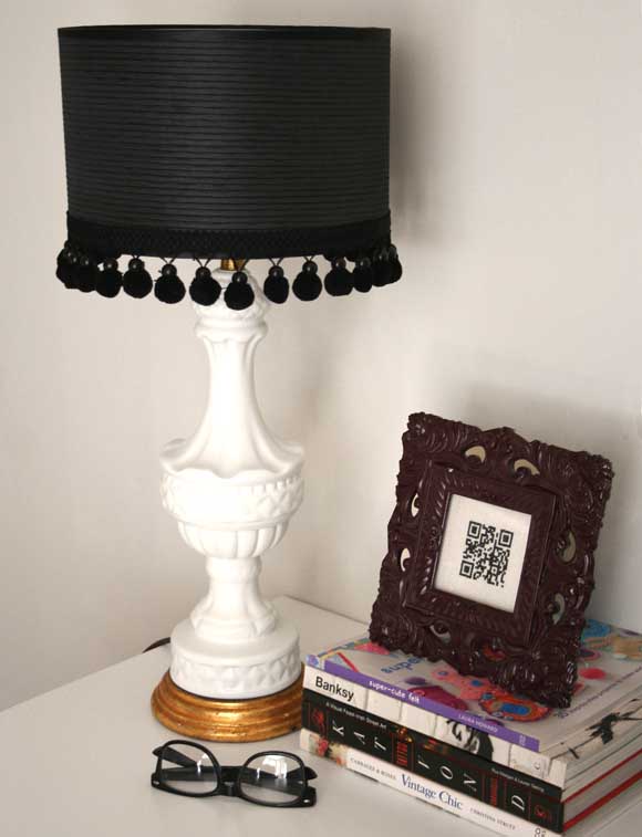
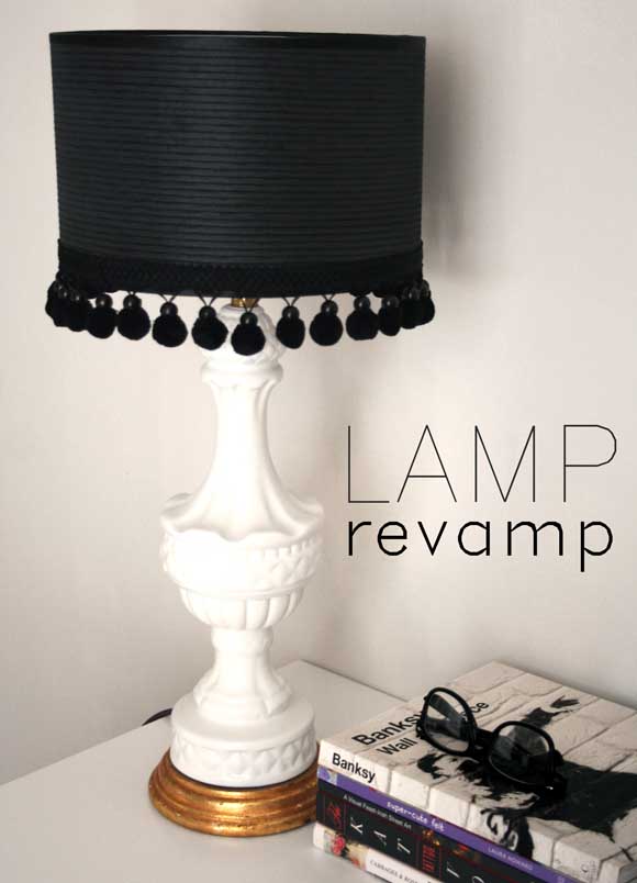
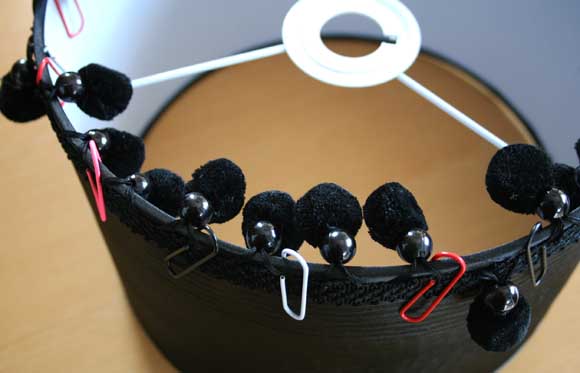
I gave the lamp two coats of ‘Sh. White’, and the cord one coat of my favourite ‘Winegum’ hue {both Montana brand spray paint}. While that was drying, I tackled the lamp shade. I had picked up a black lampshade from Dunnes Stores for €8 and while I was housebound, I e-mailed husband some ‘man instructions’ and sent him to Hickeys to pick up one meter of black bauble trim {he did so well}. I used extra strong adhesive to fix the bauble trim to the bottom of the lamp shade {pictured drying upside down} and used paper clips to make sure it stayed in place. I let both the lampshade and lamp base dry overnight. 
Then all I did after that was assemble it. I’m quite proud with how it turned out! If you keep an open mind it just goes to show what can be done on the cheap. You don’t need an unlimited budget or a mountain of supplies. If this makes you tick, I would strongly suggest visiting Pat’s totes amaze blog – In My Wheele House, which is full of fab furniture DIY’s that will have you running to your nearest antique or junk shop.

Early next week I’ll be sharing my new little office space so keep your eyes peeled! And with that I’ll leave you with some of my favourite Dublin graffiti, which is quite apt for today’s post. An oldie but a goody. Happy Friday, homies! xx A

DIY Friday – draw the curtains

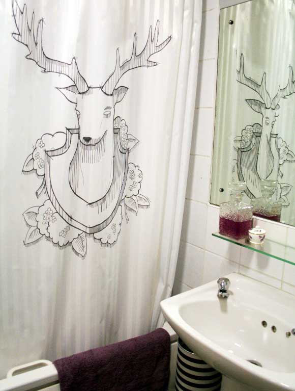
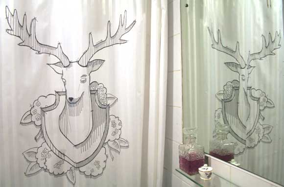
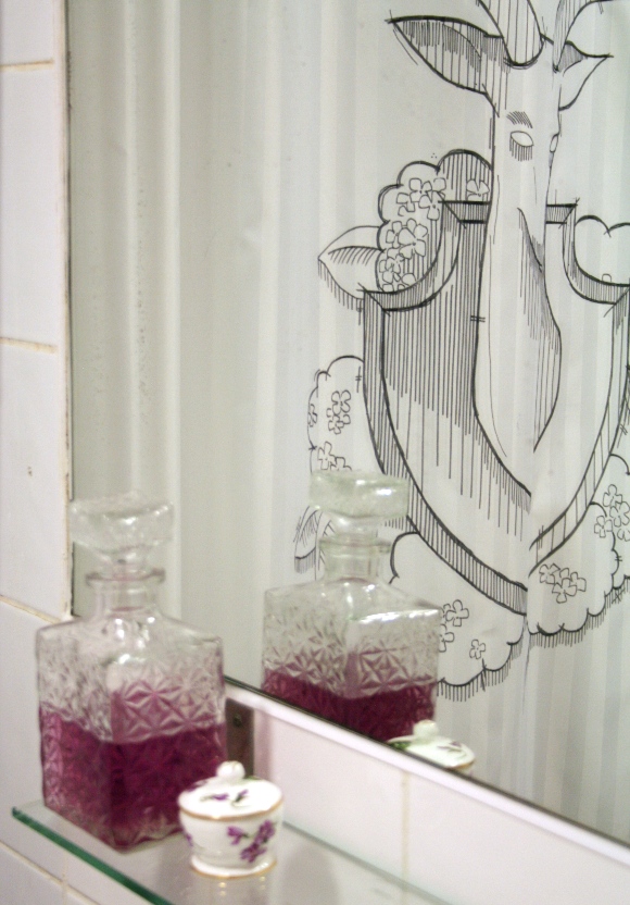
Our bathroom has received an unfair amount of design neglect this past while. I wanted to add a bit of pizzazz to it and thought what better way than via our shower curtain. With a marker in hand and three hours later, I added this Sharpie shower curtain to our bathroom, and I finally have those antlers I’ve wanted. Kind of …

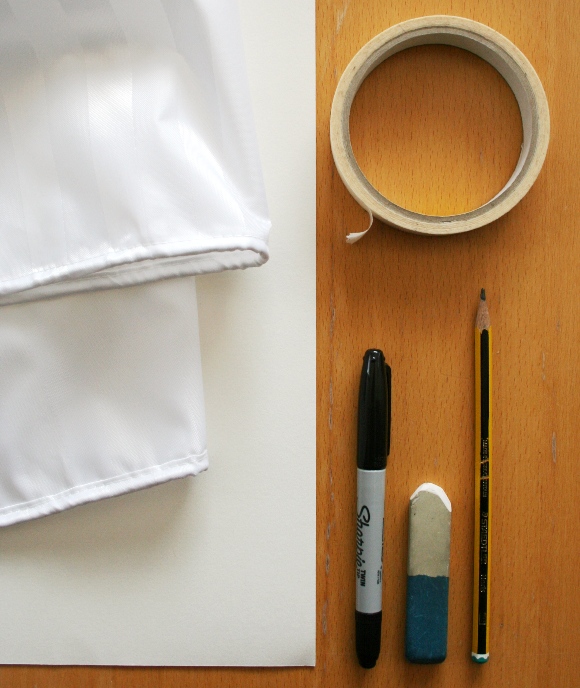
What you’ll need – a shower curtain {preferably 100% vinyl. I couldn’t find one and used a fine weave 100% polyester curtain and it worked out fine}, paper large enough to sketch on {tip – use the reverse side of a roll of wrapping paper if you don’t have large pieces of paper}, masking tape, a Sharpie permanent marker, eraser, pencil and an imagination. 
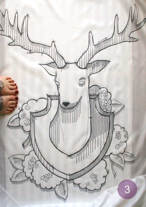
Step 1 – decide on what to draw on your shower curtain. This can be the hardest step. I magiked up this little number on Photoshop. This isn’t necessary, but Photoshop helped me quickly draw, erase, and rearrange my idea without wasting paper. I prefer the unfinished look of this sketch, so I kept the raw lines in my finished piece. This rough style of drawing also shows you don’t have to be 100% accurate to tackle a piece on this scale. You can choose to copy an existing image onto your shower curtain – you don’t have to create something from scratch. No judgement here. 

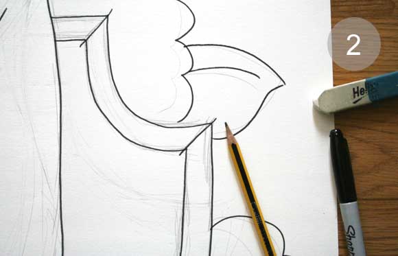
Step 2 – secure your paper to the floor with tape and draw your design in pencil. When you are happy with it, go over your design in marker. You will use this as a template. You can also choose to use this as your step 1 and skip the Photoshop malarkey if you like. Step 3 – lay your shower curtain over your template and draw your design using the permanent marker. You can tape down your shower curtain if you like to stop it moving around. I didn’t. I like living on the edge. 

Step 4 – I ironed my shower curtain at this stage because I have OCD. This step is not necessary, but it was a step I took to make it nice and smooth. Please use caution when ironing a shower curtain. Don’t use the highest setting as we are dealing with plastic here, folks. Step 5 – c’est fini! Hang up your shower curtain, and enjoy!
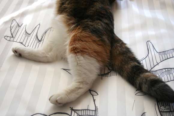
You can make your design as simple or as complicated as you like. I think I may add more to ours at a later stage. I more so think this would be a fab weekend project for kids. A cheap and cheerful way to add some  young people’s artwork into your home. And for those of you wondering, yes the Sharpie marker is permanent and no the water from the shower doesn’t effect it. 

I hope you have an awesome weekend lined up. If the weather holds up here, I foresee lots of walks outdoors and who knows – maybe flip flops.  
Happy Friday folks 🙂 xx A