A couple of
weeks months ago I shared a
snippet of the changes I was making to our monstrous living room shelves. I started to make changes just after we took down our Christmas decorations at the beginning of the year. I really think monumental changes in our home go hand in hand with the new year – starting over and putting away all the Christmas decorations really encourages me to make changes.
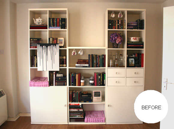
This year I really wanted to work on making our living room shelves sleeker and bolder. They’re large, cumbersome shelves that take up one end of our living room. For a long time, our shelves looked like this –

And before
that?
Yeesh. Not to mention my previous photography ‘skills’. MINE EYES. So, it was time for a change.


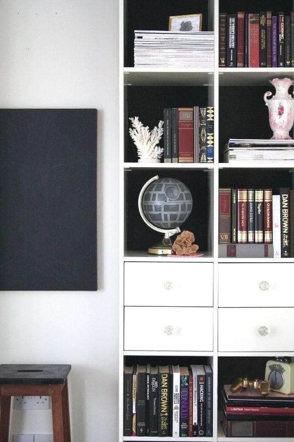
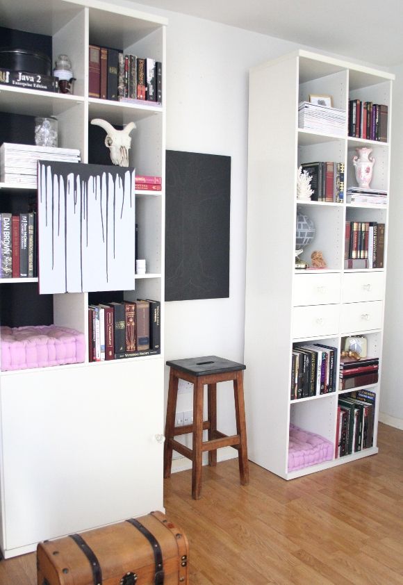
I wanted to make a bold statement, but because these shelves belong to our landlord, it had to be a statement that could be easily undone. And let’s face it, done as cheaply as possible. I loved the look of black-backed shelves, so I thought, hey – black construction paper. A perfect way to update our shelves! I bought two A2 pieces of black paper {for under €5 total}, and got cutting.
TIP – rearrange and style your shelves before adding paper to the back of them. Once I was happy with what was in each cubby, I added the necessary amount of paper to the back. For example, the top right cubbies on each shelf had tall books, so I only needed to tape paper to the top half of the back of that shelf. The same with the cat cubbies. Very few shelves had paper on the entire back of the cubby.
I also took my sweet-ass time rearranging our shelves. It’s April and I started this project in February. I didn’t want to do a sloppy, rushed job on it, and I wanted each shelf to look minted. I put lots of thought into balancing and contrasting the shelves and some quite severe downsizing {for some tips on decluttering, you can check out
my blog post and top tips here}.
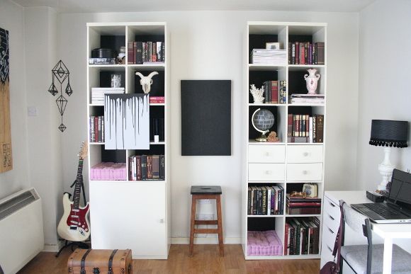
The biggest change I made to our shelves was removing the middle section. And it took a long time for me to make that decision. Those middle shelves drove me insane. It was impossible to style them and they caused a lot of heartache. So one Sunday when I was doing some serious spring decluttering, I just pulled that section of shelves out and immediately fell in love with our living room all over again. I know, a bit too gushy and overenthusiastic for a Monday, but it really changed the feel of our living room.
Not to toot my own horn, but I’m really over the moon with how our shelves turned out. And of course, stay tuned to see where those middle shelves went! They really look top drawer in their new home. xx A
