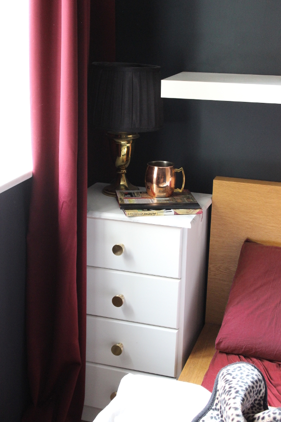
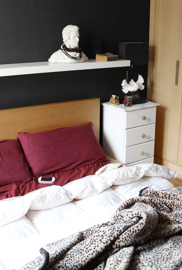
I’ve been waiting to show pictures of our bedroom until it was finished, but I’ve learned that a room is never really finished, and at the moment I have it looking as close to finished as a bedroom in a rented apartment can get.
Do you remember last year when I picked paint for Cora’s nursery? Fleetwood Paints very generously offered for me to choose two tins of paint from their new range to add to our home. Along with picking Pantone’s Lunar Rock for Cora’s room, I selected a tin of their Vogue range’s very moody and deep 1830 Rue Chapal for our bedroom. Our room gets a very poor amount of natural light, so I figured painting our room even darker would add to it. It was a big step for me painting an entire room such a dark shade, but it was the best nesting-fuelled choice I made.

Fleetwood’s Vogue paint, much like their Pantone line, has to be one of the best paints I’ve used to date. It took two coats to paint our room and still had loads left over for touch ups. Speaking of, one deal breaker for me that separates low quality and high quality paint is the touch-up test; if you touch up a patch of wall and it’s so obvious that it looks like you might as well have painted red arrows towards the now seething blotch, that’s how I can tell a paint is truly a good quality or not. With both Fleetwood’s Pantone and Vogue range you couldn’t tell where I had made touch ups the following day. For me, that’s a deal breaker because I will go out of my way and repaint a wall just to avoid a haggard touch up blotch. But it wasn’t necessary [TG] with this paint.
I painted our room in 1830 Rue Chapal the night before I was due to be induced [in hindsight, not a great idea], but once we had our new dark room, I thought about a theme I’ve long wanted to design with.
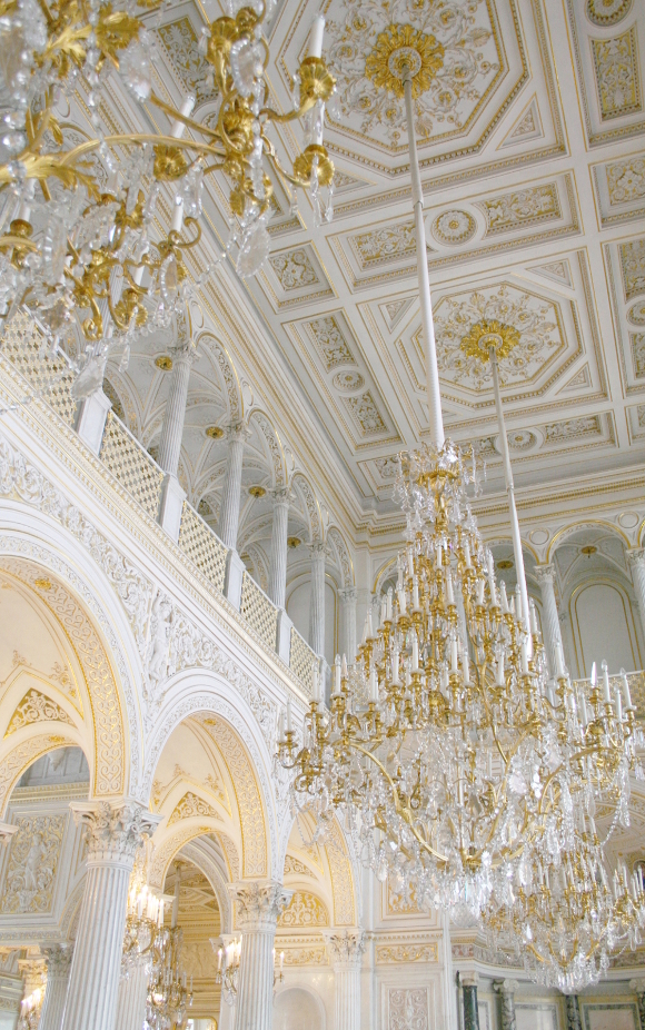
I’ve had a long fascination with Russian history, its architecture and the [dare I say] dark, romantic, luxe feeling that comes with it [recent news and political stuff aside of course] …
– My best friend and I were fascinated with Russian history when we were in high school.
– I taught myself [basic conversation] Russian 13 years ago and the first conversation Robert and I had when we first met was me teaching him how to say hello in Russian – здравствуйте [zdra-stvooee-tyay]
– I taught myself [basic conversation] Russian 13 years ago and the first conversation Robert and I had when we first met was me teaching him how to say hello in Russian – здравствуйте [zdra-stvooee-tyay]
– The happy coincidence behind the Russian watercolour my mom bought me.
– At our wedding I found out from my grandmother’s sister that my grandmother always had a fascination with Russia and always wanted to go. Something I never knew. It particularly blew my mind as we were going to Russia for our honeymoon a few days after our wedding [we visited again two years later].
– My dad’s first name is Russian and so is mine [Alexandra]. My grandmother’s fascination with Russia may have had a part in my dad’s name [and maybe mine?], but that’s just a guess.
– My dad’s first name is Russian and so is mine [Alexandra]. My grandmother’s fascination with Russia may have had a part in my dad’s name [and maybe mine?], but that’s just a guess.
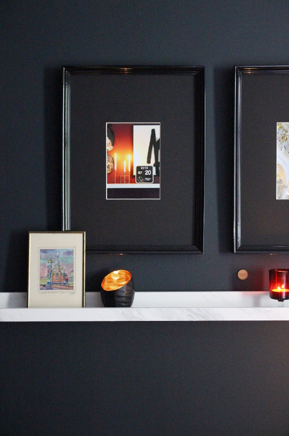
I took my theme and adding a few things from our travels. I printed one of my favourite photos I took when we were on our honeymoon in St. Petersburg as well as a photo I took of our Karlsson flip clock of the time and date of Cora’s birth, and framed them side by side. The frames I used are a now discontinued frame from IKEA which I love the look of, but there was plastic in the frame in stead of glass, which never sat flat in the frame and always looked warped, so I took out the protective pieces of plastic. It made for better photo taking too.
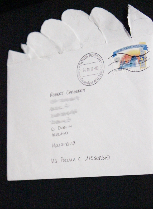
I also framed a letter I sent home to Robert while he was in the shower one morning on our honeymoon. I sent it along with all our thank you cards after the wedding из России с любовью – from Russia with love. A very small detail, but something so many people bring up when they see us. James Bond or wha.
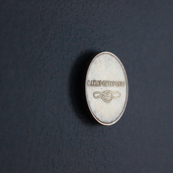
It’s illegal to take Russian currency outside of Russia, but I was able to sneak two metro tokens home in my change purse. One of which I’ve stuck up on our wall with blu tac.
Our room doesn’t look truly finished and it’s not perfect nor does it have essential flower arrangements to top it off, but this is what it looks like for now. For anyone out there thinking about going dark with their bedroom, I would say don’t walk but run to your nearest paint store. Come over to the dark side.
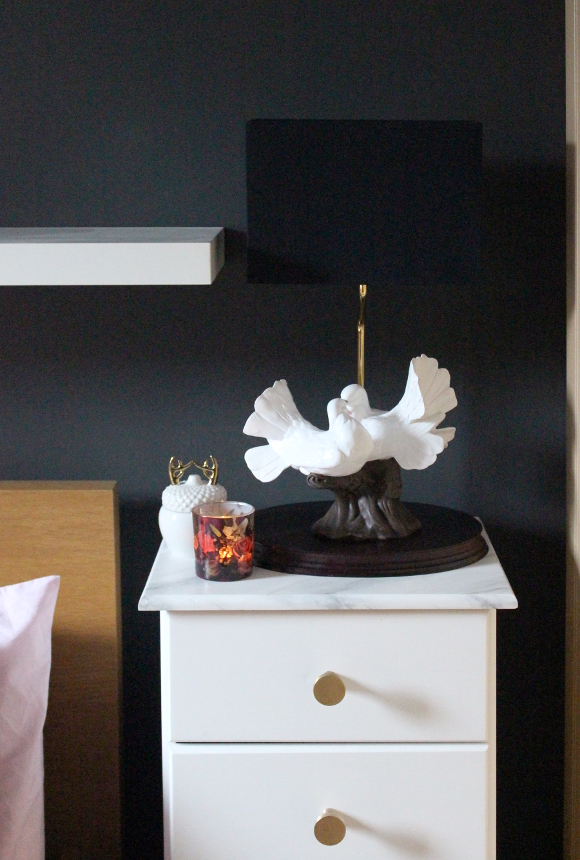
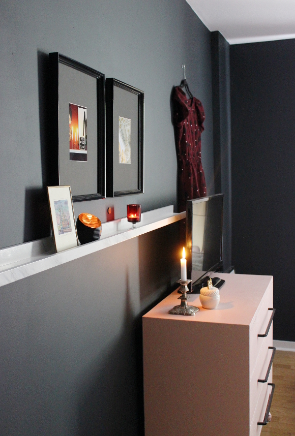
Also featured – pink dresser update – faux marble bedside tables – our engagement story – love dove lamp – small watercolour
DISCLOSURE – while this blog post is not sponsored, I did receive this paint free of charge from Fleetwood via MRCB. I only work with brands and companies that I like and of course, think you will too. Thank you for supporting the companies that support The Interior DIYer.