#PicadoMexican – pay and display

Earlier this week #PicadoMexican had its official opening and all I’ll say is Lily and Alan sure know how to throw one hell of a party. It took husband and I a couple of days to recover, and while we’re still buzzing from the party, I thought there was no better time to share my final Picado feature! Today’s final installment is all about one of my favourite parts of Picado – the pay and display area.  

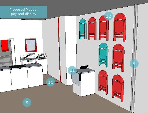
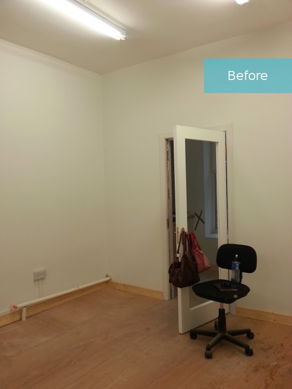
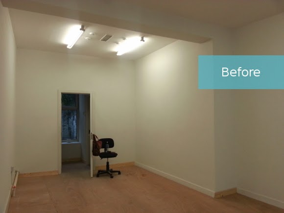
Before I start, below is a little reminder of the space beforehand as well as my design proposal for the space that I presented to Lily and Alan … 

NOTE: 1-8 are part of the kitchen and retail areas. 
9. The main floor space was reserved for when Lily will be teaching her classes. A table will be set up and the chairs will be taken off the wall for people to sit at, takes notes, and get their NOM on. During the day it’s used as additional display space. 
10. We were going to paint a red line [in keeping with the external signage] along the wall and floor to create a barrier-withouth-a-barrier if you know what I mean, between the public and private space, but fortunately no customers have wandered into kitchen. Success! No line needed.
11. It made the most sense for me to place the till area here. Both as a visual barrier for customers as they walk into the shop and hopefully [successfully!] divert their path and dissuade customers from walking straight into the kitchen. I also wanted to use a sturdy till area and not just a table, for security  / till reasons.  
12. Oh, the chair wall. It’s gotten the most attention out of the whole shop. In the very beginning I had secret ideas about hanging chairs up on the wall for Lily’s cooking classes to save on the limited floor space. Then Lily emailed me about the FRODE folding chairs in IKEA, which were the perfect Picado colours. I nearly kissed Lily right on the mouth. They were perfect, and with some help from BJARNUM folding wall hooks and Alan’s handyman dad, the chairs were up. 

At the official opening of #PicadoMexican on Monday night, I talked to a few people I didn’t know [just a few, I’m quite bad at socialising], and each person commented on the chair wall; ” … that’s such a great idea and you know, so unusual!“, without realizing I was the designer. I really enjoyed their unfiltered and honest feedback on the shop. It really made me so proud of the shop and the work that went into it, and more importantly, so excited for Lily and Alan and what lies ahead. 

It was a really amazing party on Monday night [did I mention the incredibly dangerous / delicious bespoke Mexican cocktails by Oisin?] and in the most celebratory way possible, the opening party was a form of closure for me on the project. My Mexican love-child with Lily and Alan is real. It’s full of love, people adore it, and if you haven’t visited it, I will find you and I will make you. For the Mexican food alone, go. Forget the design. 
And at running the risk of sounding like a broken record, thank you Lily and Alan. For the opportunity. For letting me get carried away with you. For believing in me. For all the pizza. For shooting the breeze. And for listening to my crappy jokes.Thank you.

#PicadoMexican – kitchen details

Happy Friday, homies! Today I’ll be sharing the next installment of #PicadoMexican – all about the kitchen details. To give you a little reminder, this is what the kitchen section of #PicadoMexican looked like when we first got the keys …  

It had potential, but it was a fairly standard magnolia shell. This area of the shop made the most sense to house the kitchen; the shop narrowed a bit towards the back, there was a sink and plumbing in the back room

which meant we could knock through and continue the pipes and electricals through to the kitchen space, and there was also a toilet [on the right as you go through the door] so again, we could easily harness plumbing etc. Not to mention, this area was the only relatively level part of the shop, so it had to go here.

And this is what I had in mind …

1. Lily and Alan needed space dedicated to packaging foods. By food safety standards, their packaging space had to be separate from the general food preparation area as well as the retail section of the shop. Placing the counter here made it the ideal spot. 
2. Understandably, Lily and Alan were conscious of having their backs turned on the front door while at the packaging station [the front door is behind them at the other end of the shop when they stand here]. My most simple solution for this was to hang a mirror so they can glance up whenever they hear the door open. I sourced a beautiful red Carolyn Donnelly mirror, but unfortunately it’s no longer available online. 
3. Not only is #PicadoMexican a place for people to come in and buy their favourite Mexican ingredients in the retail section, but in the evenings, Lily hosts her own authentic Mexican cookery classes. Well impressive. So, Lily needed the stove to be somewhere where she could demonstrate her techniques without people having to crowd around behind her. Gallery stove it is. 
4. For the kitchen itself, we turned to IKEA. We used METOD cabinets finished with RINGHULT high-gloss cabinets, HALLESTAD counter tops and finished them off with EKEBODA stainless steel handles. We also sourced the appliances from IKEA as well as the ceiling-mounted TURBULENS extractor fan which hangs over the stove top.  
We hit IKEA, ordered the kitchen, and two days later we were up to our shoulders in boxes and doors and extraction hoods, oh my! Lily and Alan then did something that didn’t even cross my mind – hired a carpenter [genius Allen] to put it together. In my stupidity, I gave them stink-eye. “Sure, we’ll be able to put it together ourselves. It’s IKEA!” WRONG. To give you an idea, the walls weren’t build at 90-degree angles so things didn’t fit in corners properly, extra space had to be made for awkward plumbing and thanks to the minutely sloping floor, Allen had his work cut out for him. Srsly. I stupidly thought IKEA kitchens would just be like a bigger version of a bookcase. 

Allen staging one of the many moves I didn’t think we’d have to pull in our wildest dreams. 

[Allen – ahead of the official opening of #PicadoMexican, I apologize in advance if I have too many margaritas and cry on you or try to awkwardly high-five you too many times.]

Alan’s dad crafted 3 shelves out of leftover board from the retail shelves, and around the counters we went with plain white square tiles. Lily and I spotted these Utopia white tiles in B&Q which were easy on the eyes as well as the pockets. I detest white or light grey grouting [it’s just gonna get filthy], so I suggested to Lily and Alan that they get dark grout so the areas around the sink won’t get noticeably darker after a couple of months. And as it happens, just as we were tiling he kitchen Anna Dorfman of Door Sixteen wrote a feature about square tiles with dark grout. Ohhhh snap. Yes, it did hurt to be that en trend, but we recovered. 

And as if I forgot – the sink saga. “Ehhh, there’s quite the collection of sinks there in Picado“, I hear you say. You would be right. There are. There are 3 sinks in the kitchen altogether. That’s not including the two sinks behind the glass door. To adhere to the food safety regulations we needed a sink for food preparation, a sink for washing pots and pans, and a sink for hands. And they all had to be separate. We were short on counter space so we had to be clever. The easiest places to put the sinks were in the corners, not just because they were corners, but because that’s where the plumbing came in on both sides. Lily picked up a Cooke & Lewis Locone spring neck tap from B&Q for the double sink which looks well swish.  

To add a little je ne sais quoi to the blank wall in the kitchen, so far we’ve added some poncho art. I took a poncho of Lily’s that she no longer uses, stretched it around a cheap canvas and stapled it on as a mini focal point for the wall [above photo thanks to Daili!]. I of course couldn’t resist taking it for one last spin before we committed it to a life as artwork …

And there you have it! Details for the #PicadoMexican kitchen. I’m hoping to share the final installment [the pay and display area] of the shop within the next couple of weeks, so keep your eyes peeled xx A

#PicadoMexican – retail details

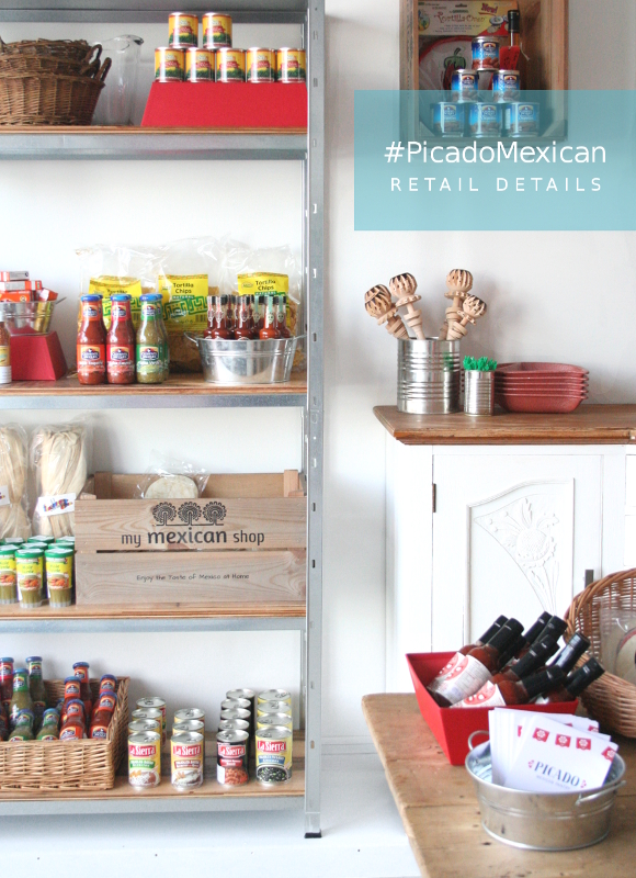
A couple of weeks ago I shared a plethora of photos of the newly completed #PicadoMexican pantry. As there was so much involved in the project, I wanted to break down the details into 3 parts detailing the different sections of the shop – the retail section [that’s where you are now!], the kitchen, and the pay and display. I wanted to share the good, bad, and the mostly awesome roller coaster ride and design process that made #PicadoMexican what it is today. So let’s get stuck into the details, shall we? 

To give you a recap, this was my original design proposal …

NOTE: 1-4 are kitchen details and will be shared within the next 2 weeks.

5. Since the security shutters could only be installed within the shop, they in a way acted as a separation between the shop and the window display. We’re making this space work to our advantage! 
6. Lily and Alan had 10 industrial crates made for their My Mexican Shop market stall. We reused these as mini display cabinets to add another level of shelving as well as storage units. 
7. Some industrial style shelving was added to the space for displaying the main food products and ingredients. My original plans for this area fell through, but it just meant I had to come up with something better. More details on these will be detailed below … 
8. It was important for me to incorporate pieces Alan and Lily used throughout their market days, so I upcycled a vintage dresser of theirs and incorporated it into the shop as a display piece and as extra storage. 
9. The main floor space will be doing double duty – a table will serve as a display area and in the evenings during Lily’s cookery courses, will serve as a prep and an om nom nom area. 
And here’s how we incorporated the above into the retail section. Well, as best as we could. There were some hiccups design challenges, but we were well up for it … 

Lily and Alan’s vintage dresser was something I wanted to incorporate into the design. I felt it was important to carry through some roots from their pantry and market stall beginnings. The vintage dresser wasn’t a family heirloom of theirs so they were more than happy for me to repaint it. This beast of a dresser is quite a solid piece and was used as a display cabinet back in the day, so it didn’t stray far in Picado. I couldn’t not incorporate it into the design. 
I sanded it down and wiped the dresser before applying 3 coats of Annie Sloan’s pure white chalk paint. I removed the existing hardware and replaced them with stainless steel EKEBODA handles from IKEA, which not only fit in with the industrial slant we were taking, but they’re the same handles that were used on the kitchen cabinets which [I like to think] subtly link the two spaces together.

As for the main storage, I was originally hoping to construct a set of pipe shelves. But as it turns out, pipe accessories are hella expensive here in Ireland compared to all those North American tutorials I drool over endlessly. With each piece costing upwards of €8.50, that option was quickly ruled out. I was in B&Q at the time so I voiced my concerns to one of their hardware specialists. I told him a bit about the industrial look we were going for, “…kinda like these industrial shelves used to display stuff here in B&Q …”, as I stared up at the ginormous shelving all wide-eyed. He pointed me in the direction of their 5 tier galvanised boltless shelves, and I ran.

The galvanised shelves met everything we were looking for. They were the perfect size for two shelves to flank either side of the vintage dresser and they were well within budget. There was however one minor detail I was a bit concerned with – the thickness of the shelves. The label said the shelves could take 65kg per shelf, but the metal shelves themselves were a bit warpy and would pop up and down in the centre. You know, and make that loud flexing metal sound? The majority of #PicadoMexican‘s products were in glass bottles or tin cans, and I was concerned that such dense items would warp the shelves. So to give them some extra stability I suggested adding chip board to strengthen and evenly distribute the weight. Alan’s dad expertly cut and stained the planks of chip board to fit each shelf which also added to the industrial look, and tied in with the wooden top of the vintage dresser. Weight now evenly distributed = winning. And it looks good? Winninger. 

Then there was the floor – this is something I don’t think I can describe to you without using a lot of hand gestures, but I will try my best. You see, the floor in #PicadoMexican was a curious floor indeed. 1/3 of the floor was completely level, aka. the kitchen, but the area between the kitchen and the front door, the floor sloped in an unruly way. Not only did the floor slope away from the walls, it also sloped towards the front door. It sloped in not just one, but two directions. Meaning, if you emptied a bag of marbles across the back of the shop, they’d all end up at the front door. Okay, that may sound a tad dramatic, but it was enough of a slope to notice. Hopefully my terrible diagram will make a little more sense … 


It meant that when we first assembled the shelves and put the base of them against the wall, the top half of the shelves were tilted away from the wall, as well as sloping down to the left. I burst into a cold sweat. I went home that night a failure. How was I going to fix this? I came up with all sorts of wild ideas, most of which involved anchoring the top of the shelves to the wall, and some of which involved me attacking things with a saw. We couldn’t have shelves teetering all over the shop in case [god forbid] someone knock into them, the shelves and their contents would collapse on top of them. I would literally have blood on my hands. To say I lost sleep over it was an understatement. 

Then one morning I woke up at 3am with a solution – build a tiny step / ramp / deck that will level off one side of the shop that the vintage dresser and shelves can sit on. It seems wildly obvious to me now, but at the time it was a real case of not being able to see the forest through the trees. I passed the details onto Lily and Alan’s carpenter, Allen, and his mad carpentry skills produced this bad boy. It is perfection and I nearly cried at his skills and if it’s not too conceded to say, my being able to solve the problem. I conquered the sloping floor before it conquered me. And it very nearly did. 


So those are our little stories behind the design process the retail section went through to get to where it is today. Check back next week when I’ll be sharing details and pictures for the kitchen section of #PicadoMexican

xx A