Crow-globe

My favourite time of year is here – autumn. There’s a lot about this time of year that makes me feel all warm and fuzzy inside – weather getting colder, crunchy leaves, scarves, cuddles and hot drinks. Aside from all the above, the next thing I love about autumn is the impending Halloween tinted decorations. 

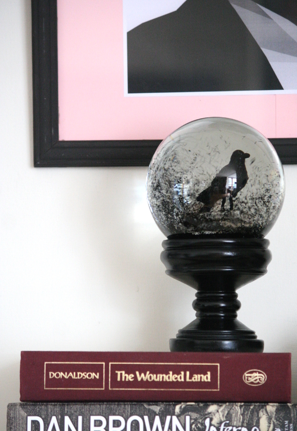
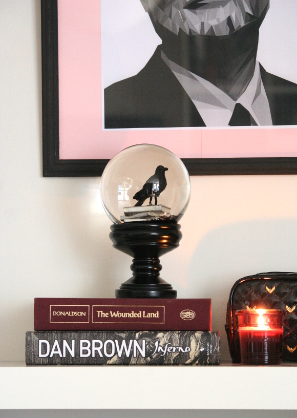
I gave myself 10 minutes in TK Maxx over the weekend [yes, I actually have to give myself a time limit], and when I got to the top of the escalator, there sat their Halloween section. A plethora of Halloween themed snow-globes obstructed my line of vision. Some were a bit naff [ugly skeletons, bad-weird pumpkins], but then there was this crow snow-globe. Or as I like to [yell while I’m shaking up all the black glitter], CROW-GLOBE. I mean, seriously. Black. Glitter. And this is a legitly solid piece, no flimsy seasonal decoration. And I’ve always wanted a crow as a pet. Is that weird? I just think I’d look so mysterious. 

Crow-globe is a welcome addition to our living room and I should state, he will be present all year round, not just the autumn months. Pro creepy.

Also featured – Bill Murray print

Teal obsession: I’m cheating on my favourite colour

This isn’t going to seem like a big deal to most of you. I see so many pictures through social media of people’s colourful lives. And I really wish I could be so bold. For me, colours are a big deal. In the past, I’ve tried to introduce many colours into our home. But the truth is, it drove me IN.SANE. I hope that doesn’t sound rude? I’m well able to appreciate when people share they’re colourful homes and if anything, I’m jealous. But I just can’t do it. Call it DOCD – design obsessive compulsive disorder.

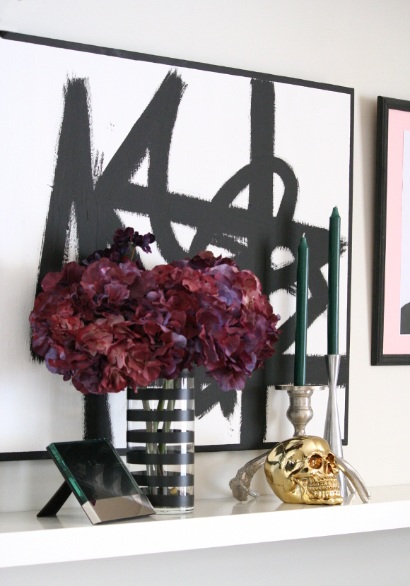
But that all changed a couple of weeks ago. It’s really lame, but it started with a hoodie my husband bought in H&M. It was a really dark teal. Oh. It was nice, and that freaked me out. But no, this isn’t a dark berry colour, so just no. But the more I thought about it this new hue, the more I realized it might actually go really well in our home. So I tested it out with an easily disposable item – candles. I headed to my local Tiger store and picked up two teal candles for €1.
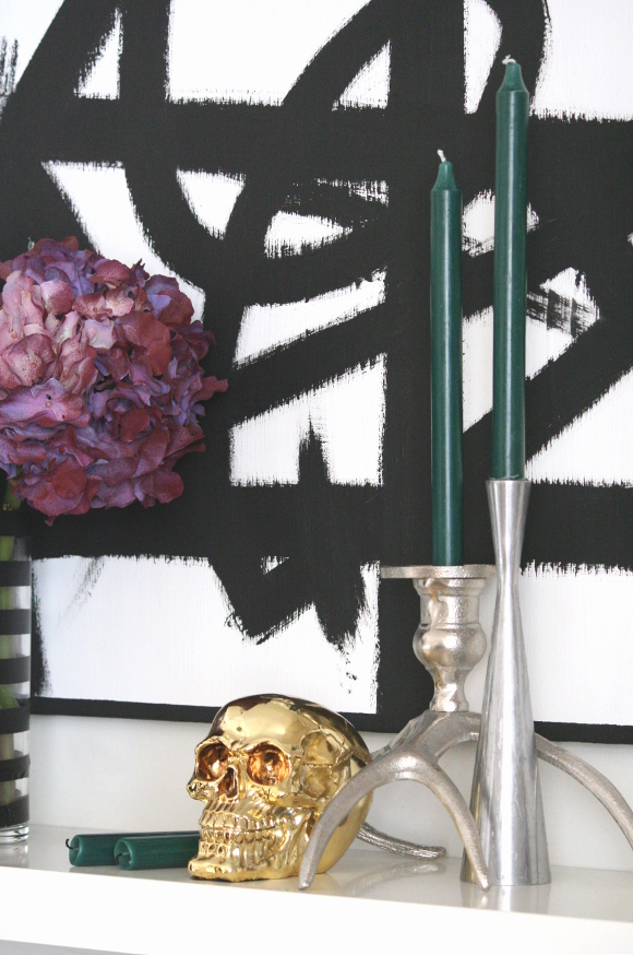
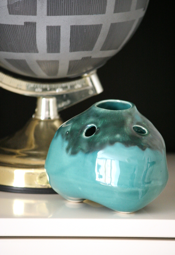
They pretty much sealed the deal. Last week while I was doing my lunch time charity shop route I spotted two particularly interesting gems. Both of which were within range of my new colour obsession. First I saw this Achill Pottery bud vase. I’d seen a few of them before in charity shops here and there, but never had I seen one in this colour. The bottom half is pushing it with the brightness factor, but I like the top half so it makes it okay. It’s a rather cute little wobbily vase with different sized holes in it for buds and off-cuts. 

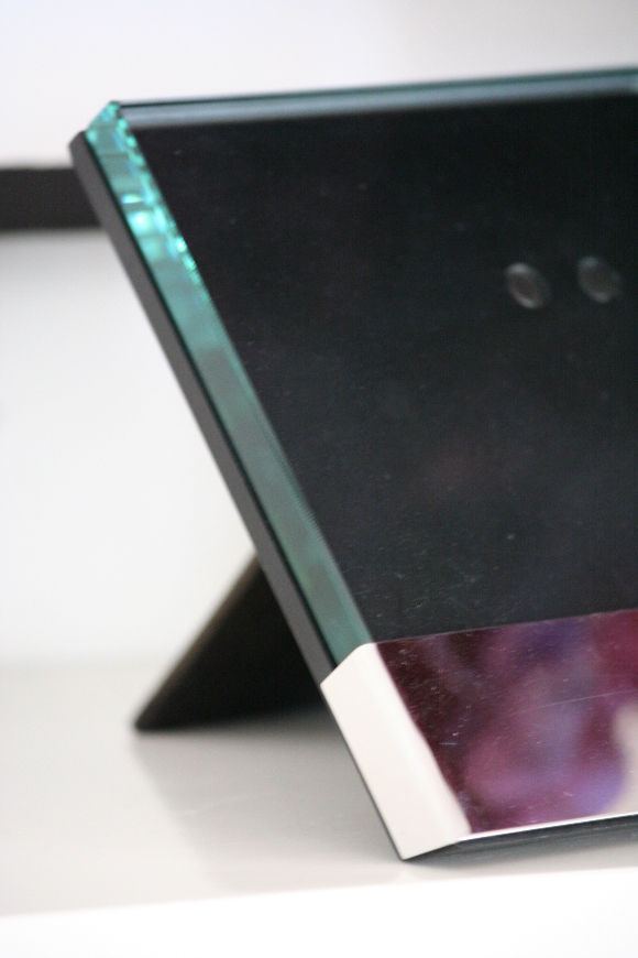
I then spotted this picture frame in the same charity shop. While I know it itself is not teal, the thick wedge of glass on it glints teal whenever I walk past it. I should say this frame was in a very sorry state in the shop. It had a massive old sticker across the glass, rendering it pretty severely gross. But I saw past the ugly. I steeped it in warm soapy water, and laughed a menacing manner at all those who disregarded it. 

CONFESSION: we have no photos in our home. Now that I think of it, ever since I moved out from my parent’s place close to 8 years ago, I haven’t had one photo printed and framed. Not even one from our wedding, which was almost 2 years ago. So I’m hoping that now I have this pretty little number, it might encourage me to get my ass in gear.
xx A

Paper and paint

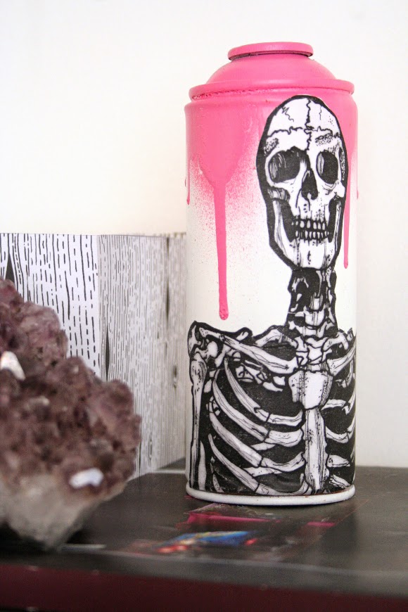
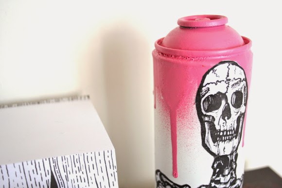
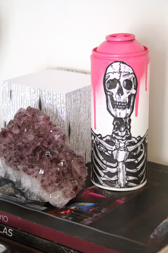
Have you ever had one of those moments where you see something that completely stops you in your tracks? As I was passing by White Lady Art on the way to my bus stop after work one day, what should I see in the window but this amaze-balls piece of urban art. It was a perfect combination of some of my favourite things – skulls, drippy spray paint, graffiti and my new affection for pink. I kinda had to have it. 

I went straight into the shop. There were loads more pieces of spray can art in the shop, all handmade by the intrinsically talented Irish designer, Eric Davys. His creative process is so beautiful and detailed. It reminded me so much of before I was into interior design and was heavily interested in becoming involved in either comic book artistry or special effects makeup. I’ve contemplated blogging my work from my previous life, but as it doesn’t really fit into design, I kinda don’t think it would be appropriate. But that’s a story for another day! We’ll see. 

For the moment, cansy, that’s what I like to call him, sits on our desk and beautifully matches and juxtaposes against my My Fair Lady print which hangs over our desk. I should have taken a photo of the two together, but I’m a bad blogger and didn’t think of it at the time. Shame on me. 

I did miss my bus that day when I spotted cansy, but it was so worth it.