Boy, oh boy

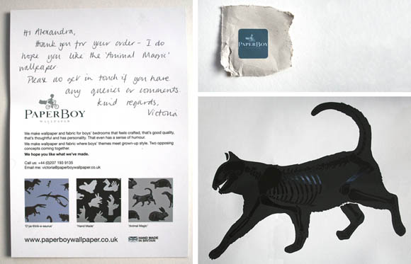
Last night I got my long awaited PaperBoy Wallpaper sample in the post. It’s kind of extremely awesome. I first stumbled upon the PaperBoy website at the beginning of this year, and just had to blog their ridiculously creative wallpaper. It was only recently I was able to order a sample, since my post code was being silly on the ordering page. But alas, persistence has paid off and I was greeted with an enormous sample when I came home. I found it difficult to get a good picture of the wallpaper myself {above}, so you can see a truly accurate image of the glossy bones below directly from their website
Plus, how awesome is it to receive a handwritten message directly from the designer Victoria? I am definitely ordering a pillow or two of this pattern in the near future. But for now I have a little framing project on the go for my living room that part of this would work perfect in. 
My original post about PaperBoy Wallpaper – “What little boys are made of“. 

Pretty shoes and tattoos

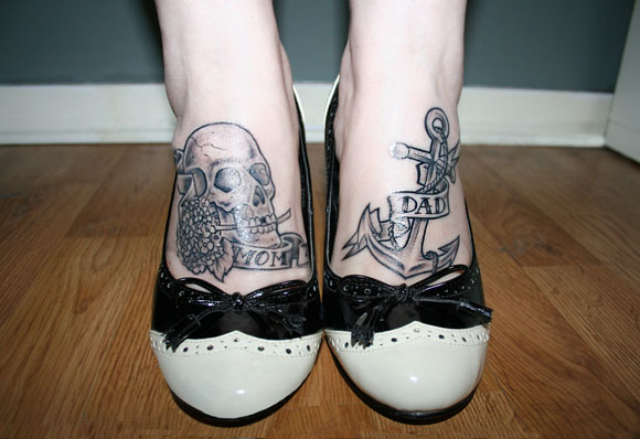
After months and months of sketching and careful consideration, I got two real tattoos, compared to my previous one.

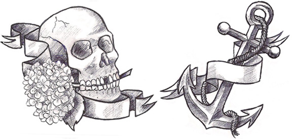
It took me months to finalize my drawings for my feet; I’ve always liked the idea of tattoos on feet. In my original design I had robins, poppies, knitting needles, wool, a set square, and sweet pea along with what you see above, but my drawings were way too packed. After a lot of humming and hawing I narrowed down my drawings to a skull, a hydrangea, and an anchor {my three favorite things}. I added some scrolls to add some flow, and threw in some mentions. There’s no direct connection between the objects and my parents. Just some stories, and that one is more feminine than the other.

Since I wear tights 99.3% of the year, my tats will only come out on special occasions. But in the end, how many people can say they’ve drawn their own tattoos? Old school tattoos at that.

Tattoo done by Neil at Dragon Tattoo

I want it now – milk crate table


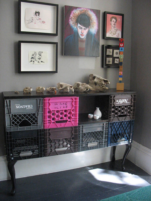
Something I’ve wanted for a long time is milk crate storage. I really enjoy strong juxtapositions in design, and this is a perfect example. Placed against clean walls and carefully placed items, I really love seeing {what some people would consider} grungy items placed with just as much care and consideration.
Thanks to Design Sponge for this image from Shaun Moore and Todd Caldwell’s home in Toronto, Canada. There are aspects of this house I wouldn’t mind Ctrl+C-ing directly into my own home.