
This isn’t going to seem like a big deal to most of you. I see so many pictures through social media of people’s colourful lives. And I really wish I could be so bold. For me, colours are a big deal. In the past, I’ve tried to introduce many colours into our home. But the truth is, it drove me IN.SANE. I hope that doesn’t sound rude? I’m well able to appreciate when people share they’re colourful homes and if anything, I’m jealous. But I just can’t do it. Call it DOCD – design obsessive compulsive disorder.
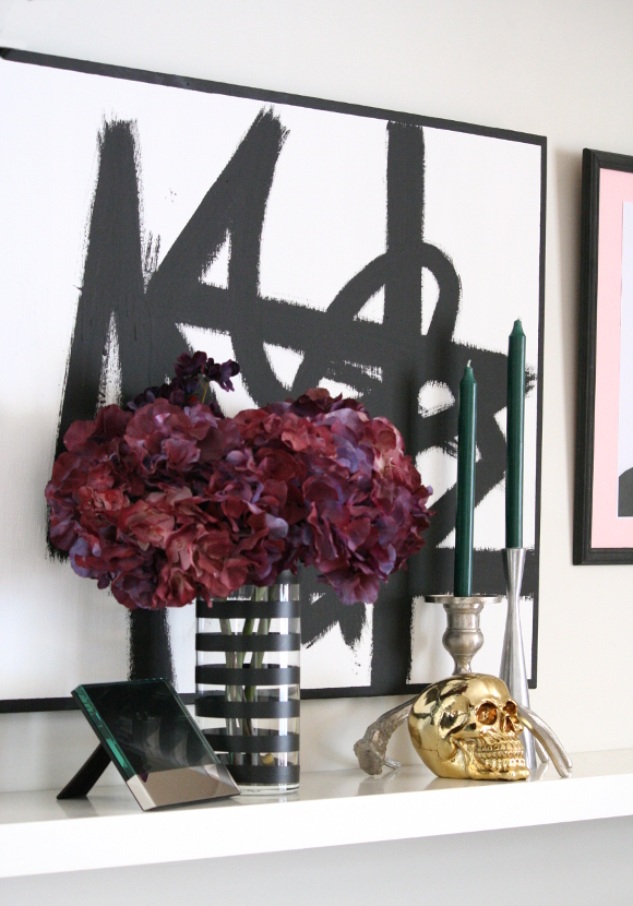

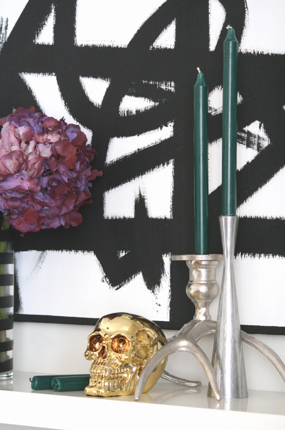
But that all changed a couple of weeks ago. It’s really lame, but it started with a hoodie my husband bought in H&M. It was a really dark teal. Oh. It was nice, and that freaked me out. But no, this isn’t a dark berry colour, so just no. But the more I thought about it this new hue, the more I realized it might actually go really well in our home. So I tested it out with an easily disposable item – candles. I headed to my local Tiger store and picked up two teal candles for €1.
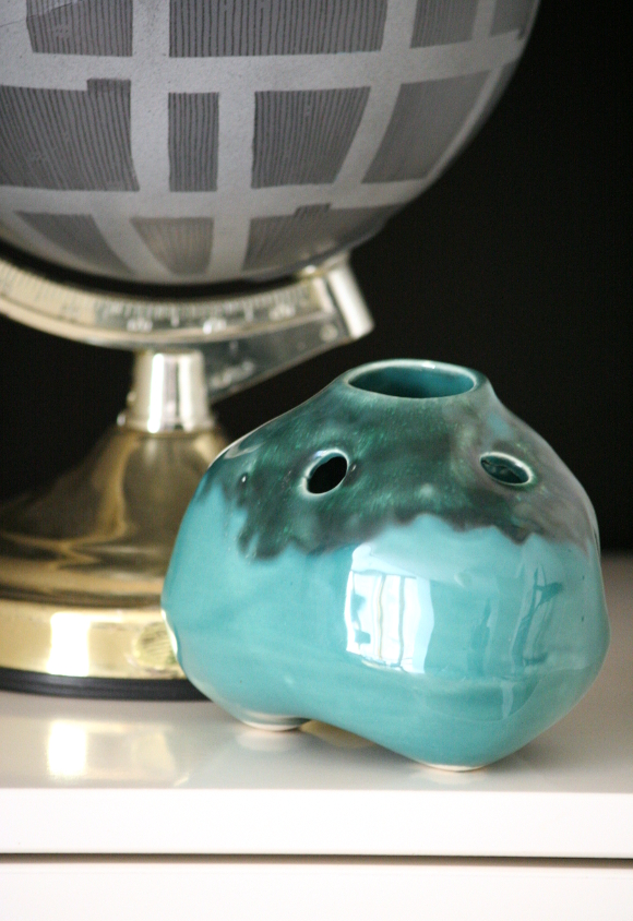
They pretty much sealed the deal. Last week while I was doing my lunch time charity shop route I spotted two particularly interesting gems. Both of which were within range of my new colour obsession. First I saw this Achill Pottery bud vase. I’d seen a few of them before in charity shops here and there, but never had I seen one in this colour. The bottom half is pushing it with the brightness factor, but I like the top half so it makes it okay. It’s a rather cute little wobbily vase with different sized holes in it for buds and off-cuts.
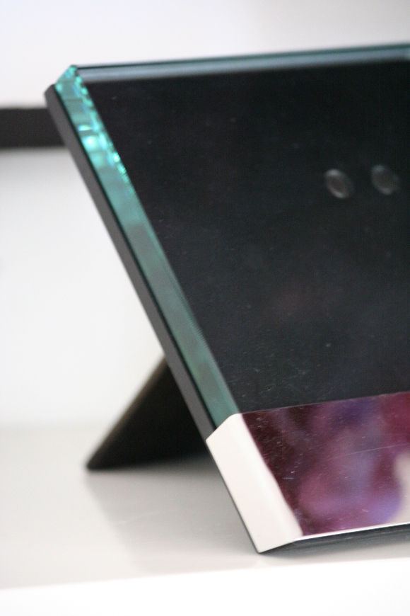
I then spotted this picture frame in the same charity shop. While I know it itself is not teal, the thick wedge of glass on it glints teal whenever I walk past it. I should say this frame was in a very sorry state in the shop. It had a massive old sticker across the glass, rendering it pretty severely gross. But I saw past the ugly. I steeped it in warm soapy water, and laughed a menacing manner at all those who disregarded it.

CONFESSION: we have no photos in our home. Now that I think of it, ever since I moved out from my parent’s place close to 8 years ago, I haven’t had one photo printed and framed. Not even one from our wedding, which was almost 2 years ago. So I’m hoping that now I have this pretty little number, it might encourage me to get my ass in gear.
xx A
Oooh yes! That's a gorgeous combination of colours! YES TO COLOUR!! Sorry that's cuz I'm a mentalist when it comes to colour. I've tried doing a really neutral palette once and I realised quite quickly it's so not me! lol I think you just have to find what you are happy to live with 😉 xxx
So true, Kimberly. I was the opposite in the past when trying to force loads of colour into our home. It just wasn't me. Still, I hope to one day have your balls when it comes to colour! MOAR COLOUR!
xx A
I did the same thing, tried to force color–but I'm just a neutrals girl. This is a really nice and subtle combination though, very nice.
Thanks Christina! And it's good to know I'm not the only one who has rebounded from colour. Not to mention, I'm glad you can see my blog pictures now o/
Oooh this is different! In my head you are berry/wine colours with black and white stripes!
I like this dark teal touch, though – it seems to work very well. Love everything about that third picture – it looks amazing! (And incidentally shows how gold and silver works perfectly together!)
You must deffo get a picture in that frame! Love how you've captured the picture with the purpley hydrangea reflected in the bottom, contrasting with the teal glint of the sides. Berry and dark teal – who knew?! I guess it makes sense – red and green are complimentary colours, and this is just twisting a bit of the colour wheel from a true red and true green. (Pardon my over-the-top analysis of you adding teal to your decor!)
Maria xx
Yes! It's so funny, I was thinking of our gold / silver combo convo when I was editing my photos. I used to think metallics were so one or the other, but now I hardly put any thought into it and they can mingle all they want.
As much as I like to think I'm the first person to have ever come up with a teal / berry combination, I suppose you're right with the whole colour-shmolour wheel stuff. You know how to cut to the core of me, M-Dogg.
xx