Behind the scenes – Nigel Slater’s kitchen

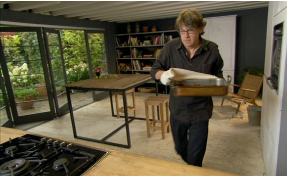
One of my most viewed posts to date is a blog post I wrote almost two years ago about Nigel Slater’s kitchen. It’s been a hit for good reason; because his kitchen is awesome. Beautiful charcoal hues, a strong presence of wood, clean lines and those bi-fold floor to ceiling windows. I still want and need all of that in my life.
It came as a complete shock when one day I got an e-mail from Rudi Thackray – the man and genius behind designing Nigel’s set. And for good measure, he also designed Lorraine Pascal’s Fast Fresh and Easy Food set, the Aquatics Centre Entrance for the 2012 London Olympics, Heston Blumenthal’s Perfection set and The Jonathan Ross Show set to name but a very small few. Um, woah. 

Rudi saw the hype on my site about his kitchen, and got in contact looking to share some inside info and crack the illusion behind the set. I couldn’t pass up the opportunity, so I built up some courage and asked if he had any sneaky behind-the-scenes stuff. He did.

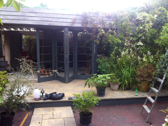
Just for you guys, here are a few exclusive behind the scenes pictures and a slight insight into Nigel’s kitchen …

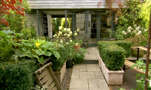
What looks like a relatively small set {in terms of TV shows}, contained within an existing back garden outside of London, Rudi and his team have us all fooled. In the picture above, you can see the step that carries through into the ‘garden’ below. 

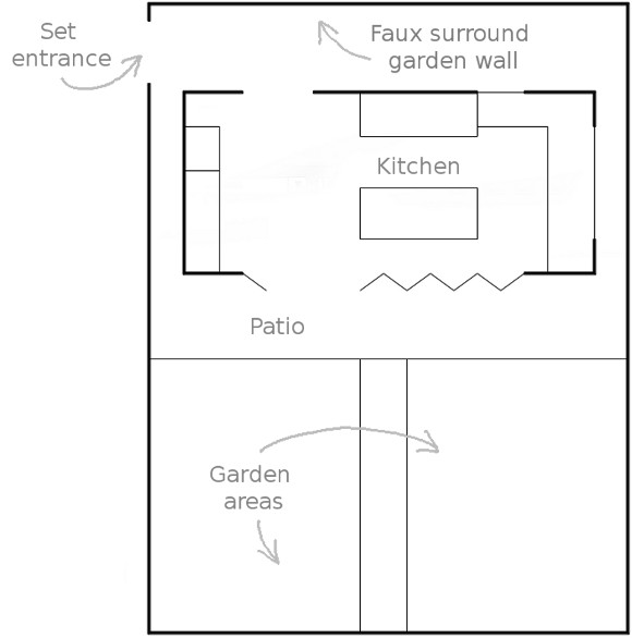
Below I did a mock-up of what I think to be roughly the layout of the set.  I took a stab and guessed the guy in the red shirt {in the 5th picture} was standing at the set entrance. From here, the rest is guess work and that the timber walls you see in the 4th and 5th picture are faux stone walls which you can see in the doorway of the 2nd picture. 
Here I was, utterly convinced such a place actually existed. I will forever attempt to figure out TV sets now. A massive thank you again to Rudi for sharing his exclusive pictures, and for anyone curious, you can check out my original post on Nigel’s kitchen here
xx A

New project – boudoir blanket*

It’s been a couple of months since I’ve worked with yarn. If too much time passes between pieces, I get a serious case of idle hands, so I had been on the lookout for a new project. I spotted this Tunisian crochet pattern a couple of weeks ago, and I was sold. I really liked the little square pattern it produced. Sign me up for all of that please.

I then YouTubed ‘Tunisian crochet pattern’ {as I can’t read patterns. I have to watch them}, and found this great tutorial by TheCrochetSide. There was however one thing that baffled me about Tunisian crochet – it has its own special massive crochet hook. And I mean massive. I had never heard of such witch craft, so I was immediately disheartened and thought I’d never find one. Luckily, I didn’t have far to look and Home Focus at Hickeys came to the rescue again … 

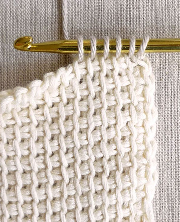
Those puppies are an eye-watering 14 inches long {that’s what she said}. Another interesting thing about Tunisian crochet is that it’s a cross between knitting and crochet – you have multiple loops/stitches on the hook at any given time {as seen in the first pic}. It sounds confusing, but it’s a simple pattern once you get the hang of it. 
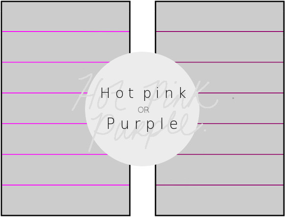
I then spotted this blanket on Pinterest, and knew it was perfect. It was such a simple pattern, and was just what I was looking for – a bedroom blanket. It would work perfectly with the Tunisian pattern. Except for one thing. I can’t decide on what colour the feature stripe should be. I did a little mock-up for you to feast your eyes on … 

#qp_main24294 .qp_btna:hover input {background:rgb(150,150,150)!important}

HOT PINK OR PURPLE STRIPE? VOTE HERE!
Hot pink stripe
Purple stripe

www.poll-maker.com

I need your ever-knowledgeable help guys. What do you think? Hot pink would be a break from the norm, but then again a dark purple / winegum colour stripe would be perfect … I’m so indecisive. Give me your brains. 

*Sorry. This isn’t a sexy, intricate or mysterious blanket. ‘Boudoir‘ blanket just sounded a lot better than ‘bedroom‘ blanket. 

Trials and tribulations

I really don’t like having my picture taken. Suck it in. Sit up straight. Shoulders back. How does my hair look? Open your eyes. Chin up. Higher. HIGHER. Can you see my rolls? Suck it in more. Oh god, did I draw my eyebrows on straight this morning? Hold your arms in a flattering way. Wait – let me fix my skirt. Shoulders up. No wait, shoulders down and back? My bra strap is falling down – will you be able to see that? I think there’s cat hair on my shirt. Oh, and don’t forget to smile. 
I have a very exciting project going on this week, but part of it requires me to submit a photo of myself. Oh … yay. 
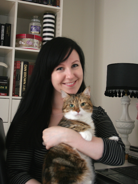
Last night I asked husband to take a photo of me, but god love him, he has the pulse of a bear so every photo came out really blurry and shaky. It breaks my heart because he tries so hard. So this morning I tried my hand at doing it myself. 38 photos later … 

It looks a bit like I’m auditioning to become a hand model, but I’ll settle with this pic. And because I like keeping it real, here’s how I took the photo … 
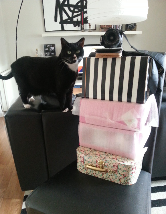
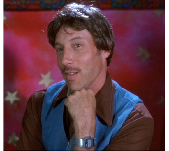
Unfortunately, no, I haven’t trained my cat to take portraits. I had to use a chair, 4 boxes and 7 coasters to prop up my camera. Each time I had to focus the camera, run over, sit down, *insert first paragraph here*, attempt a genuine smile, and all within 10 seconds before the timer went off. Then do that 30+ times. I felt a bit like this …
And for good measure, here is my favourite outtake. If it was in focus, I’d be submitting a crazy cat lady photo.  

Haha, that face. If only.