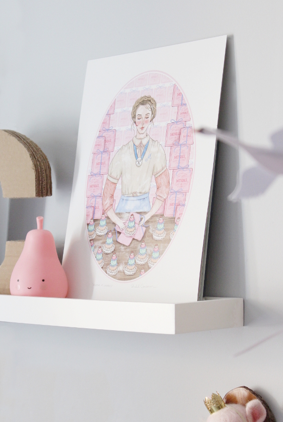
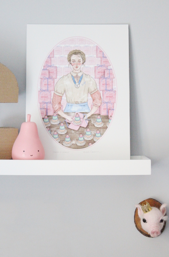
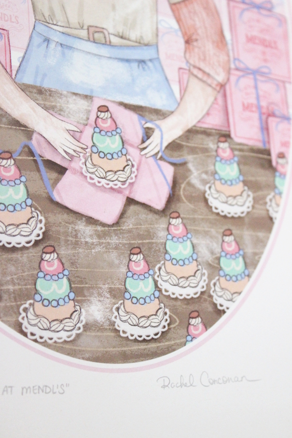
Agatha at Mendl’s by Rachel Corcoran from April & the Bear

When I was planning how to change our spare bedroom into a nursery, for the longest time I wanted to design Cora’s room with a Grand Budapest Hotel theme. I had chosen beautiful donut themed artwork, found handmade GBH room keys on Etsy, and even dreamed about Grand Budapest Hotel Pink walls, complete with paneling. The more I got into it, the more I realised it was a theme I should really only try when we have a home of our own because a lot of my ideas were not realistic as a renter. 

Fast forward to a few weeks ago and Siobhan from April and the Bear shared a new print they had in stock by Irish illustrator Rachel Corcoran of her Agatha at Mendl’s illustration and I immediately wanted it. I had just treated myself to their letter board so I was like, woah hold on just wait a minute before you buy something else, so I was waiting for a nondescript thing to happen so I could treat myself to some Agatha [am I the only one that does that? Waits for some kind of justification before buying something? Because I know it’s crazy, but I do it]. 

A week or so later I actually ended up winning a voucher from April and the Bear for sharing photos of our new letter board on Instagram (!!!), so I had thee perfect excuse to go back and get my hands on Agatha. Cora and I made our way to Cows Lane and we picked up the last print in stock [I’m sure they have loads still so don’t worry]. When we got home, I realised we don’t have any picture frames big enough for her, so I put Agatha on Cora’s top shelf out of harms [tiny, sticky fingered] reach. 

Rachel’s illustration perfectly captures Wes Anderson’s innocent whimsy. It is so beautiful and perfectly captures the movie. I don’t think I’ll ever get tired of its sweet details. Rachel also has two Gilmore Girl’s illustrations as well as a healthy choice of frightening female prints featuring the likes of Wednesday Addams, Lydia Deetz, Ripley from the Alien movies and Winifred Sanderson. All of which I now need and to further instill my it’s Halloween all year theme. 

Thank you again again again Siobhan for the voucher and for stocking such dangerously beautiful things in your store, and to Rachel for your mad skills. You have both stemmed my need for a GBH theme. Temporarily 😉

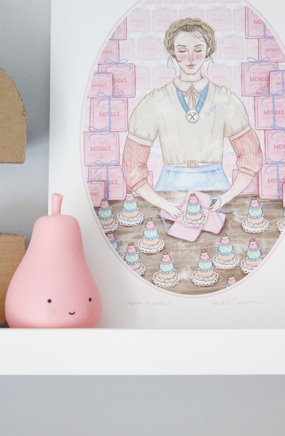
Also featured – cardboard monogramfaux taxidermyswan mobile

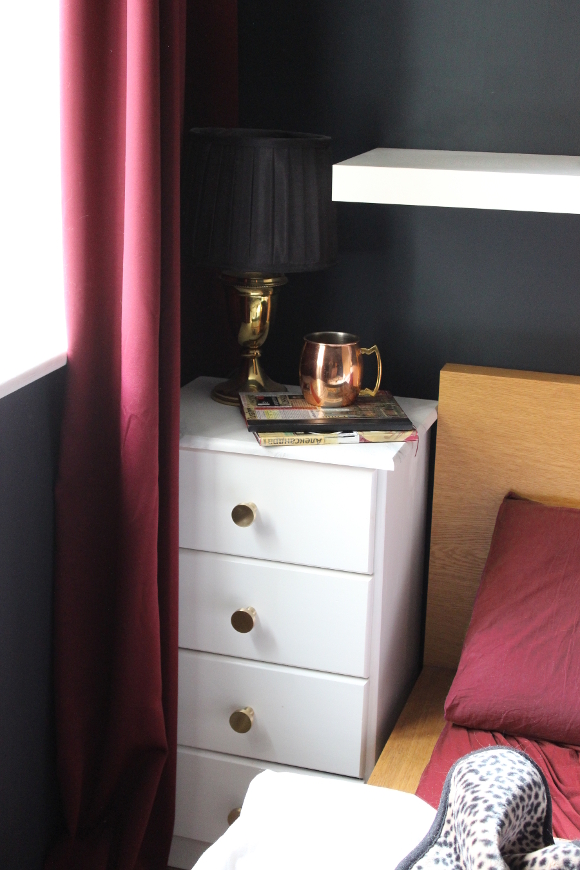
Our dark bedroom

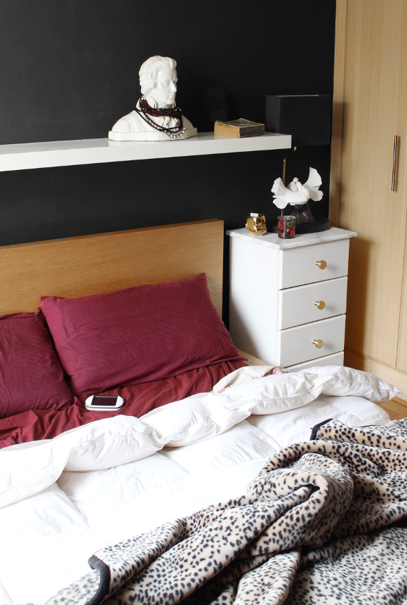
I’ve been waiting to show pictures of our bedroom until it was finished, but I’ve learned that a room is never really finished, and at the moment I have it looking as close to finished as a bedroom in a rented apartment can get. 
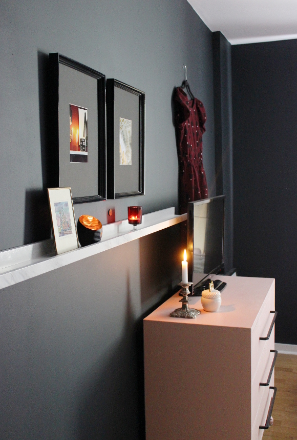
Do you remember last year when I picked paint for Cora’s nursery? Fleetwood Paints very generously offered for me to choose two tins of paint from their new range to add to our home. Along with picking Pantone’s Lunar Rock for Cora’s room, I selected a tin of their Vogue range’s very moody and deep 1830 Rue Chapal for our bedroom. Our room gets a very poor amount of natural light, so I figured painting our room even darker would add to it. It was a big step for me painting an entire room such a dark shade, but it was the best nesting-fuelled choice I made. 

Fleetwood’s Vogue paint, much like their Pantone line, has to be one of the best paints I’ve used to date. It took two coats to paint our room and still had loads left over for touch ups. Speaking of, one deal breaker for me that separates low quality and high quality paint is the touch-up test; if you touch up a patch of wall and it’s so obvious that it looks like you might as well have painted red arrows towards the now seething blotch, that’s how I can tell a paint is truly a good quality or not. With both Fleetwood’s Pantone and Vogue range you couldn’t tell where I had made touch ups the following day. For me, that’s a deal breaker because I will go out of my way and repaint a wall just to avoid a haggard touch up blotch. But it wasn’t necessary [TG] with this paint. 

I painted our room in 1830 Rue Chapal the night before I was due to be induced [in hindsight, not a great idea], but once we had our new dark room, I thought about a theme I’ve long wanted to design with. 
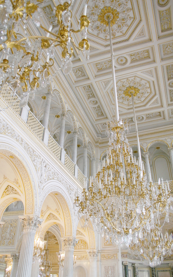
I’ve had a long fascination with Russian history, its architecture and the [dare I say] dark, romantic, luxe feeling that comes with it [recent news and political stuff aside of course] …

– My best friend and I were fascinated with Russian history when we were in high school.
– I taught myself [basic conversation] Russian 13 years ago and the first conversation Robert and I had when we first met was me teaching him how to say hello in Russian – здравствуйте [zdra-stvooee-tyay]
– The happy coincidence behind the Russian watercolour my mom bought me. 
– At our wedding I found out from my grandmother’s sister that my grandmother always had a fascination with Russia and always wanted to go. Something I never knew. It particularly blew my mind as we were going to Russia for our honeymoon a few days after our wedding [we visited again two years later].
– My dad’s first name is Russian and so is mine [Alexandra]. My grandmother’s fascination with Russia may have had a part in my dad’s name [and maybe mine?], but that’s just a guess. 

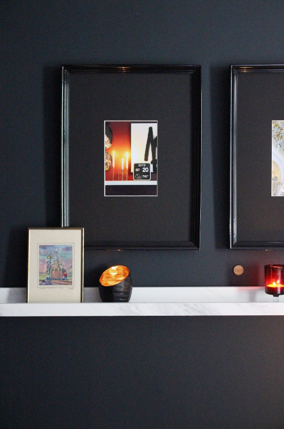
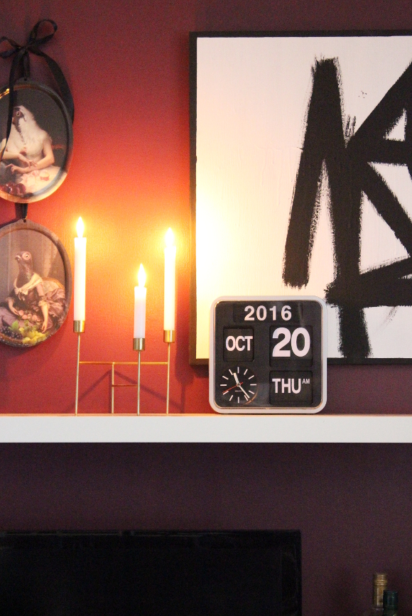
I took my theme and adding a few things from our travels. I printed one of my favourite photos I took when we were on our honeymoon in St. Petersburg as well as a photo I took of our Karlsson flip clock of the time and date of Cora’s birth, and framed them side by side. The frames I used are a now discontinued frame from IKEA which I love the look of, but there was plastic in the frame in stead of glass, which never sat flat in the frame and always looked warped, so I took out the protective pieces of plastic. It made for better photo taking too. 

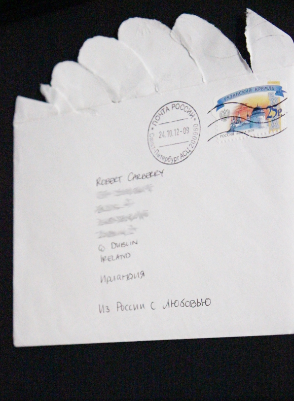
I also framed a letter I sent home to Robert while he was in the shower one morning on our honeymoon. I sent it along with all our thank you cards after the wedding из России с любовью – from Russia with love. A very small detail, but something so many people bring up when they see us. James Bond or wha. 
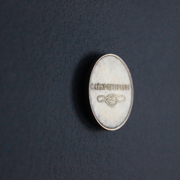
It’s illegal to take Russian currency outside of Russia, but I was able to sneak two metro tokens home in my change purse. One of which I’ve stuck up on our wall with blu tac. 

Our room doesn’t look truly finished and it’s not perfect nor does it have essential flower arrangements to top it off, but this is what it looks like for now. For anyone out there thinking about going dark with their bedroom, I would say don’t walk but run to your nearest paint store. Come over to the dark side.

Master bedroom makeover Part IPart IIPart III – Reveal[?]

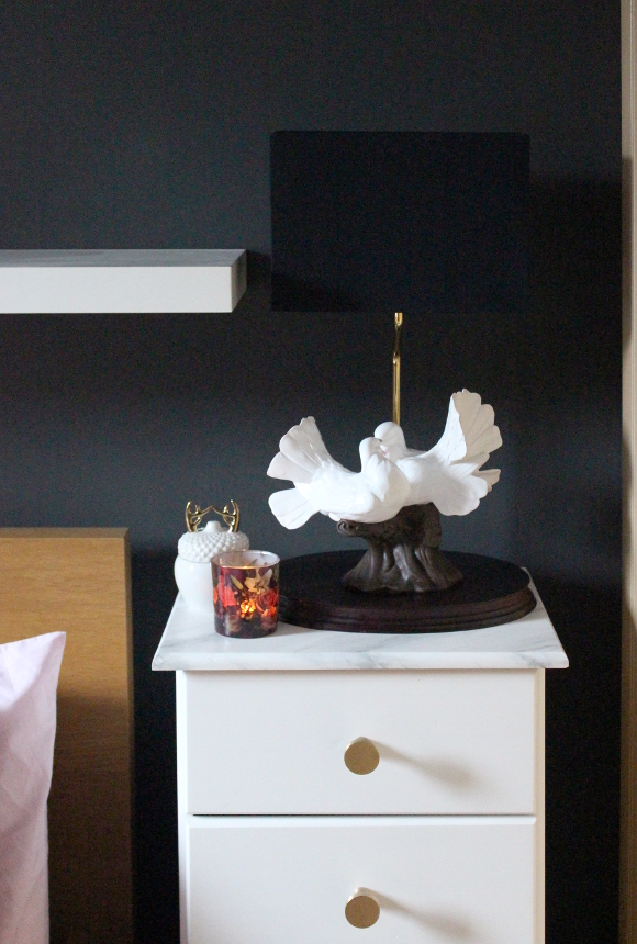
Also featured – pink dresser updatefaux marble bedside tablesour engagement storylove dove lampsmall watercolour

DISCLOSURE – while this blog post is not sponsored, I did receive this paint free of charge from Fleetwood via MRCB. I only work with brands and companies that I like and of course, think you will too. Thank you for supporting the companies that support The Interior DIYer. 

Amara Interior Blog Awards – Best DIY & Home Blog nominee

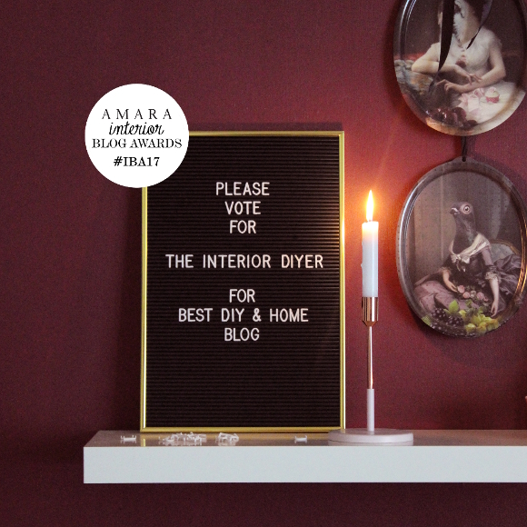
For the third year in a row, THE INTERIOR DIYER has been nominated for an Amara Interior Blog Award. This year I’ve been nominated for Best DIY & Home Improvement Blog which I’m pretty excited about as it’s a new name to my [let’s be honest] favourite category.  

I’m not getting any better at asking people to vote for me, so I’ll keep this short and sweet. If you’d like to vote for THE INTERIOR DIYER, please do by casting your vote by clicking the below …

I of course encourage you to check out the other nominees in not only my own category, but all the categories as there are some incredibly talented bloggers out there. 
Thank you if you voted for me, and if you didn’t vote for me, I’m very okay with that too [I’m probably not supposed to say that, but it’s true].