I’ve been putting a phenomenal amount of pressure on myself to do and make new projects for our first Christmas in Canada as a little family. Reality, however, always has different plans. The reality is that we moved into our apartment less than 2 months ago and there is SO MUCH I didn’t realise would be involved with starting from scratch with everything. I’m working on cutting myself some slack [and will be trying my best to actually relax over the holidays], but I still wanted to spread some Christmas cheer, so today I’m sharing a roundup of my favourite Christmas projects. And luckily, 50% of them are edible [my kind of project].
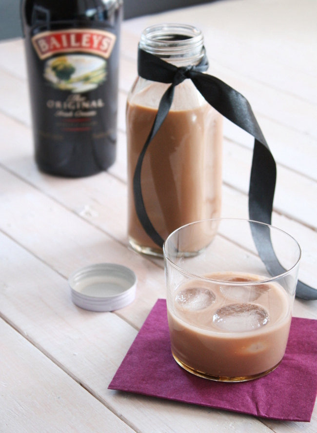
VEGAN BAILEYS – I made this recipe two years ago for Sadhbh of Where Wishes Come From’s Christmas Craft Advent. I promise this recipe legit tastes like Baileys. It was sooo good. But if the whole vegan thing isn’t your thing, two years previous to that I published my Nannie’s Knock-Off Baileys recipe.
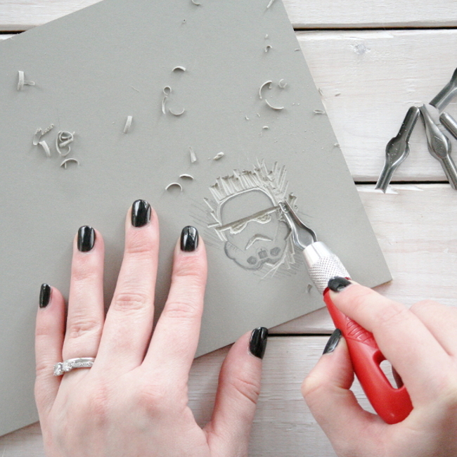
STORMTROOPER STAMP TUTORIAL / STORMTROOPER WRAPPING PAPER – a really fun project I made for Wayfair a few years ago combining Star Wars and my affinity for wrapping paper. You could very easily use this stamp tutorial to make a stamp to create a wallpaper effect!
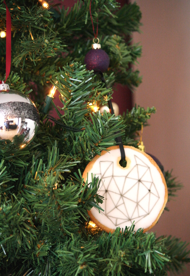
EDIBLE ORNAMENTS – another one of my favourite Christmas projects that I was hoping to recreate this year but never got around to it. I’ve made these zesty lemon Christmas ornaments a few times and they do not disappoint. They’re very easy to make and even more fun to eat straight off the tree.
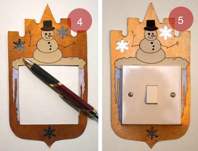
SEASONAL SWITCH PLATES – this is an oooooold project [as noted by my photography ‘skills’], but making these seasonal light switch surrounds were one of my favourite projects years and years ago. I can’t wait for them to arrive in our container. Actually, I might have to make more to suit Canadian light switches as they’re a different shape … ANY EXCUSE RLY.
Those are my strictly Christmassy projects, but if you’d like to see all my DIYs, just check out my DIY tab. Merry Christmas / bottoms up!
New project – entertainment room makeover
A few weeks ago VELUX contacted me about collaborating on a blog post. Like with any posts I work on with a company, I wait to see if a project will arise for me to include them in something I’m working on. A few weeks passed and our patience paid off when Camilla, a long time reader, got in contact with me about updating her entertainment room. And would you believe, she had two VELUX skylights that were a key part of the brief. Perfect!
I visited Camilla’s house two weeks ago to talk with her and her fiance Wayne about what they were looking for. They weren’t looking to undergo a huge change; a few updates to turn the current bright space into a cosy entertainment room. Both Wayne and Camilla are homebodies, so it’s a room that will get a lot of use. They’ve ordered a projector for the room, but in order to be able to use it, they need to install blackout blinds to their two existing VELUX skylights [which is a pretty vital part of the design, and segues nicely into our collaboration!].
In keeping with darkening the entertainment room, they were considering going dark with the design and I actually managed to convince them to go nearly-black on the walls [like in our bedroom]. I assured them that with the right accessories and accent pieces, a dark room won’t seem as overwhelming as they may think. It’s a room that gets a lot of sun during the day thanks to the skylights, but with the press of a button, the room can be transformed into a cosy Netflix snug thanks to electronic blackout blinds.
We talked about their design likes and dislikes, textures and finishes they preferred, and even about the more abstract things they like. I went away, compiled an entertainment room mock-up with lots of dark green, wood and hints of dusty pink and [to my very nervous surprise] they loved what I came back with …
Products clockwise from top [then spiraling inward] …
– Blackout blinds from VELUX
– 1830 Rue Chapal nearly-black paint from Fleetwood
– 4 seater VIMLE sofa from IKEA
– Dusty rose velvet cushion from Dust
– Gold printed fern leaves cushion from Harvey Norman
– Green vintage rug – still on the hunt for one!
– Bonsai tree from IKEA
– Rose gold and dusty pink candle sticks from Article
Both Camilla and Wayne like unexpected twists in design [a couple after my own heart], so after sneakily learning about their favourite movies and TV series, I found some Labyrinth and Rick and Morty themed parody prints that at first glance give a strong level of sophistication to the room. They like mid-century modern, natural and nature inspired fabrics and finishes, as well as a hint of gold. It’ll be a few weeks before we can start updating the room and ordering products, but once the work does start, I don’t see it taking long to finish. I particularly can’t wait to live vicariously through their purchasing the likes of that green couch. Anybody? No? Just me? I’m fine with that.
DISCLOSURE – this is a sponsored blog post from VELUX. As always, all words and opinions are my own. I only work with companies I like and of course, think that you will too. Thank you for supporting the companies that support The Interior DIYer.
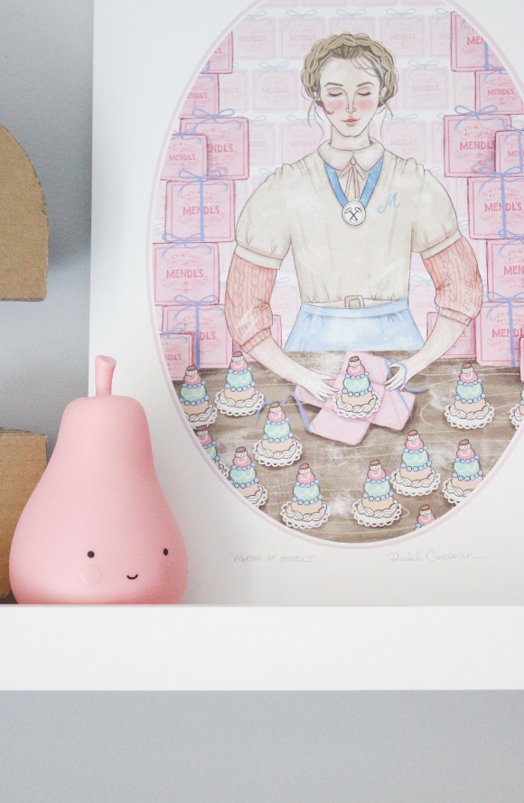
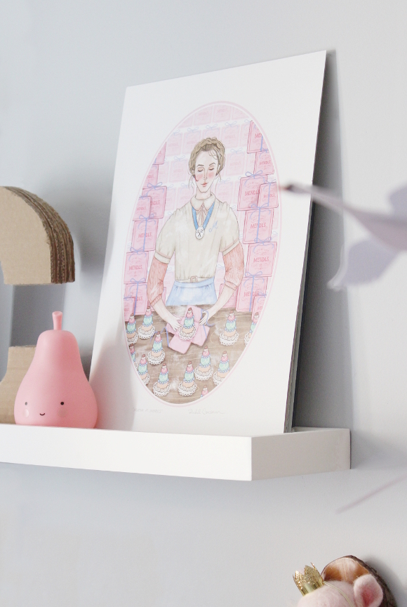
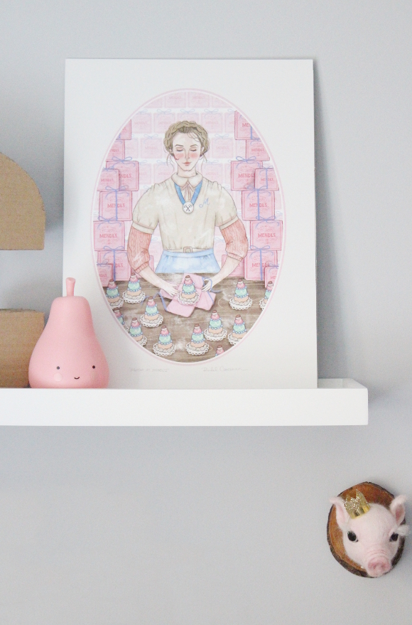
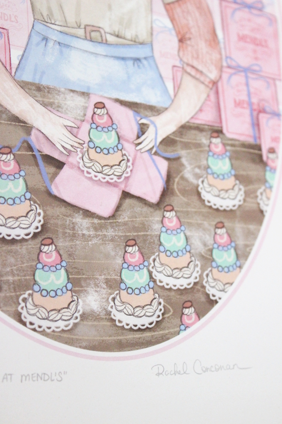
Agatha at Mendl’s by Rachel Corcoran from April & the Bear
When I was planning how to change our spare bedroom into a nursery, for the longest time I wanted to design Cora’s room with a Grand Budapest Hotel theme. I had chosen beautiful donut themed artwork, found handmade GBH room keys on Etsy, and even dreamed about Grand Budapest Hotel Pink walls, complete with paneling. The more I got into it, the more I realised it was a theme I should really only try when we have a home of our own because a lot of my ideas were not realistic as a renter.
Fast forward to a few weeks ago and Siobhan from April and the Bear shared a new print they had in stock by Irish illustrator Rachel Corcoran of her Agatha at Mendl’s illustration and I immediately wanted it. I had just treated myself to their letter board so I was like, woah hold on just wait a minute before you buy something else, so I was waiting for a nondescript thing to happen so I could treat myself to some Agatha [am I the only one that does that? Waits for some kind of justification before buying something? Because I know it’s crazy, but I do it].
A week or so later I actually ended up winning a voucher from April and the Bear for sharing photos of our new letter board on Instagram (!!!), so I had thee perfect excuse to go back and get my hands on Agatha. Cora and I made our way to Cows Lane and we picked up the last print in stock [I’m sure they have loads still so don’t worry]. When we got home, I realised we don’t have any picture frames big enough for her, so I put Agatha on Cora’s top shelf out of harms [tiny, sticky fingered] reach.
Rachel’s illustration perfectly captures Wes Anderson’s innocent whimsy. It is so beautiful and perfectly captures the movie. I don’t think I’ll ever get tired of its sweet details. Rachel also has two Gilmore Girl’s illustrations as well as a healthy choice of frightening female prints featuring the likes of Wednesday Addams, Lydia Deetz, Ripley from the Alien movies and Winifred Sanderson. All of which I now need and to further instill my it’s Halloween all year theme.
Thank you again again again Siobhan for the voucher and for stocking such dangerously beautiful things in your store, and to Rachel for your mad skills. You have both stemmed my need for a GBH theme. Temporarily 😉
- 1
- 2
- 3
- 4
- …
- 17
- Older Posts

