Mahogany mirror hallway update

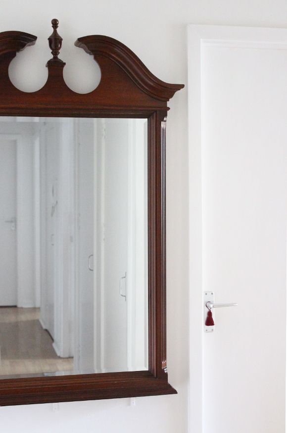
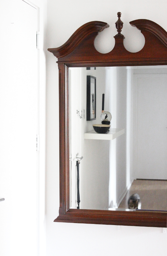
About a year and a half ago my parents gave us their mahogany mirror for safe keeping. Unfortunately, it went to waste for a long time and sat wrapped in the corner of our bedroom [as seen in this blog post] that is, until last week!

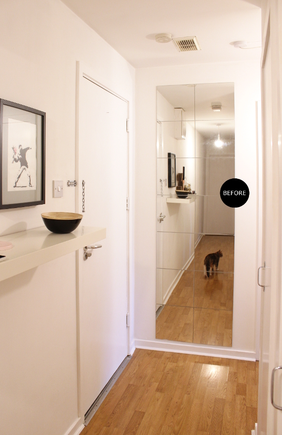
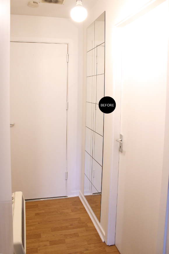
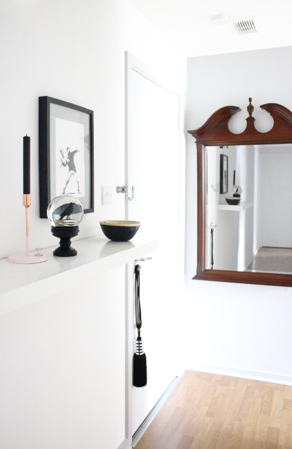
I had every intention to hang up said beautiful mirror, but I wasn’t sure exactly where to hang it. For a long time I thought about hanging it in our room, but I wasn’t 100% certain so it continued to sit. It finally dawned on me to hang it at the end of our hallway behind the front door. It was the perfect space for it! Long before we moved in our landlord stuck a cluster of IKEA mirrors to the wall behind the front door. They definitely were a functional addition to the hallway, but their charm had well and truly warn off in recent years. At the very least, they were impossible to keep clean.

It’s not too noticeable from this photo, but not all the mirrors were flush [to be honest, as we found out when hanging the mahogany mirror, the wall itself is not flat]. If you were standing in the hallway trying to use the collective cluster of mirrors to inspect your outfit, your knees may be left entirely out of the equation thanks to the different angles of the mirrors. There were many blind spots and some of the mirrors tilted outwards vertically leading you to believe you were wider than you actually were. Not something anyone, let along a pregnant woman, wants to see. You can kind of see this effect on the mirror Juniper appears on. 

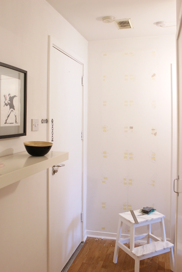
Using a metal ruler, I carefully removed the mirrors by filleting the ruler behind each mirror and scraped the sticky pads off of the back of each mirror, one at a time. I sanded the leftover sticky marks and applied about 4 – 5 even coats of paint to the entire wall [those yellow marks proved tricky to hide]. I carefully stored each mirror on top of the wardrobe in the spare bedroom and will put them back in place when we eventually move out. 

Dad DIYer, along with help from Robert, hung the mirror last week and it has made such a HUGE change to our hallway. We’re no longer warped-looking when checking out our outfits and it’s such a welcome and more put-together addition to our hallway. Also, mahogany. When we grow up and have a real house ALL OF THE THINGS will be mahogany. 

Little living room updates – cast your vote

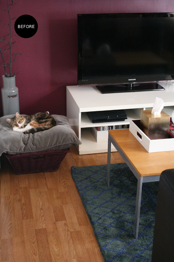
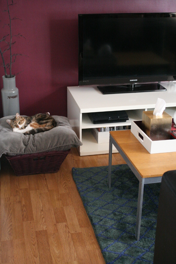
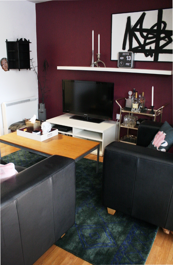
Back in November while I was editing the photos I took of our new rug, the first picture I included in that post kind of made me uneasy. It was all the colours. And that end of the living room. It didn’t really work anymore. There was too much burgundy, there was too much wood that didn’t match and the rug made it more obvious. It all looked too thrown together and nothing worked. 

Since we’re renting our apartment and are stuck with our landlords furniture [I wish I could burn it to the ground and start over trade it in for more comfortable and practical pieces], I’m forever hitting road blocks in our own home. Of the many pieces of furniture, our landlord’s coffee table has been driving me up the wall. It’s not the same colour as the ‘wood’ floors and it’s quite distressed thanks to previous tenants. And I don’t mean the good kind of distressed that’s trendy. The bad kind. 

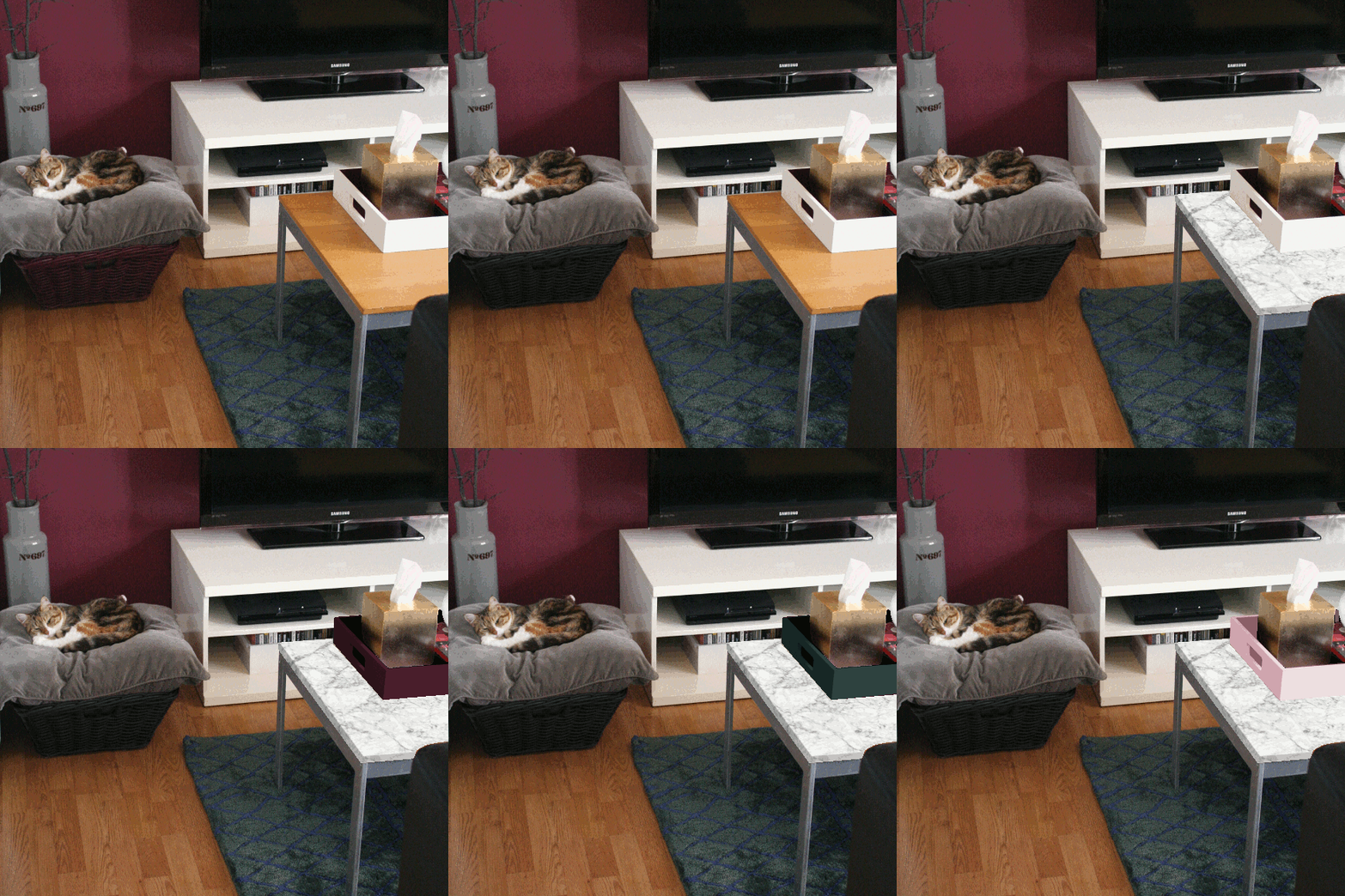
When Kimberly updated her vanity and then Linda updated her kitchen counters, both ingeniously using faux marble contact paper to do so, I filed that nicely in my brain [even check out my comment on Kimberly’s post. Ha!]. Contact paper is beyond perfect because when we move out, I’ll simply peel it off and it’ll be immediately reversible. As with most things I’m a bit unsure of, I did a mock up to help me make up my mind. I edited the cat basket to black, slapped some faux marble on the coffee table, and as anyone who has updated their home will know, the design domino effect came into play so the tray on our coffee table got edited too. Many times. 

Here’s what the above GIF is showing, frame by frame …
1. Original living room as it is now
2. Cat basket edited black 
3. Coffee table marble-ised
4. Tray edited black 
5. Tray edited burgundy
6. Tray edited viridian
7. Tray edited pink [for the hell of it]
And to think, this was all done without disturbing Juniper in the slightest.

Here’s where I need your help. Genuinely. Tell me what you think. Marble? Yes or no? A solid colour coffee table instead? And what colour tray should I go with? Or just leave it all alone? Srsly. I’ll be thinking about this one for a while, but a change is defo going to happen. At the moment I’m going for the black basket + marbled table + black tray. But nothing’s set in stone. Or faux marble. 

It really tied the room together

Me and rugs don’t have had a great history. First, there was the ethereal IKEA Stockholm rug I lusted after for so long. Being in a high traffic area and having two cats meant the rug went downhill rather spectacularly fast so I repaired it and sold it as it was not a rug suitable for our home [the rug was definitely the issue, Dude].
Then there was the dainty pink rug. I got it cheap. Real cheap. Second hand. From an online site where you advertise stuff you want to sell. Especially dirt cheap if you want to get rid of it fast. Yes, it was a bit small for our space, but it was cute! At first. Then it gave up on life and fell apart. It was cheap. I learned from my mistake. That rug went straight into the bin as it would have been of benefit to no one.

With the most excellent of timing, Wayfair.co.uk got in contact to work on another project this year [I worked with them last year on my lumberjack pillow tutorial that was featured in my broseph’s Canadian man cave office]. In return for my upcoming tutorial, I got to shop on the Wayfair.co.uk site and low and behold, their rug range is immense. 

Since I already have a lot of burgundy in our apartment and I’ve had a [failed] black and white rug, I wanted to go for something different yet would work with our apartment. I spied the Fusion Green Rug and thought about it for a couple of weeks. It was an incredible green with an imperfect navy pattern on it. It was a bit of a leap as I wasn’t sure exactly what colour it would be sans a sample, but my fingers were crossed on a deep viridian. It arrived yesterday, and boy did I luck out …

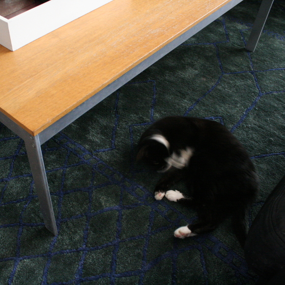
I am not just saying this because I am now the proud owner of it, but it’s an exquisite rug. It’s painfully luxurious and soft under foot. It’s also a very solid rug so it won’t warp like the IKEA Stockholm rug did. It passed the cat test and doesn’t shed or pull or distort like our disaster of a pink rug either. MASSIVE. SIGH. OF. RELIEF. I’m still up in the air as to flipping the rug 90 degrees so it’s running the other direction, but for now, it’ll more than do. 

Disclosure – Wayfair.co.uk sent me this rug free of charge in return for an upcoming project I’m working on for them [keep your eyes peeled as it’s a good one and involves a certain new movie being released next month!]. As always, all words and opinions are my own. I only work with companies I like and of course, think that you will too. Thank you for supporting the companies that support The Interior DIYer.