The man with no manager

I don’t even remember how I heard about it, but at the end of March husband and I attended the Bill Murray: Chasing the White Whale OFFSET Exhibit. We’re both pretty huge Murray fans so we were excited to go. And as it happens, so were about a thousand other people. Rightly so. The event was held in The Library Project and housed prints of all shapes and styles from talented designers and artists, all of which of course were paying homage to Mr. Murray. 

During the exhibit, I spotted Sean Cummins‘ piece Lost in Tranglation. I loved everything about it. Its geometric structure and composition and form and stuff. It really captured Bill’s nonchalant attitude, but he also looked happy in it {some of the prints were a bit scary. Is that rude? I don’t mean it to be. But a small few were}. 

There were also Murray masks going around and I couldn’t resist picking one up for myself. It’s currently hanging up in our living room, but I’m waiting for an opportune moment to scare husband with it. I’m not sure how just yet. 

Sean’s print is originally in multiple shades of blue. I asked if it were possible to get a copy of the print in grey-scale. I know, that’s a pretty cheeky thing to ask for, but when I went to collect the print last week, there it was with the original copy. I’m really glad I got both the original blue as well as a grey scale copy, because you never know, one day soon I may redo the living room around blue. 

I reused an old charity shop frame I had and backed the print with some pink paper that was laying around. I think Bill pulls it off well. Down came the plummy painting {I was feeling a bit meh about it anyways}, and up went Bill. He now takes pride of place above our TV and is a pretty stellar addition to our living room. 
Thank you Sean, and your incredible work.

UPDATE: you too can order Sean’s Bill Murray print for your own home! Yay!

Bolder shelves on a budget

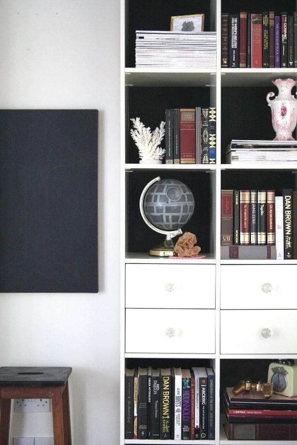
A couple of weeks months ago I shared a snippet of the changes I was making to our monstrous living room shelves. I started to make changes just after we took down our Christmas decorations at the beginning of the year. I really think monumental changes in our home go hand in hand with the new year – starting over and putting away all the Christmas decorations really encourages me to make changes. 

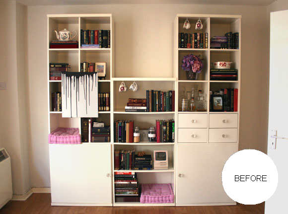
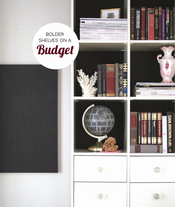
This year I really wanted to work on making our living room shelves sleeker and bolder. They’re large, cumbersome shelves that take up one end of our living room. For a long time, our shelves looked like this – 

And before that? Yeesh. Not to mention my previous photography ‘skills’. MINE EYES. So, it was time for a change.

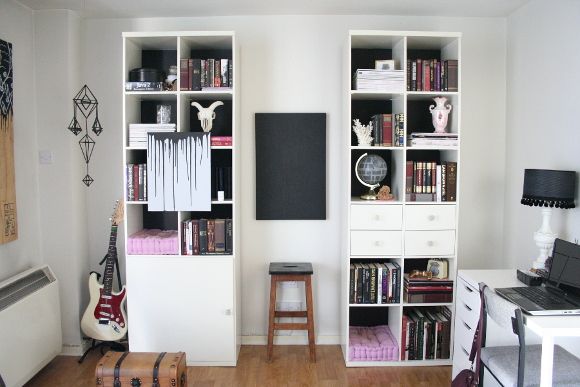
I wanted to make a bold statement, but because these shelves belong to our landlord, it had to be a statement that could be easily undone. And let’s face it, done as cheaply as possible. I loved the look of black-backed shelves, so I thought, hey – black construction paper. A perfect way to update our shelves! I bought two A2 pieces of black paper {for under €5 total}, and got cutting.

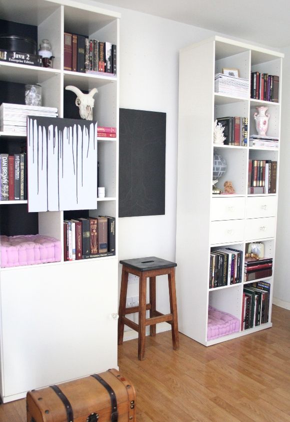
TIP – rearrange and style your shelves before adding paper to the back of them. Once I was happy with what was in each cubby, I added the necessary amount of paper to the back. For example, the top right cubbies on each shelf had tall books, so I only needed to tape paper to the top half of the back of that shelf. The same with the cat cubbies. Very few shelves had paper on the entire back of the cubby.
I also took my sweet-ass time rearranging our shelves. It’s April and I started this project in February. I didn’t want to do a sloppy, rushed job on it, and I wanted each shelf to look minted. I put lots of thought into balancing and contrasting the shelves and some quite severe downsizing {for some tips on decluttering, you can check out my blog post and top tips here}. 

The biggest change I made to our shelves was removing the middle section. And it took a long time for me to make that decision. Those middle shelves drove me insane. It was impossible to style them and they caused a lot of heartache. So one Sunday when I was doing some serious spring decluttering, I just pulled that section of shelves out and immediately fell in love with our living room all over again. I know, a bit too gushy and overenthusiastic for a Monday, but it really changed the feel of our living room.
Not to toot my own horn, but I’m really over the moon with how our shelves turned out. And of course, stay tuned to see where those middle shelves went! They really look top drawer in their new home. xx A

Delightfully vile

There’s nothing I love more than a good four letter word. If you’ve ever spent more than 10 minutes with me, you’ll quickly find out the extent to how many four letter words I like. But for the sake of remaining lady-like in today’s post, I’ll refrain from listing off my favourite ones. 

One of my favourite bloggers is Anna Dorfman of Door Sixteen. She has been a huge source of inspiration for me over the years, has influenced my style and encouraged me to make our home sleeker, simpler and bolder. If you haven’t already checked out her site, you better get on it. 

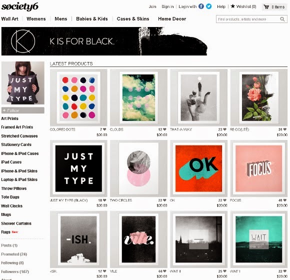
In recent months, Anna opened her own society6 shop, K is for Black. It’s full of all kinds of amazing designs. One thing I think is very nifty about society6 is that each graphic {as seen above} is available as a print, mug, canvas, rug, iPhone case, pillow, canvas bag, you name it. I had my eye on Anna’s vile collection for some time, specifically in pillow form, but, shipping. Living in Ireland always means shipping makes me make an ugly crying face. 

But not all was lost. One day Anna tweeted that her society6 shop had reduced prices {from $20 to $15}, AND free worldwide shipping {which is still happening!}. So I ordered the vile pillow case, it arrived, I tore open all of the packaging, and it now sits with pride of place in our living room. A perfect punch of black, white, and a paint smear of baby pink {let’s face it, I tend to like messy paint. Have you seen my website header?} for our living room. It’s lovely. 
Let’s pretend the below picture is a lot nicer than it actually is. It does zero justice to new pilly-willow.