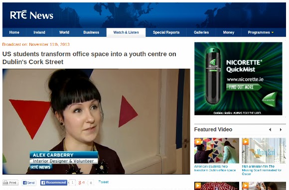
Yesterday was the grand opening of the Localise youth room in Sophia House, and to say it was an incredibly exciting day would have been an absolute understatement.
To give you a bit of background on the project, at the beginning of October Emily approached me about doing a project with Derek O’Cleary, the director of the local charity Localise, for a youth room in Sophia House. Sophia House provide accommodation and opportunities for families who would otherwise be homeless. Sophia House had some unused office space on their premises which they wanted transformed into a safe, positive and warm environment for the residential teens. They currently had facilities for younger kids, so it was important that the teens also had somewhere to call their own at this crucial age, in the hopes of stopping them from turning to the surrounding rough streets.
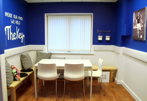
We met with the teens and took note of what they wanted from the space. They wanted a homework area, somewhere to watch TV and movies, and a space to play games. With a timeline of 6 weeks to get the space from drab to fab {sorry}, it was a bit of a sprint as Derek and I drove around Dublin to get everything done and crossed off the list. Most of the assembly and painting went down on the 9th of October thanks to the incredible student volunteers from Notre Dame University who were here as part of their study abroad program. I would literally still be standing on a ladder painting if it wasn’t for their help {again, HUGE thank you guys if you’re reading this!}.
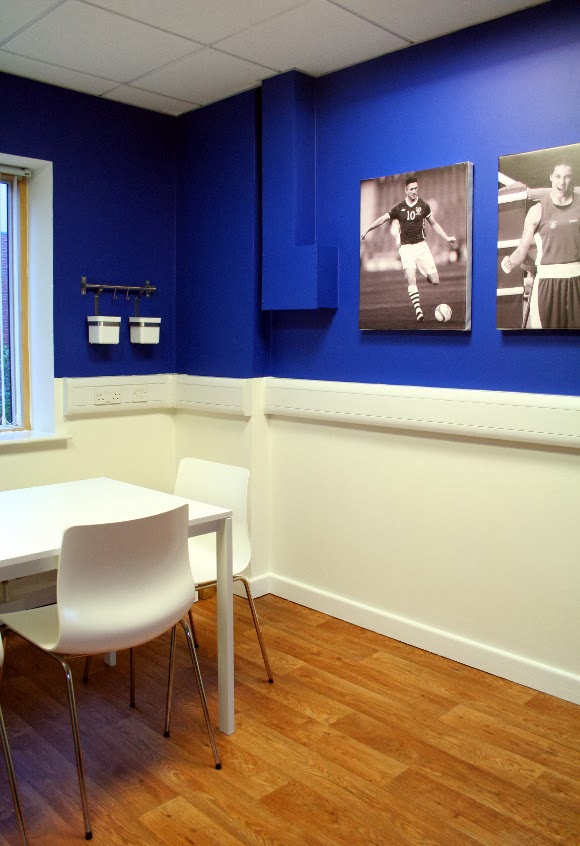
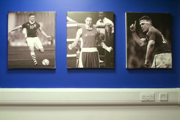
The teens wanted sports figures and logos to be included in the design but since there were arguments between the likes of Manchester United, Liverpool, Arsenal etc, we chose prominent Irish athletes Robbie Keane, Katie Taylor and Brian O’Driscoll in stead to keep it a bit closer to home {and thanks dad for helping me choose the athletes! 🙂 I know zero about sports}. I sourced some high res images online, converted them to black and white and had them printed and mounted on canvases which I think it gives it a bit more of a polished feel than posters.
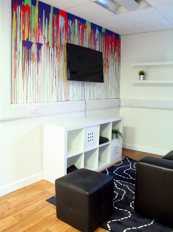
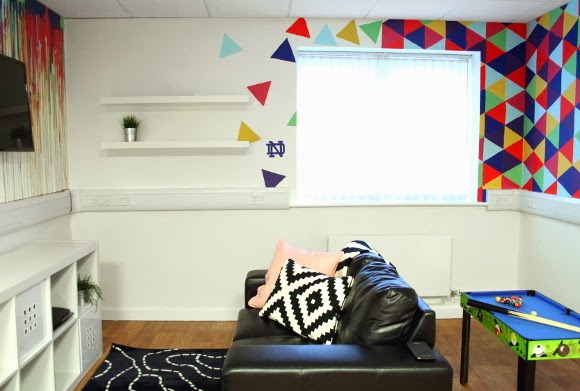
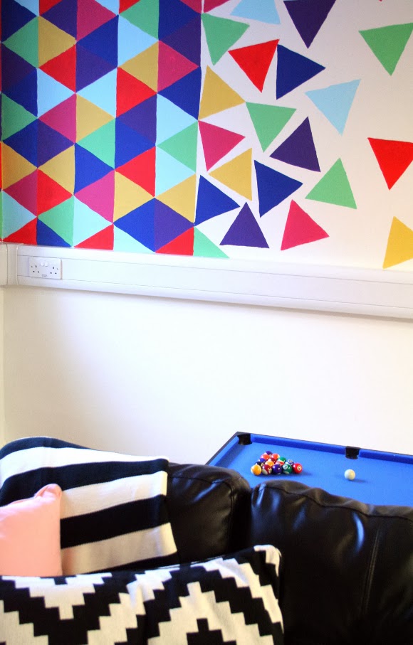
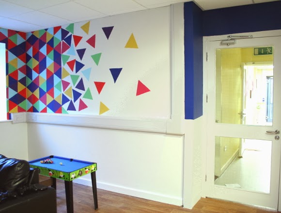
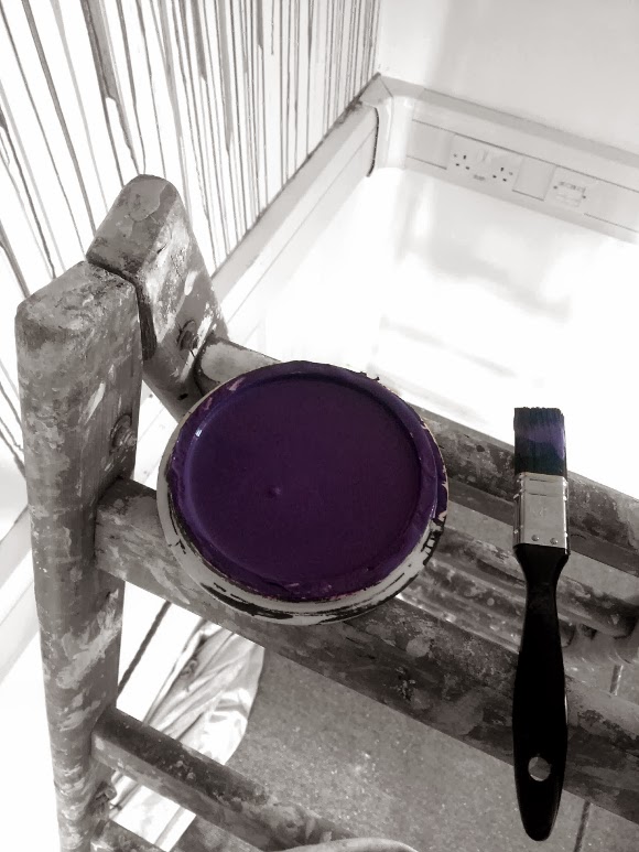
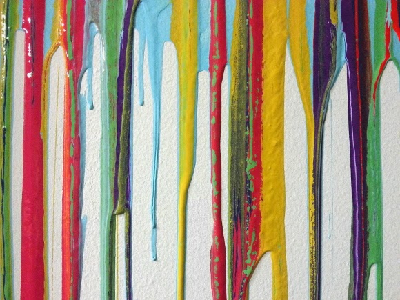
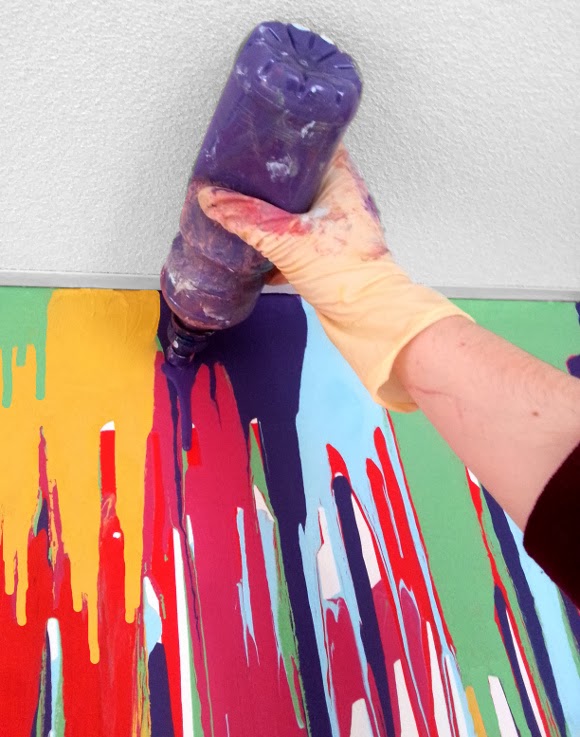
I personally had the most fun when it came to the paint. There was the drip, the geometric and the street art walls. I bought sports drinks bottles {the ones where you can drink directly from the lid}, filled them with paint, got up on a ladder and dripped away. The geometric wall was simplified down a lot more from the original plan and became just triangles. I cut some templates from cereal boxes and Keri, Holly and I traced them onto the wall and ‘exploded’ them at the perimeter. Random colours were chosen and painted on by the Notre Dame students.
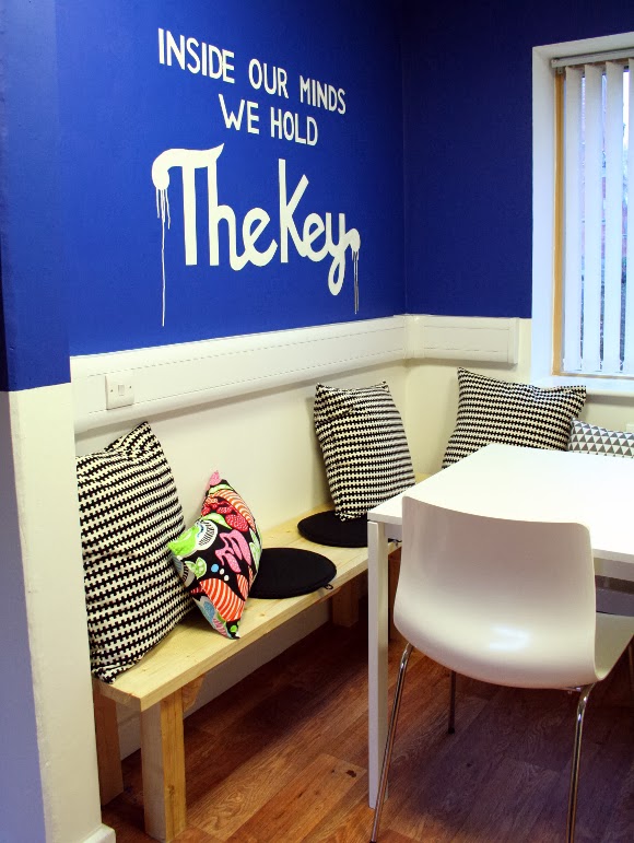
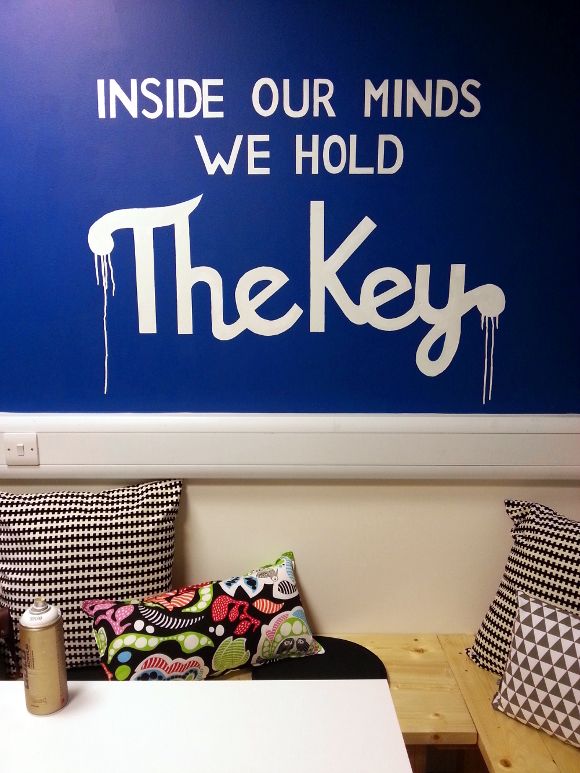
And of course the graffiti wall. I’ve been a long time fan of Maser, one of Dublin’s Ireland’s top graffiti artists, so I sent him a little e-mail one day {as you do} asking if I could use one of his quotes as part of our project. He loved the project, gave me the go-ahead and 30 minutes later I was drawing it out and applying roughly 10lbs of masking tape to the wall and spraying away. I added some drippy bits to tie in with the drip wall and voila. My first piece of wall art and I’m pretty effing proud of it if I may be so bold.
Yesterday after the big reveal I kicked everyone out of the room {in the nicest way possible} to take these pictures. While I was snapping away, the teens whose room it now is came in about 100 times asking if I was finished yet. I could hear them in the next room complaining I was taking too long, but I took it as the biggest seal of approval and compliment of the day – they wanted their room and they wanted it 10 minutes ago. A job well done I think.
You can see the original mood and atmosphere boards I put together if you’d like. I think it turned out quite close to what was planned and we didn’t stray too far. It was very surreal to see those boards come to life.
At running the risk of sounding incredibly emo and sappy, my heart swelled with pride today every time I looked at these pictures and watched this video by {the painfully talented} Darcie while writing this post. And thank you again Derek for the opportunity to work alongside yourself and Localise. It was an incredible project to work on, and I’m so happy to have been part of it all. xx A
Design details
Vinyl flooring – Des Kelly Interiors
Main navy paint – Atlantic surf 1 – Dulux
Detail paint – milk white, rich honey, summer pudding, scooter red, pea pod and chance – Crown Paints
Canvases – Reads Design & Print
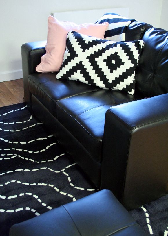
Chairs, table, cushions, shelves, shelving unit, faux plants, rug and throw – IKEA
Couch, cube seating and grey triangle patterned pillow – Harvey Norman
Wooden bench – handmade by Paul

