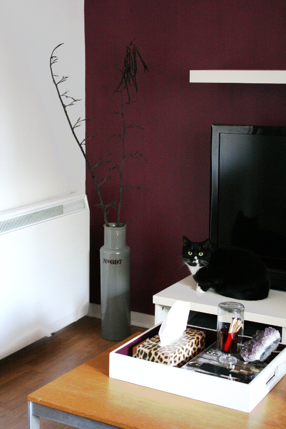
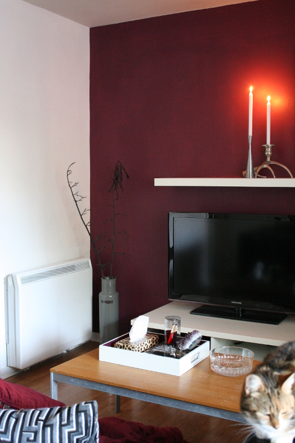
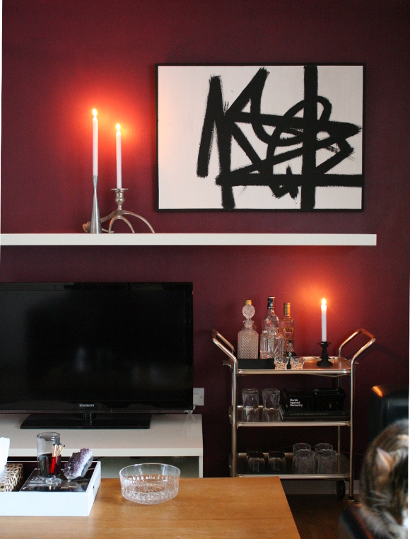
I’m forever amazed when a coat of paint changes a space so much. Within 2 hours you can change the feel of a room for under €25. Or in my case, for free as I already had the paint. Yesterday, to the dismay of Robert who wanted nothing more than to MGSV to his hearts content, I painted the wall behind our TV in the same berry colour as the wall behind our shelves. Yes, another feature wall. I quite resent that that term is used with such hate by some people, but feature wall it is. To them I ask, what did a feature wall ever do to you?
I LOVE A GOOD FEATURE WALL.
There. I said it.
I am so, so, so, so, so in love with this end of the living room again. I don’t care how lame that makes me sound. The wall behind our TV was just too much boring and too much bland for my liking and for too long. White on white on white. I do like simple and bright design, but not in my own space as I’ve come to realise over the years.
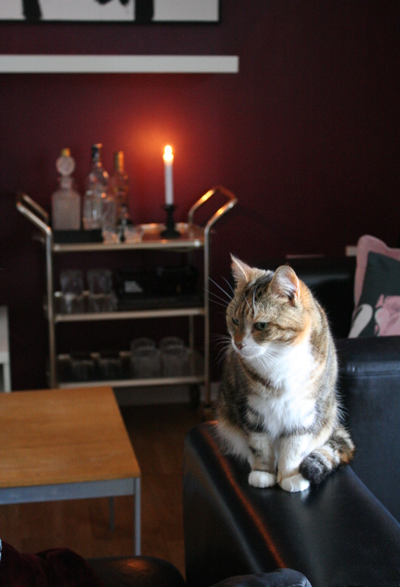
As I realised with the test patch I painted last week, I think this paint colour looks all kinds of amazing in candle light. Tiger are going to make an absolute fortune in candles from me this year. I know it’s a bit early to be mentioning the C word, but I cannot WAIT to decorate our mantle / shelf for Christmas [this time it’s Christmas Pat :P].
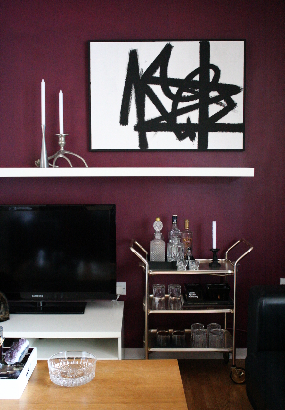
Another reason I wanted to paint this wall dark, aside from the fact that I love this colour, is because I really like the contrast of stark white pieces on dark backgrounds. I don’t know why I took so long to paint this wall because [I think] it looks amazing and really ties the room together. My abstract painting is back up [yay! o/] and I added some simple white candles to offset all the dark. It’s a quick change that made a big impact on our piddly little rental living room, which can easily be undone in an afternoon.
p.s. Anyone else notice there’s a cat in every. Single. Photo I took? Juniper and Toshi were very needy this weekend. Sorry / not sorry 😛

I actually said OUT LOUD whilst reading this, "Oh my god that looks SO GOOD!!" I freaking love it! You are really making me want to go this route for my dining room now. Sexy AF. And hell yeah to feature walls – I love a good feature so screw the nay-sayers. As for Toshi and Juniper, they make every picture more cuddly!! I JUST WANNA SQUISH THEM. xxx
DO IIIIIIIIT! COME TO THE DARK (burgundy) SIDE!!!! Just think of how much your dining set will POP in front of a burgundy wall?! And all the gold and candles and yumminess? Although, it is mighty fabulous already with the navy you already have in there. You're starting to even convert me!
Dark is great. It really does set off the artwork beautifully. Also, it makes the TV disappear somewhat. I like.
Loving the multiple kitteh photos. If you can't beat 'em, join 'em… or plan your photos around them; that works too.
I actually didn't think of the wall colour disguising the TV! And that it does. It's such a warm colour – it might be something I paint seasonally! We'll see. We'll see …
Love it! Such a cosy colour, and it really does soften the look of the tv. This is something I'm thinking about at the mo, and Kimberly's (ex) gallery wall and now this are making me think I should paint the wall behind it a dark colour.
And anyone who hates feature walls can do one ;P
Hahahaha love it Linda! I am definitely pro feature walls. Yaaaay! o/
Oh and Kimberly's previous gallery wall in her dining room was well lush. I have a mini gallery wall going on in our spare bedroom all thanks to her!!! The rest of our apartment is sadly sans artwork. I gotta work on that!
I just have to say that the candle glow on the dark walls is just GORGEOUS!
Thank you, Nic! I'm going to have to agree with you there. I love it so much. I fear every picture between now and spring will have an obligatory lit candle!
This is amazing – I LOVE IT!!!!!! It looks soooo cosy with the candle light – I thought the same when you showed the bar cart in front of the patch of berry – the candle glowing looked so good. Just love it now! And your abstract black and white picture looks f***ing spectacular against that berry!!! Good move, Hydrangea Girl, good move. xx
Hahahaha, thank you Dinki Dots! Represent. I loved having that painting hanging above the TV as I thought it balances the TV out so well, but once the wall went white, it all got a bit boring. Another reason why I berries the shit outta that wall.
It's so lovely and I only wish I painted it sooner! xx
What paint color is this?! Love it
Author
The paint in this blog post was actually a paint colour I mixed myself a few years ago. In my more recent blog posts (which you can see if you click on my ‘Blog‘ tab) I use a similar shade of burgundy which is Classic Burgundy by Glidden paint (formerly was made by CIL but I believe Glidden have since purchased the company).
You should be able to replicate the colour by providing the colour swatch at your local paint store. It’s much warmer and more of a deep red in real life compared to how the colour is represented on the Glidden website.