Guest bedroom bedside table – updates

Have you ever decorated part of your home and once it was finished, it didn’t exactly look better? Yeah, that happens around here more often than I’d like to admit. 
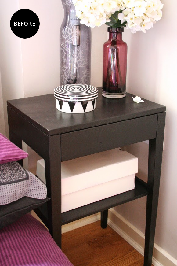
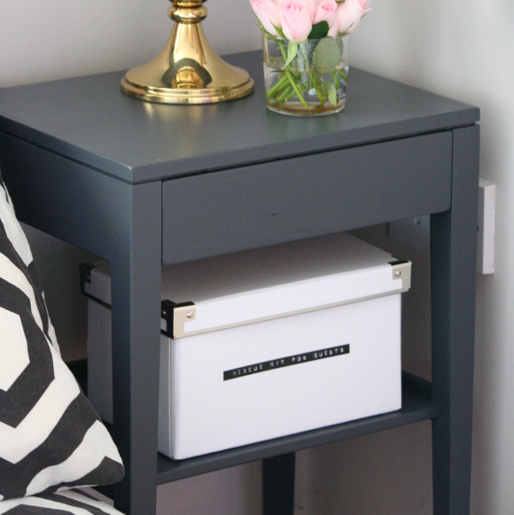
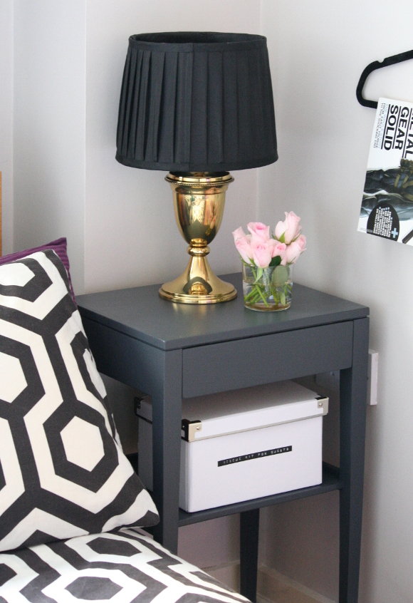
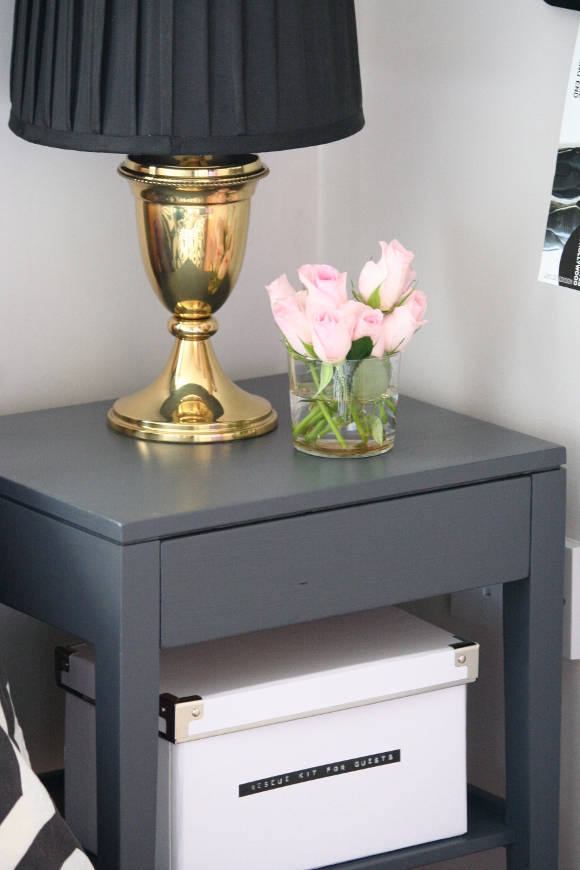
Case in point, our spare bedroom earlier this year [below]. I painted our bedside table black and accessorized it with pieces I wasn’t particularly fond of and it was all just BLEUH. Everything needed a bit of an upgrade, so on Monday night I repainted the bedside table with leftover Dulux Exterior SatinWood ‘iron clad’ paint that I used on our living room stools. This paint is meant for front doors, but it works like an absolute dream on furniture. 

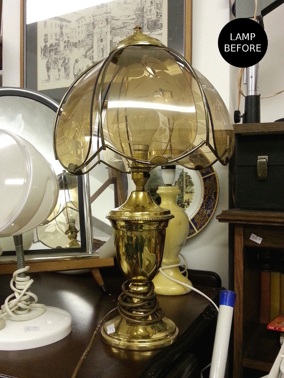
Upgrade step 1: complete! Now onto step 2: in keeping with my current a bit less IKEA phase [ie – our new old desk], the next step was to find a replacement lamp for the IKEA lamp we had. Yesterday I took to my well-worn Dublin charity shop route and I spotted this absolutely lush gold lamp in Second Abbey …

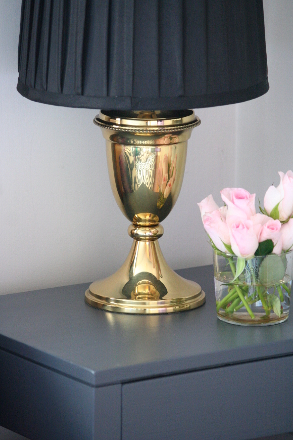
Phwoar. Isn’t it well lush? I headed to Dunnes Stores and picked up a small black pleated lamp shade to bring it out of the early 90’s, and I’ve got to say, I’m ridiculously pleased with how it turned out. Just LOOK at it …

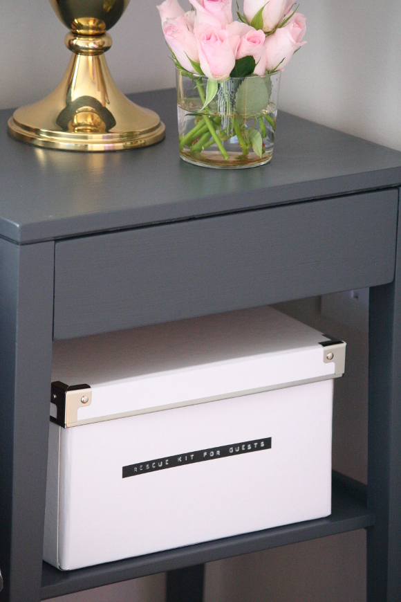
All shiny and gold and pretty. I next upgraded our rescue kit for unexpected guests box [psst – you can also see what the bedside table originally looked like in that post]. I had a spare white KASSET box from my DIY holiday memory boxes, so I added the contents of the rescue kit to the slightly fancier box and added an old school Dymo Omega label to balance out all the fancy. And damn straight, I am mixing gold and silver. 
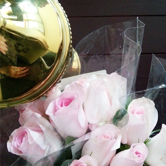
And last but not least, I decided to jazz up the bedside table by doing something I almost never do – I bought flowers. I love flowers in our home so I don’t really know why I’m always hesitant to buy them. I will admit part of me thinks it’s a bit of a waste of money. I know that sounds harsh. I tried to curb my opinion by buying these pretty pink roses which were reduced yet absolutely perfect [WINNING]. I trimmed them into one of our gold tumblers, et voila. 

When I showed husband the new getup in the spare bedroom, the first thing he said was “are you sure you want to keep that lamp there? It’s really nice and we’ll never see it in the spare bedroom … “. He makes a good point. Yes, he may be critiquing my styling placement, but I’ll focus more so on the fact that he thinks I made a kick-ass Frankenstein lamp 🙂 xx A

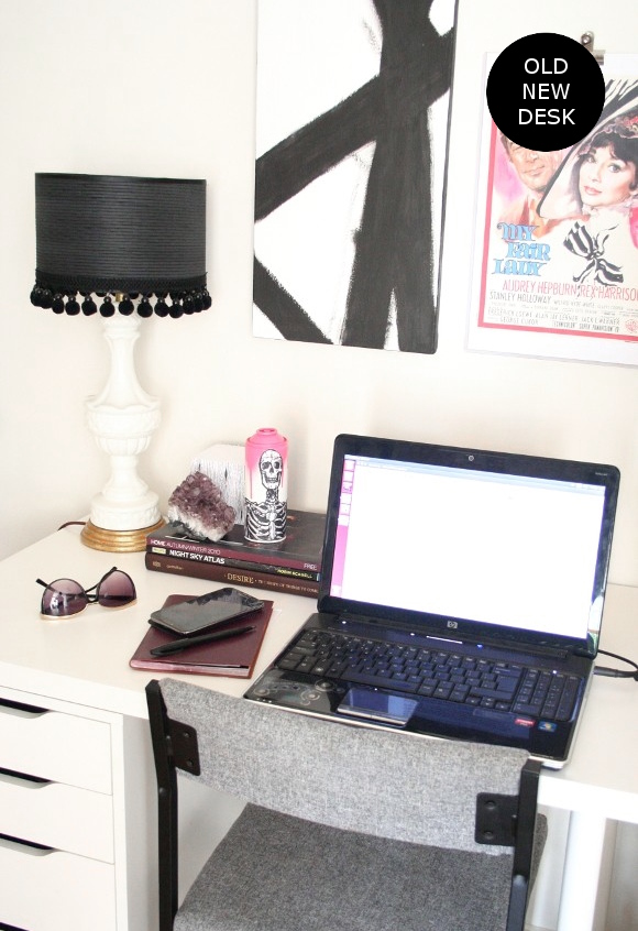
New old desk

For a while now I’ve been a bit over our home office. I’ve wanted to mix things up and more importantly, make our apartment a bit less IKEA-y. Don’t get me wrong, I heart IKEA, but thanks to our landlord’s [IKEA] furniture that we can’t change, our apartment was starting to look a bit like a catalog. So out with the new, and in with the old.

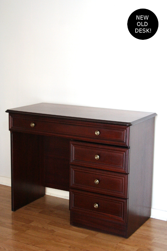
I wanted an older and darker desk with more character, so I took to the internet. I sold our IKEA desk within a couple of hours and that same evening I found a pretty sa-weet mahogany desk. It was petite, compact and fill of pretty. I even haggled it down to the same price that I sold our IKEA desk for, making it a direct swap of IKEA for mahogany! Not bad … 

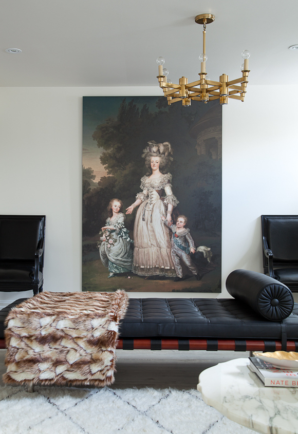
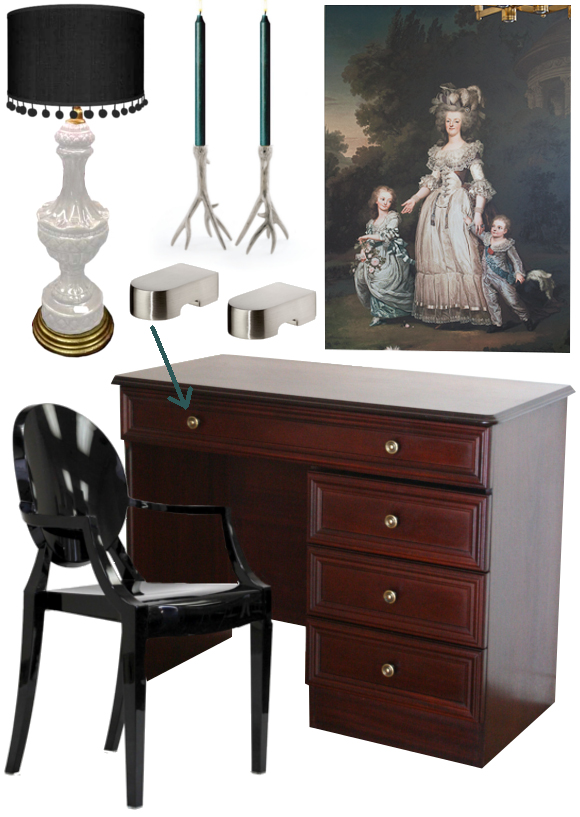
My grand ideas for this small space kept bringing me back to Christine Dovey’s, aka Bijou and Boheme’s, basement makeover. There are no words. It’s just insanity. I’ve yabbered on about Christine many times before, so I’ll keep my drooling to a minimum today. But there’s something I just really adore about the dark accessories, white walls, old school painting and gold accents going on. A perfect mix of old and new. So ideally, I’d love if I could work the following into our new office space …

Include our existing upcycled charity shop lamp. I’ve had a hankering to update it a little by adding MOAR DANGILY TRIM Done! 
– Add some more teal candles from Tiger [you cannot go wrong with 2 candles for €1], as well as adding another metallic antler candle holder, similar to the one on our living room shelf
– A giant piece of art of some sorts. Kinda old and maybe kinda new and I might even try my hand at something. This section is a bit up in the air. Can you tell?
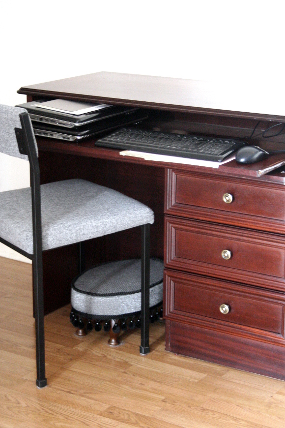
– The moment we got the desk, I wanted to change the door knobs. They don’t look too bad below, but the current hardware is in no way in keeping with our living room [our office sits in the corner of our living room]. I’ve spent a couple of days searching for some yummy knobs [oh dear god, hello SEO!] in hardware stores to glitz up our desk, but no luck. Going completely against my ‘less IKEA look’, I spotted these ORRNAS  door knobs on the IKEA website and I like what I see. Bringing a little bit of IKEA back in is okay, right?

– I would just die if I could have a black ghost chair. Or dark grey. I’m not picky

At the moment the chair I’m using I found abandoned on the side of the road. It’s a lot less dirty than it sounds, trust me! If the whole ghost chair thing doesn’t work out [which let’s face it, probably won’t because of €€€], I’d contemplate reupholstering my skip-chair in black velvet. It seems like it would be a fairly straight forward job, the only thing deterring me at the moment is the thought of all the cat hair.

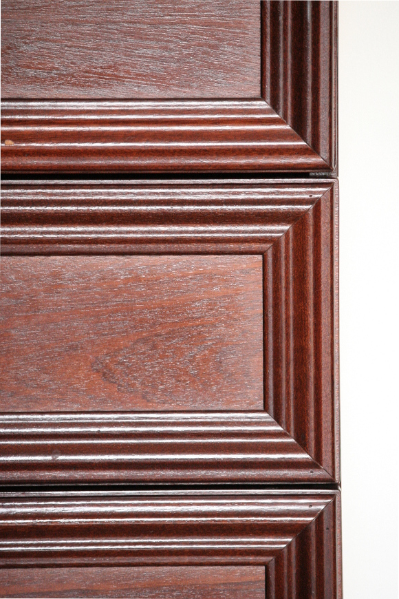
Oh and before I forget, above is a better picture detailing the top ‘drawer’ in our new old desk; it folds down revealing a rolling shelf that I use for my keyboard and mouse, and when the desk isn’t in use, we store our laptops in there. Out of sight, out of mind. This little desk isn’t just a pretty face, and I couldn’t be more smitten.

xx A

#PicadoMexican – pay and display

Earlier this week #PicadoMexican had its official opening and all I’ll say is Lily and Alan sure know how to throw one hell of a party. It took husband and I a couple of days to recover, and while we’re still buzzing from the party, I thought there was no better time to share my final Picado feature! Today’s final installment is all about one of my favourite parts of Picado – the pay and display area.  

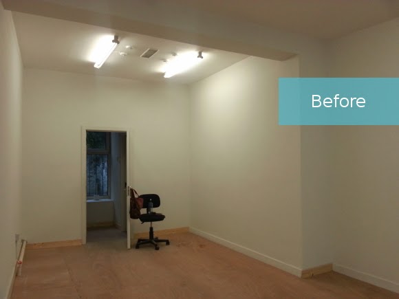
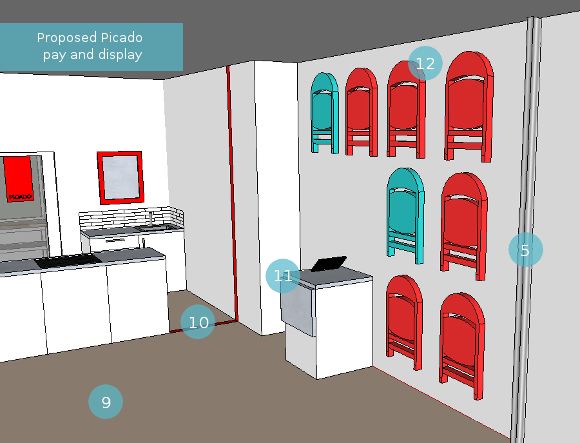
Before I start, below is a little reminder of the space beforehand as well as my design proposal for the space that I presented to Lily and Alan … 

NOTE: 1-8 are part of the kitchen and retail areas. 
9. The main floor space was reserved for when Lily will be teaching her classes. A table will be set up and the chairs will be taken off the wall for people to sit at, takes notes, and get their NOM on. During the day it’s used as additional display space. 
10. We were going to paint a red line [in keeping with the external signage] along the wall and floor to create a barrier-withouth-a-barrier if you know what I mean, between the public and private space, but fortunately no customers have wandered into kitchen. Success! No line needed.
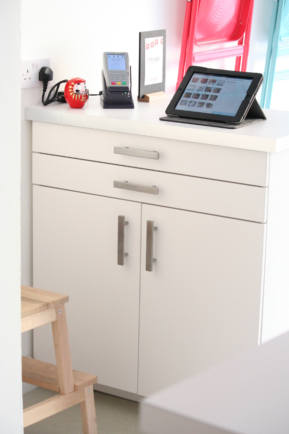
11. It made the most sense for me to place the till area here. Both as a visual barrier for customers as they walk into the shop and hopefully [successfully!] divert their path and dissuade customers from walking straight into the kitchen. I also wanted to use a sturdy till area and not just a table, for security  / till reasons.  
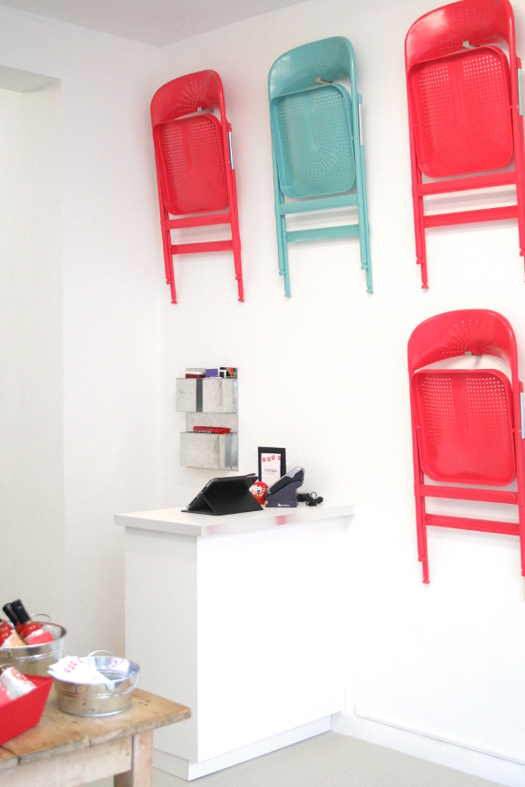
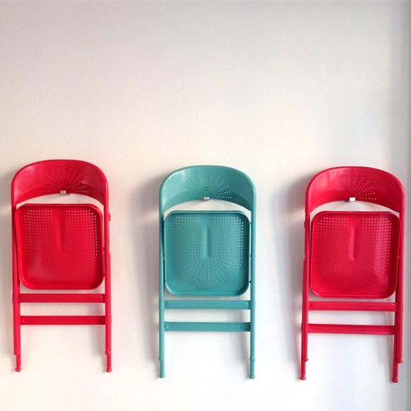
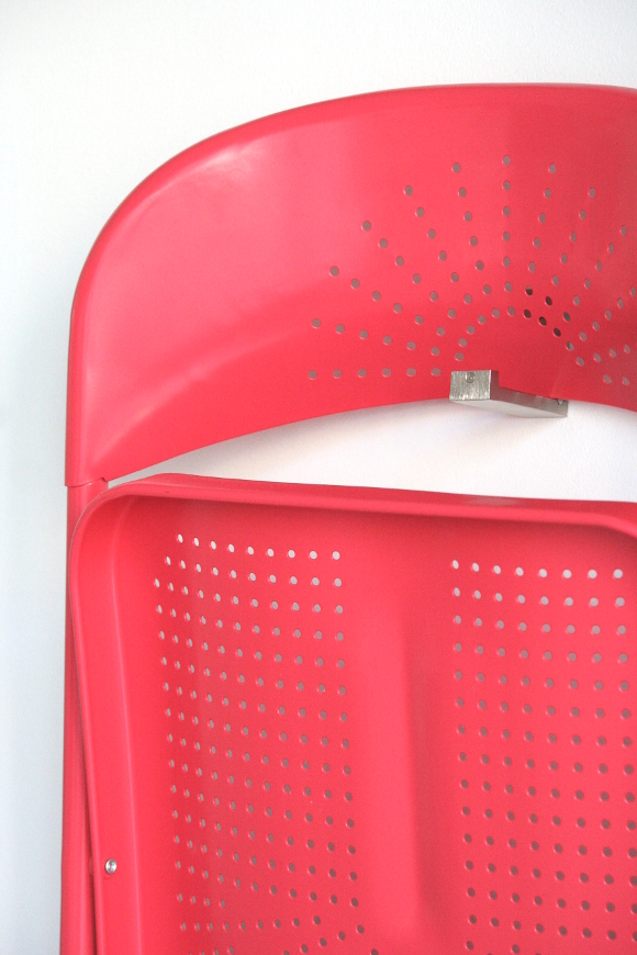
12. Oh, the chair wall. It’s gotten the most attention out of the whole shop. In the very beginning I had secret ideas about hanging chairs up on the wall for Lily’s cooking classes to save on the limited floor space. Then Lily emailed me about the FRODE folding chairs in IKEA, which were the perfect Picado colours. I nearly kissed Lily right on the mouth. They were perfect, and with some help from BJARNUM folding wall hooks and Alan’s handyman dad, the chairs were up. 

At the official opening of #PicadoMexican on Monday night, I talked to a few people I didn’t know [just a few, I’m quite bad at socialising], and each person commented on the chair wall; ” … that’s such a great idea and you know, so unusual!“, without realizing I was the designer. I really enjoyed their unfiltered and honest feedback on the shop. It really made me so proud of the shop and the work that went into it, and more importantly, so excited for Lily and Alan and what lies ahead. 

It was a really amazing party on Monday night [did I mention the incredibly dangerous / delicious bespoke Mexican cocktails by Oisin?] and in the most celebratory way possible, the opening party was a form of closure for me on the project. My Mexican love-child with Lily and Alan is real. It’s full of love, people adore it, and if you haven’t visited it, I will find you and I will make you. For the Mexican food alone, go. Forget the design. 
And at running the risk of sounding like a broken record, thank you Lily and Alan. For the opportunity. For letting me get carried away with you. For believing in me. For all the pizza. For shooting the breeze. And for listening to my crappy jokes.Thank you.