Cardboard monogram, round 2

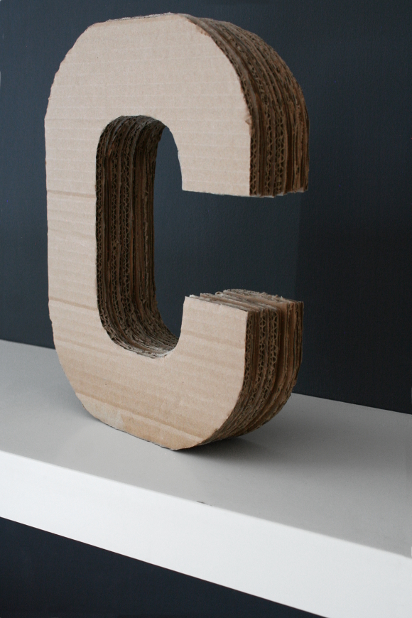
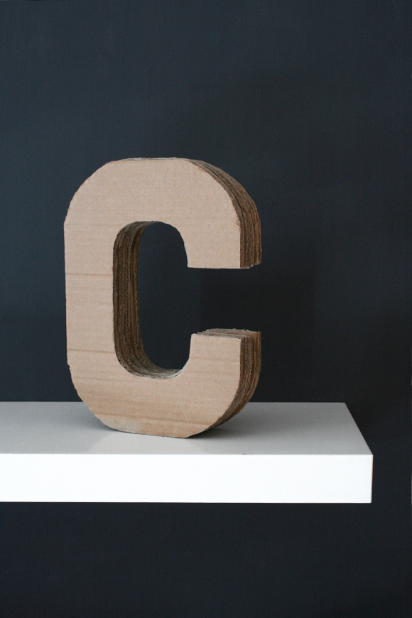
Way back when I worked on my broseph’s Canadian man cave one of the many things I made for his room was a cardboard monogram that I carved from a giant cardboard box I had laying around. I really liked the way his turned out so I made a mental note to make one for our own home. And then a year happened. Quite possibly exactly a year to the day [I blogged the office reveal on January 9th 2015, photographed it the day before and would have worked on the last few projects the days leading up to it]. I love when coincidences like that happen. 

I wanted to make a monogram ‘C’ for our own home after I made my broseph’s. My maiden name began with C and so does my married name so it conveniently represents both. A giant lump of cardboard may not be to everyone’s taste, but it’s something I like and enjoyed making. I had set aside two cardboard boxes that were just the right size to make enough C’s. If you’d like to make one of your own or for someone else, feel free to check out my full tutorial here! Happy reducing, reusing and recycling xx

Stormtrooper stamp DIY

Oh I am SO EXCITED to finally be able to share my latest collaboration with Wayfair.co.uk, which is now live as and from today.

Wayfair.co.uk approached me again this year to create a tutorial for their site, and this year they asked if I had any ideas for a project based around either a Star Wars or Christmas theme. So I kinda took both ideas, mashed them together and created a Stormtrooper stamp tutorial that can be used to create bespoke wrapping paper. I couldn’t help but keep in mind what else this stamp could be used on; not just wrapping paper. I think it would work brilliantly to create a pattern on fabric like curtains or pillowcases, to be used as a wallpaper pattern on a feature wall, or subtly used to update a piece of furniture. Alls I’ll say is when we own our own home, THIS IS HAPPENING TO THINGS

Head on over to see my Stormtrooper Stamped Christmas Wrapping Paper post to see the full tutorial! 

Happy wrapping 😉 xx 

Pantone colour[s] of the year for 2016

On Wednesday evening, Pantone announced their colour for 2016 and it was not one but two coloursRose Quartz and Serenity. I don’t usually write about the colours of the year because the past number of years their chosen colours have been a bit meh for my liking [marsala sounded good, but was a bit too muddy for me]. But this year. This year I can get behind them. 

I don’t like referring to colours as masculine and/or feminine, but unfortunately it’s easy to define them in that way because they have been for a long time. Yes, there are strong and soft colours, but it’s 2015 and I think it’s high time there be colour equality. They’re colours. Like whatever you want! I myself prefer warmer colours so I’m forever gravitating towards rich deep reds vs. blues. To me, red tones remind me of grand homes with tonnes of velvet curtains, panelled walls, OTT candles and the likes. Only within the past year have I stepped outside of that colour scheme and brought a bit of viridian into our home. So you never know, a bit of Serenity might sneak in too. Maybe. Maybe … 

What do you think of 2016’s colours of the year? Are you open to introducing predetermined colours into your home? Or do you prefer to not follow trends? I don’t particularly mind trends. I like what I like and if it’s on trend, woo! If it isn’t, than I’m perfectly happy either way.
Happy Friday, homies! Do you have anything exciting planned this weekend? We’ll be decorating for Christmas [I’m so late this year #BadBlogger] and tuning into A Very Murray Christmas. Have a good one x