Hanging accents for small spaces

I’ve written about our spare bedroom a good few times before. It’s a tough little room as the bed pretty much takes up the whole space, so adding things like accessories, can be challenging.

A couple of months ago I was struggling to get our spare bedroom ready for a guest coming over. I had some magazines, a little vase of flowers and some knick-knacks on the bedside table to make it feel a bit more welcome. Not to mention the lamp as well. Once I was finished, I realised there wasn’t enough room for said guest to even put their phone on the bedside table.

Insert obvious pun relating to being driven up the walls here. And then it clicked – the only way was up!

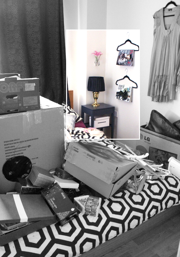
I bought these velvet hangers from Dunnes Stores (€5 for a set of 10), perfect for hanging up magazines and the likes above the bedside table. I didn’t put much thought into the placement of the hangers, just somewhere easily within reach from the bed, and stacked them to add a bit of variety.

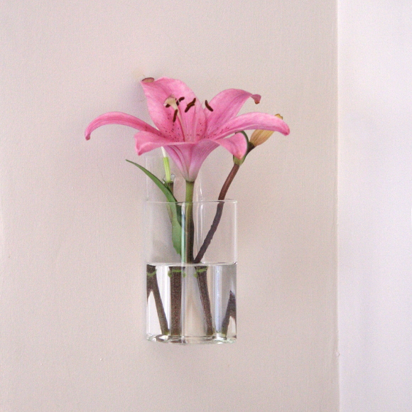
I spied the glass hanging vase from Tiger just before Christmas and thought it was perfect for the spare bedroom wall. That’s the thing with Tiger – if you see something you like, you have to grab it with both hands, hold on tight and lock it down, because chances are the next time you stop in, the stock will have changed and it will be GONE. Like that girl in that GONE GIRL movie*. So I grabbed it with both hands [and paid for it, obv].

Also, don’t always believe what you see in online (and magazine) features. The rest of the room is chaos …

Just keeping it real. Bloggers are humans too.
And don’t worry Kimberly and Maria, it’ll be tidy for April. Promise. xx A

Also featured – bedside table and lamprescue kit for unexpected guests

*I have not seen Gone Girl so I don’t know if this is a reference that makes sense. It sounded like it would fit at the time of this being published. It’s tough trying to be a lyrical genius. 

DIY Friday – birch covered container

In the beginning stages of brainstorming ideas for the Canadian man cave, I had spied a number of birch covered candle holders and vases on the high street. Some of which were a little steep on price. I was about to buy one when I had a moment and thought, “wait a second, I can DIY that“. 
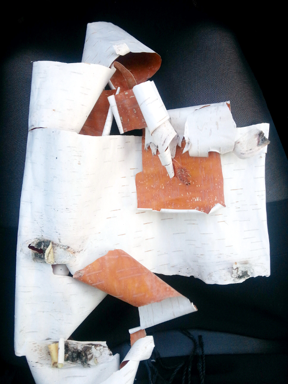
The next weekend husband and I were out driving and I spied a couple of birch trees that were shedding A LOT. Perfection. Now I’m not one to normally attack an unsuspecting birch tree, but this tree had massive pieces of bark hanging off. I couldn’t not peel it a bit. So I did

What you’ll need
A piece of birch bark
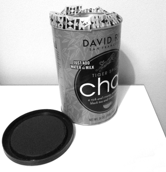
An empty container
A pencil, pair of scissors and a ruler
Spray adhesive [or any strong glue]
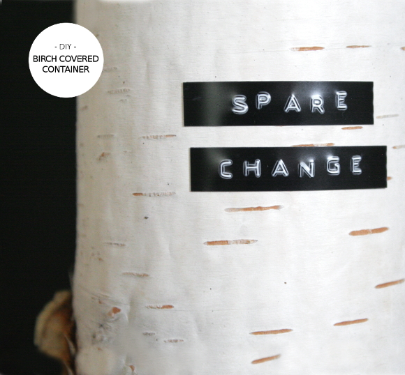
Dymo label maker [optional]
Step 1 – I first measured the height of the container. I roughly marked it on the piece of birch using a pencil and ruler, and then I simply cut it out. Now, be warned – birch bark will roll up and out of control, so maybe you’ll need a glass of wine near by to calm the nerves. Handle it gently. Remember, this is only a 5 minute project so you won’t have to put up with it for long. 
If you can’t get a solid piece of birch, it would be just as easy to cover your container by alternatively building up strips of it. 

WARNING: shoddy phone picture alert … 

Step 2 – I next taped off the top lip of the container. I did this so the adhesive spray wouldn’t get all over it. If you don’t do this and should any glue get on it, the lid will stick to it. And we don’t really want that. 

Step 3 – I sprayed the outside of the container with spray adhesive in a well ventilated area. Carefully add the piece of birch. Spray adhesive is usually quite forgiving, so if you need to move the birch, it should be no problem. You know what else is forgiving? That glass of wine. 

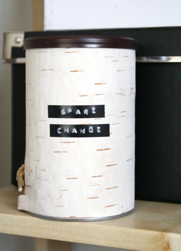
I finished off the container with a quick punch of my Dymo label writer to kick it up a notch. It was a really easy, and the best bit, it was FREE and in keeping with making the most out of what you already have.

Happy Friday, friends! I hope you have a good one lined up this weekend xx A

Canadian man cave – coordinating mismatched furniture

While it isn’t a groundbreaking blog post, today I thought I’d share a cheap and cheerful design tip that I’ve put into action on a couple of my projects to date. 

It’s a simple tip that I used again while redesigning my brother’s Canadian man cave; there was some mismatched pieces of furniture in the room so we removed all the existing handles and replaced them with coordinated pieces to make the room feel less mismatched and more sharp. 

A small detail I know, but to me, those are the sellers. The devil is in the details. It cost us under a tenner for the whole room and it made the room feel more considered and designed as a whole. 

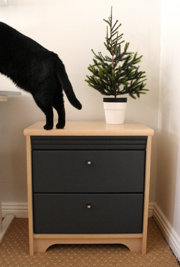
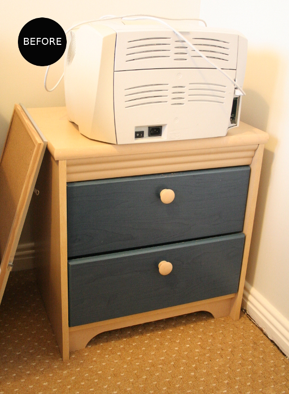
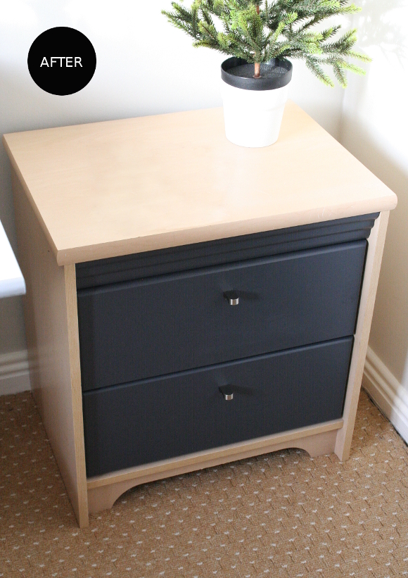
The main piece of furniture I changed was the hardware on the desk drawers. Originally, my brother and I each had one of these drawers in our bedroom as our bedside lockers growing up. In my parent’s new place, there isn’t room for both lockers in my brothers bedroom so one is being used as much needed desk storage. 

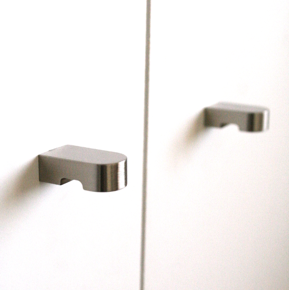
To make the drawers feel a bit more mature, we repainted the drawers plus the wavy detail above the top drawer in an effort to make it seem sleeker. I repainted the drawers with Dulux‘s Exterior SatinWood paint in ‘iron clad’ that was leftover from our bedside table and stools. When the drawers were dry, we then replaced the handles with some sleek ORRNAS knobs from IKEA. Queue gentleman’s desk companion extraordinaire … 

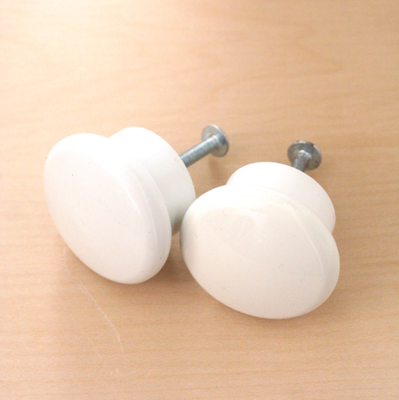
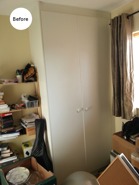
To further coordinate the room, we took off the wardrobe’s existing boring builders handles and replaced them with more ORRNAS knobs from IKEA. It’s impossible to photograph the wardrobe and the desk drawers together as they’re on opposite sides of the room, but trust me, these small details really help tie the room together. 

Some really minor details, but it really makes a difference. I bought new handles for our own home office and updated ours at the same time. While our new old desk doesn’t match the shelves in our living room, I coordinated all 9 handles on the shelves and desk and it ties them together on another level. I did this again last year for Picado by coordinating the new kitchen hardware with the vintage dresser knobs. 

They’re tiny details, but I find they make thoughtful impacts.