
After packing away the last of the Christmas decorations a couple of weeks ago, I attempted to punch up my living room with a new color scheme.
Since snatching up Marks & Spencers‘ autumn / winter Home magazine last December, and after staring at it on my coffee table ever since, the dark color scheme has really grown on me. I’ve gone for maroon, deep plum and dark navy accents in my living room against dark True Marble walls by Crown Paints. I’m really into the strong contrasts at the moment – dark design with a punch of color.
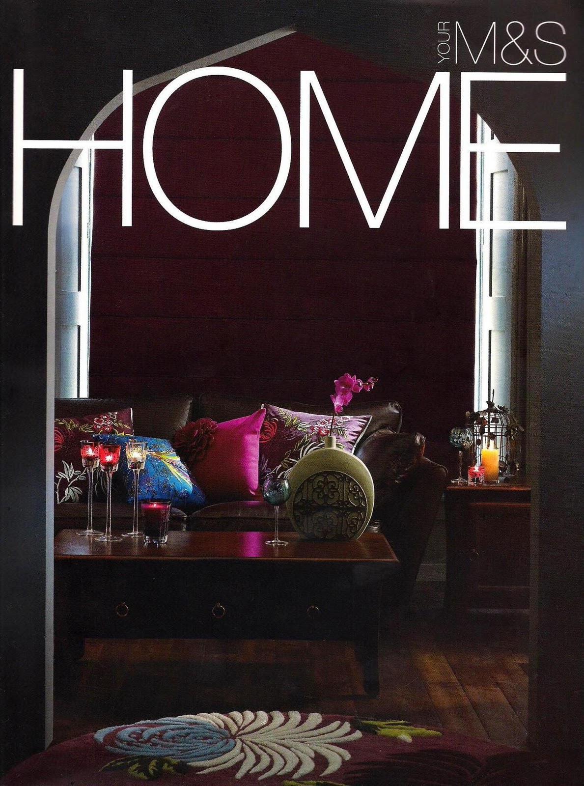
My muse these days: M&S Home autumn / winter 2010 magazine. I shouldn’t pick these magazines up. I want to squander my pay cheques the moment I see them.

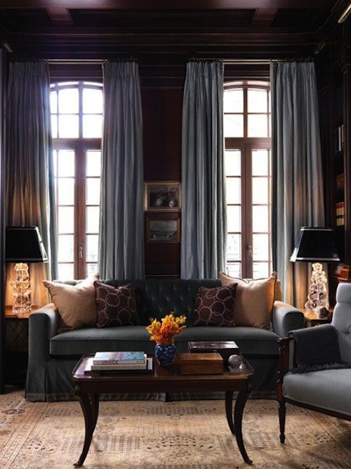
Dark images brought to you by shelterness. I hope to own a Starck Louis Ghost or Victoria Ghost chair one day. One can dream. I’m also digging the high gloss kitchen. Not so good when it comes to sticky fingerprints though …
I’m really into symmetry these days – considering up until now I’ve been about nothing other than asymmetry – including my fringe as of recently {yummy image creeped on Plush Palate}.
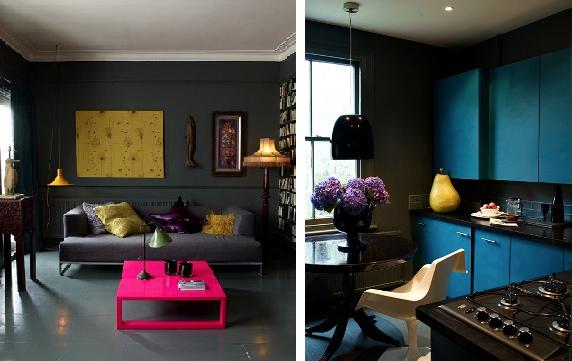
Serious color hits I found on Digs Digs {plus hydrangeas … Yes, yes}. Designed by Atelier Abigail Ahern, this one bedroom rejuvenation project wasn’t afraid to embrace such strong contrasts. I don’t know that I’m brave enough to tackle something like the above, but I can still admire it from a safe distance.

When I grow up I want paneled walls. So bad. Lake Shore Penthouse above by the amazing Kara Mann boasting dark paneled walls and a punch of pink {image c/o In Home Trend}.
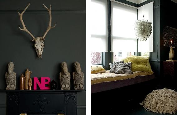
Continued moodiful hues from Atelier Abigail Ahern. Who doesn’t want a skull in their living room? No, really.
Agreed. So good… also, even though its a few years old, I am still digging all of it. It is all so wonderfully moody.
xxxxxxx