Fictional design – S&tC 2

When it comes to crunch time in college, I usually put a movie or series on repeat to keep me company through the overwhelming hours. In the past I found comfort in watching every episode ever of the Sex & the City series since it’s just long enough to watch over a couple of sleepless nights. Or weeks.
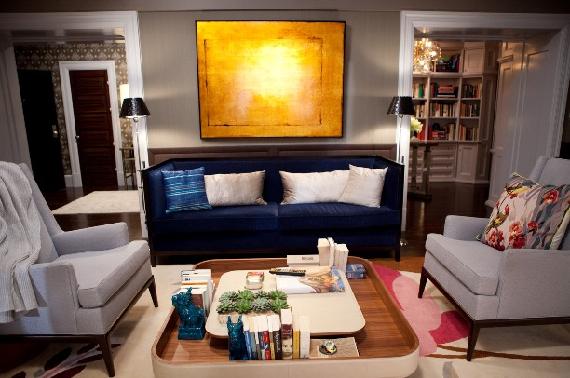
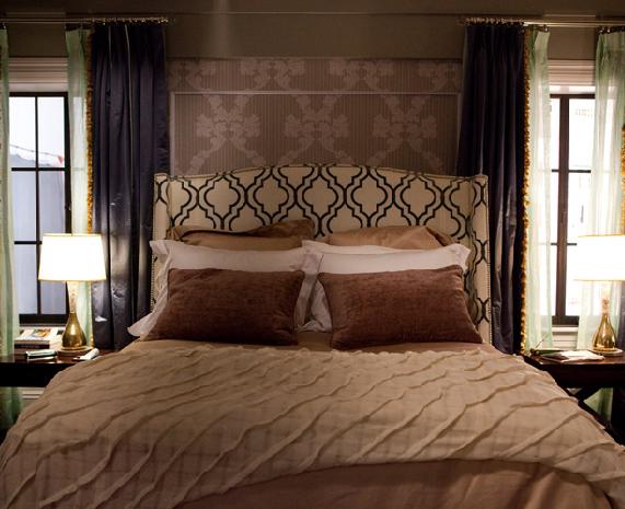
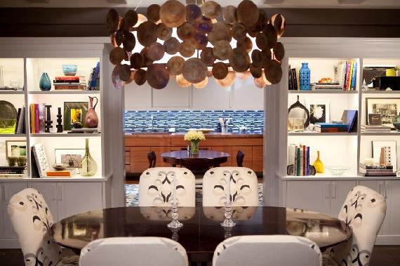
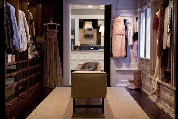
In Sex & the City 2 I couldn’t help but admire Big and Carrie’s new abode. It’s a bit color-mashy for my personal taste, but I still think it’s wonderful. I like how some aspects are crowded and over sized. It makes me look forward to having a real grown up home. 

I’m in a constant struggle with how to organize my bookshelves. They change weekly. Maybe I’ll tackle something like Big and Carrie’s dining room, but out of all the pictures, the walk-in wardrobe is the most of what I want. Not that I own a lot of clothes or shoes, but I really like the juxtaposition between Carrie and Big’s sides – how their own sides suit each other so well. And how a little of Carrie has snuck onto Big’s side.
Image sources: 12, 3, and 4.

Inspiration – Studio VI

I am nearing the end of my final project for my BA in Interior Design. T-minus 24 days until my final presentation, and 24 days until the rest of my life. I’ve been studying for four years part time while working full time, and I literally am at a point where having complete control of your own free time is a completely foreign concept to me.
I’m busily working away on my CAD plans and 3D Max, and it’s easy for me to forget my concept and what I’m aiming for. What better way to remind myself what I’m loosing countless hours over, than to share a couple of my favorite concept, typology, and precedent images – to keep me on track.
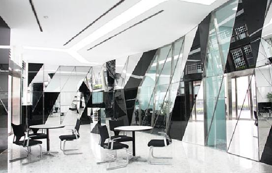
Raffles City Beijing Office by SMC Aslop | My initial inspiration for my current project was encouraged by the Raffles Beijing Sales Office. A strongly reflective environment, which had a feature wall I so much wanted to achieve. Similar to the 4 minutes video by Madonna and Justin Timberlake {slightly embarrassing to have that as a reference}, I wanted a feature wall that was encroaching on a typically normal or clinical space.
Zaha Hadid | Her Sonnabend instillations really appealed to me. I like the absent environment, mixed with an interactive foreign object intruding on the space. What an overwhelming feel to a room.

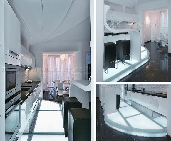
Natalia Farnosova and Helena Samarin | I can’t help but cringe when I hear or use the term futuristic, but it is ultimately the vibe I’m trying to achieve for this project. I have found abundant inspiration from this amazing apartment in Kiev designed by Natalia and Helena.

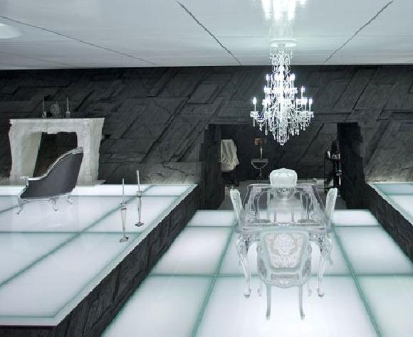
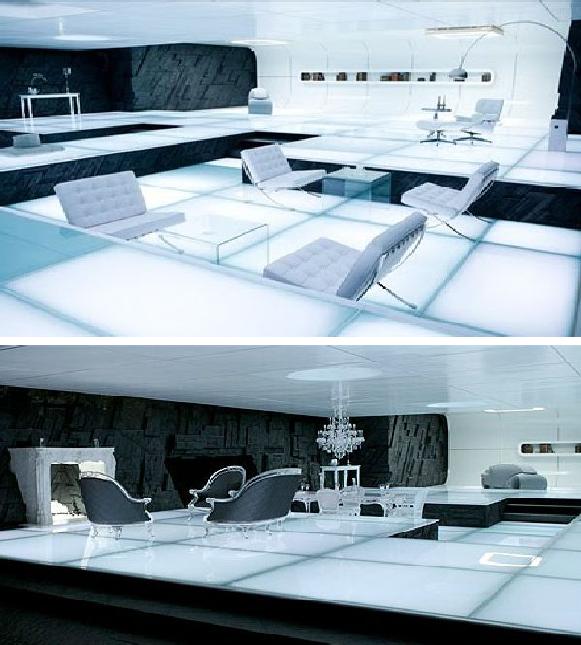
Tron Legacy | My last three college projects have been influenced by movies, to a degree. For the most part the Tron soundtrack has influenced a lot of my creative process, and is just the pick-me-up I need when the going gets tough. It was more so perfect timing, since my project is going down a similar route, even using some similar cold blue highlights and those Barcelona chairs, I want to much. {source}
If any of you are in the same boat and are nearing your finals – I feel your pain. Good luck, and hopefully you can see the finish line!

Before and after – meddling with Melodi

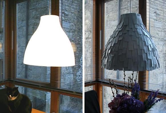
I’ve wanted a feature lighting pendant for some time for our dining nook. Any of the beautiful pendants I’ve seen have unfortunately been outside of a reasonable price, so the opportunity arose for me to come up with a little something of my own. Here is what I cooked up:
There was no better place to start than beloved IKEA for a basic pendent shape. I chose the 180cm x 38cm Melodi pendant lamp, as I wanted a sleek shape to juxtapose the surrounding sharp lines on my dining room. My fabric of choice was a lovely stone grey felt.
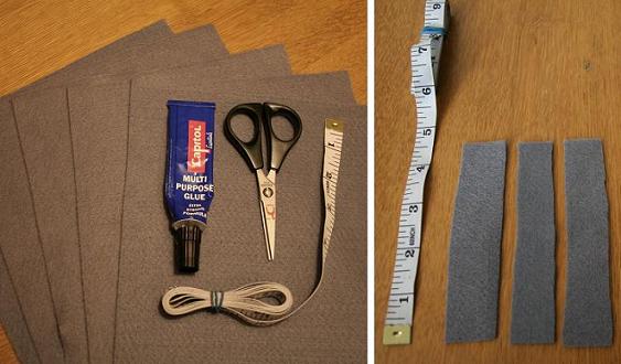
Materials used
– One IKEA Melodi pendant lamp
– Felt sheets {I used roughly 8, at €0.72 per sheet}
– Glue/adhesive
– Scissors
– Measuring tape {not necessary}
– A steady hand and a good eye for cutting straightish lines
I began by cutting the felt into 1×5 inch strips | by cutting the felt rectangle into vertical strips, then cutting the vertical strips in half. Pretty easy, but you can choose whatever length or shape you like.

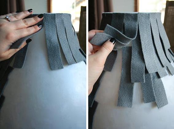
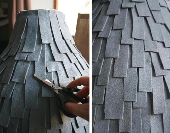
I started at the top of the Melodi lamp, and using a small dab of glue at the end of each piece, I placed the felt evenly around the top of the lamp. For the remainder of the lamp, there is no right or wrong method to placing each piece of felt. I continued to dab glue to the end of each piece, and placed them underneath the felt above, making sure to underlap {as opposed to overlap} to cover the exposed Melodi lamp.
Not to make it too repetitive, I decided to stagger the lengths of the felt. I simply did this by gluing the felt, and then trimming it to varying lengths where I saw fit. Don’t be afraid to hack into it. I continued this process until no parts of the original lamp were visible. The entire process took two evenings {an after work job}, accompanied by some decent tv.
Please note | in our dining area, 3 out of 4 walls are floor to ceiling windows, therefore the light I have placed is strictly ambient and decorative lighting. This area already gets a generous amount of light. Be careful should you tackle a fixture like this of your own, that it is not for task lighting {ie reading, chopping, etc}, as this level of light would not be appropriate and will strain your eyes.
I hope to have inspired some of you to get out there and make something of your own. It’s so simple, and can be as straight forward as you allow it to be. And more importantly, enjoy crafting!

Additional note | check out the IKEA Hackers site to see my Meddling with Melodi mention. Warm fuzzy feelings.