
Last week I shared a picture of the new hue on our living room wall. The reason I gave you an out of focus sneak peek of it is because the paint was so ugly that I wanted to tear my eyes out. It was bad. I thought I had failed. And here is how I conquered said failure.
These photos were taken on different days and under different lighting conditions, so please excuse some of them as they aren’t the best.
I wanted to paint the wall behind our shelves a bold colour. I’ve always swooned over the deep maroon some of the deceptive dust covers I made 100 years ago, so I took some left over scrap pieces of the paper and taped them to the wall to give myself an idea of whether or not that colour would be too dark, and also to see if that hue would suit our room.
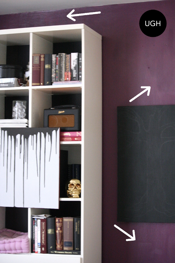
I loved the colour and was excited to get painting so we headed out that evening I bought a 2.5L tub of B&Q’s forest fruit paint. In a silk emulsion finish. It wasn’t until the next morning that I realized how wildly unsuitable it was for our living space. You could see every brush stroke and it was so shiny you could almost see yourself in it. It made me feel pretty crap.
I remembered a discussion my dad and I had about paint a couple of weeks previously. I wondered, if I mixed a little bit of plaster of paris into the paint, would it make it look like matt paint?
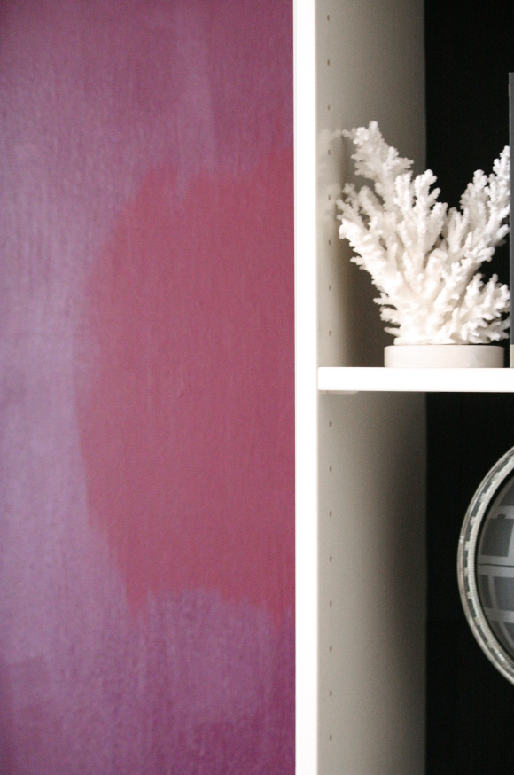
I mixed a couple of teaspoons of plaster of paris with water into a smooth paste then added it to a couple of cups of paint in my painting tray. Whatever you do, do not add the dry plaster of paris directly to your paint. It’ll end up like a badly made hot chocolate with lumps everywhere.
At the same time, I wasn’t too keen on how purple the paint was. It was a cold purple and definitely wasn’t adding to the cosy vibe I was going for. Before I started mixing my paint in the tray with the plaster of paris, I cheekily squeezed a tube of cherry red acrylic paint into the tub [which was only about 1.5L after my 2 coats of paint on the wall the previous night] and mixed furiously.
I painted a test patch to see how the new paint differed in both colour and sheen. And just like Charlie, this level of Sheen was winning.
The above picture is a bit horrible, but you get the idea. I was excited. I had conquered the paint. I was in love with how it turned out and it only took one coat of paint to fix the problem. Please tell me I’m not the only one who’s had a paint disaster?
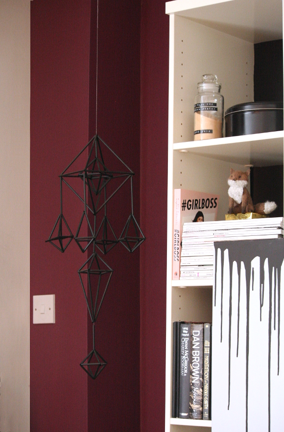
At the moment I don’t have photos of the entire wall without a Christmas tree stuck in the middle, but the colour is much better suited for our living room. A beautiful berry hue. That paint very nearly got the better of me. Nearly. xx A
the new wall color matches your blouse in your new picture at the top of your website!!! haha 🙂 its a really great color and it really suits your apartment.
Hahah, oh god I didn't even notice! I am so predictable.
You ended up with the perfect colour! I'm very impressed with how you fixed that shiny purple paint, and transformed it into a lovely matt berry hue. Very resourceful, and you didn't waste what you had!
Maria xx
Upcycling wizard genius or disaster designer? Think I'll settle with the former 😀
xx A
Yep, soooo much better. What an interesting solution, too. Who knew a little matte can go a long way?
The color you ended with is truly great! I really like how your apartment looks with this color! You did a really nice job! Thanks for sharing!
The design is awesome! I love everything!
The color is lovely! I am getting really keen on this color lately and I want to paint at least one room at home in this color! haha