Canadian man cave, office edition – progress!

There’s been a bit of headway with the Canadian man cave office I’m designing for my broseph and I thought today I’d share some of the progress we’ve made. For a little reminder, you can see the before pictures here!
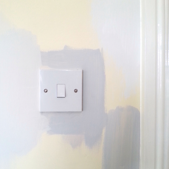
We first had to decide on a colour for the walls. I’m a huge fan of grey, but too dark of a grey would have been harsh in here. 

I had some Crown Paint test paint pots from when I repainted our living room years ago, so I thought they would be a good starting point. As it turns out, Crown Paint’s swan’s a swimming was a great fit [you can see it in the above picture: far left swatch as well as top right swatch]. My phone picture doesn’t do it justice, but it’s a warm, frothy latte-grey hue. Accompanied by some serious tunage, broseph and I painted his office in one afternoon and moved his furniture to better suit the space. 

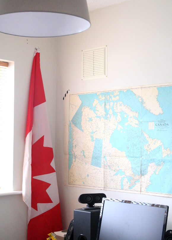
I hung up an old map of Canada we had as well as my brother’s flag. As a temporary lighting solution, I hung up an IKEA Jara giant shade, but I’m not in love with it. At the moment I’m thinking B&Q’s angular Colours Tuck or Colours Keynes ceiling light for a serious statement. I’m unsure if we’ll hang curtains or not [there are wooden blinds in place already], but at the very least there’s a skylight that needs a blind [possibly a blackout blind] that we’ll be ordering from roofblinds.co.uk
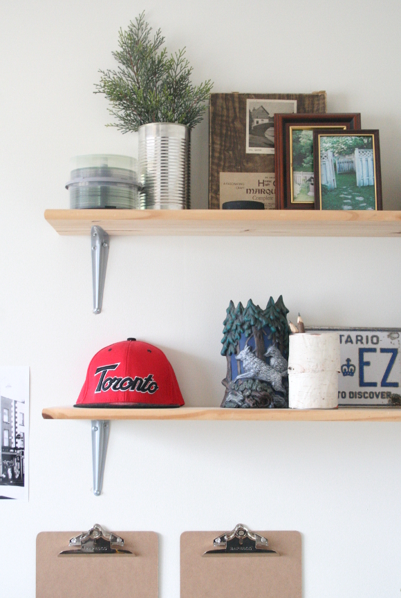
I’d like to get more artwork and personal items up on the walls too. We have yet to do anything with the largest wall in the room [which is to the right of the above picture], and I’ve been brainstorming some better ideas for wall storage, so the shelves will be changing. But for a better and sleeker not only look, but layout. 
There are of course loads of DIYs and upcycling in the room that I’ve been documenting as we go, as creatively and cheaply as we can. I’m hoping to have the office ready for my broseph for the new year because everyone loves a fresh start after the holidays and he deserves a great one. 
I’ll be staying with my family for a couple of days over Christmas so I have no excuse. That is, unless Netflix and a bottomless tin of chocolates aren’t within reach! xx A

Latest project – Avril Hutch Acrylic Art website

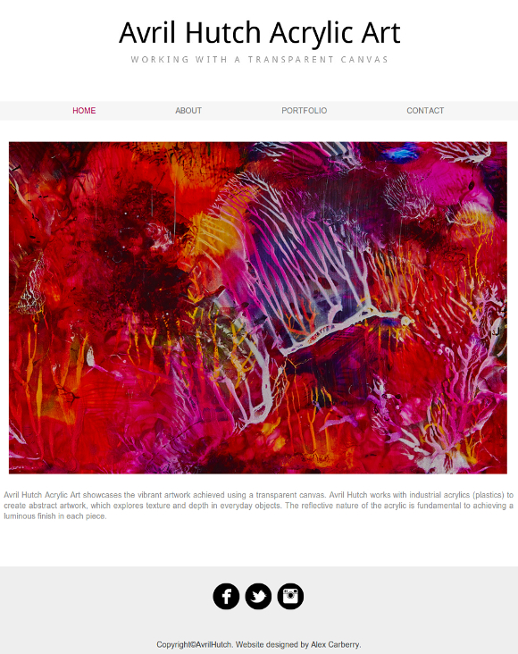
Avril and I have something in common in that we both work in offices during the day but once 17:30 comes around, we do something very different with our time. By night, Avril is an artist. And the term ‘artist‘ is a serious understatement. 

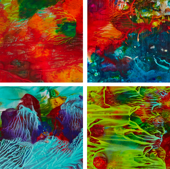
We had ranted, giggled and spoken in hushed voices about our alter-egos and alter-artists on many occasions, but on one particular occasion quite recently Avril confided some pretty big news to me. “Last weekend an RTE NationWide film crew came over, filmed me and my artwork and I’m going to be on TV”, she said with a slight look of excitement and multiple shades of panic in her eyes. After we finished freaking out, Avril told me she was told she’d need a website among other things before her debut. Eventually, I quite awkwardly piped up, “Well, I can make you a thing if you want?” So I made her a website

It was great to work with Avril because she had a clear idea of what she wanted incorporated into her site. We added a few bells and whistles, but ultimately her website stayed clean and simple so not to detract or distract from her amazing perspex artwork. 

For more information on Avril’s unreal artwork, check out her new website, Avril Hutch Acrylic Art here! She is one crazy talented gal. 

And of course, tune in to tonight’s NationWide [19:00 on RTE One] to see Avril’s interview and the history behind her art. Or check back here later, where I’m hoping to include a little snippet after it airs it out here! Best of luck Avril, and bottoms uuuuuuup! 😀 xx A

Paper and paint

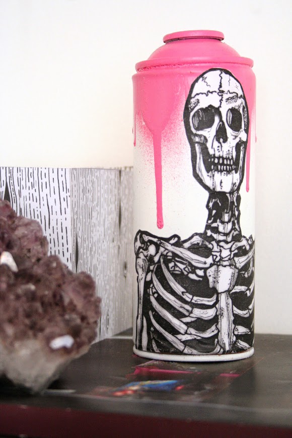
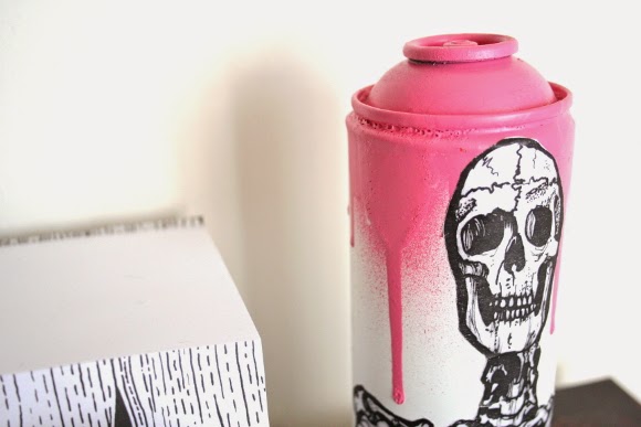
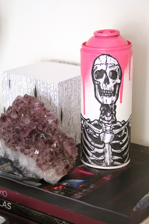
Have you ever had one of those moments where you see something that completely stops you in your tracks? As I was passing by White Lady Art on the way to my bus stop after work one day, what should I see in the window but this amaze-balls piece of urban art. It was a perfect combination of some of my favourite things – skulls, drippy spray paint, graffiti and my new affection for pink. I kinda had to have it. 

I went straight into the shop. There were loads more pieces of spray can art in the shop, all handmade by the intrinsically talented Irish designer, Eric Davys. His creative process is so beautiful and detailed. It reminded me so much of before I was into interior design and was heavily interested in becoming involved in either comic book artistry or special effects makeup. I’ve contemplated blogging my work from my previous life, but as it doesn’t really fit into design, I kinda don’t think it would be appropriate. But that’s a story for another day! We’ll see. 

For the moment, cansy, that’s what I like to call him, sits on our desk and beautifully matches and juxtaposes against my My Fair Lady print which hangs over our desk. I should have taken a photo of the two together, but I’m a bad blogger and didn’t think of it at the time. Shame on me. 

I did miss my bus that day when I spotted cansy, but it was so worth it.