The key to a good before and after is to have a really shitty ‘before’ picture. This works wonders and will exponentially boost your ‘after’ picture. Just sayin’.
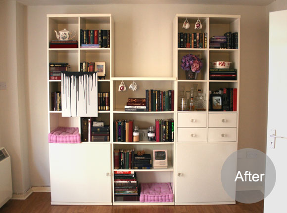
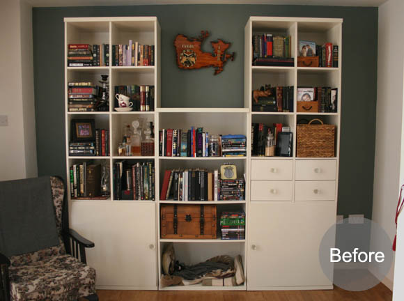
We have a large IKEA shelving unit in our living room. I really like it, but it took some time for me to get it looking just right. Up front, my key pieces of advice are – less is more and patience. I’ve been working on our shelves, one display idea at a time, since August. Yes, I’ve been whittling away for almost 5 months. But patience is a virtue.
As I’ve mentioned before, our living room is quite dark. When we first moved in, I had a knot in my knickers to repaint the sterile white walls a deeper color. But it wasn’t long before this icky colour it was killing my eyes. So, after careful consideration, a new colour was chosen. Which makes my before and after look even better. As you can see, my shelves were previously a shower of shit; there was no order, and it drove me crazy. So over the past while, I’ve come up with some little display tips and ideas.
1. Pick a colour – don’t be afraid to choose a colour you’re into at the moment, and add little pops of it here and there. I’ve used hits of lavender throughout mine, alongside our mostly dark collection of stuffs.
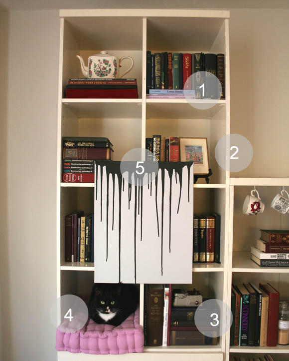
2. Thrifty things – I love displaying cute and unusual things I’ve found in charity shops. This is a watercolor painting of the Kremlin I bought about a hundred years ago. I adore it.
3. Man up – I’m always conscious of displaying fiance’s favorite things. I worry sometimes I’m smothering the place with my stuff. Don’t be afraid to incorporate gadgets and whatnots, such as fiance’s guitar pedal shown here.
4. Creature comforts – yes, I’m that kind of cat lady. I’ve incorporated sleeping cubbies for our kitties throughout our shelving. I was on the lookout for box cushions for this very purpose, and I luckily found some in Arnotts Bargain Basement for €10 each. And in the right color! Our girls approve of them.
5. Sneaky art – not only is this painting I did the right amount of contrast to the surrounding books, but it also has a secret; layering a painting over shelves like this is a super sneaky way to hide things behind it. See below …
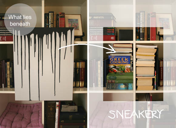
Look, a sneaky mess. Clever, huh? I keep all the books here that I have yet to re-cover. If you’re curious by what I mean, you can check out my deceptive dust covers tutorial here. Also, you can check out my original drip painting here if you like.
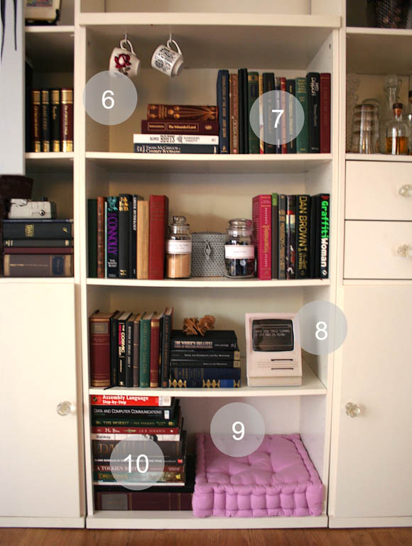
6. Delightfully kitsch – I don’t like limiting ideas to certain rooms. Here I thought, why not add little hanging teacups like you would see in cute kitchens? I hung these with extremely sturdy 1″ white cups hooks, so there’s no risk of them falling. You can get a bit of a better idea of the hanging cups here.
7. Balancing act – the previous users of these shelves must have had brick collection because each of these shelves were so strained in the middle. A trick I figured out to counter balance a saggy shelf is to use slightly taller {and lighter} books towards the center of the shelf. This way the sag will be nowhere near as noticeable. Trick of the eye.
8. Geek out – this is about layering up books and non-book items together. I’m a big cross stitch geek, especially when making cheeky ones. This particular piece is a cross stitch I made fiance for Christmas. You can check it out up close here if you like.
9. More creature comforts – another little nook for our kitties to snuggle in.
10. Stack em up – there was no better place to put all our super heavy books other than right on the bottom shelf. My Salvador Dali book alone is about 5lbs. I like mixing between horizontal and vertical books, but be careful not to make it too repetitive.
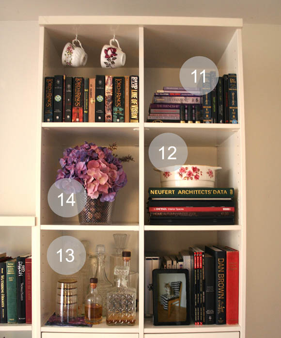
11. Variety is the spice of life – a little more punch of purple here. Also on this shelf are some shotgun shells; for our most recent anniversary I gave fiance a trip to a shooting gallery. It was amaze-balls. Let’s just say yours truly kicked his ass at accuracy.
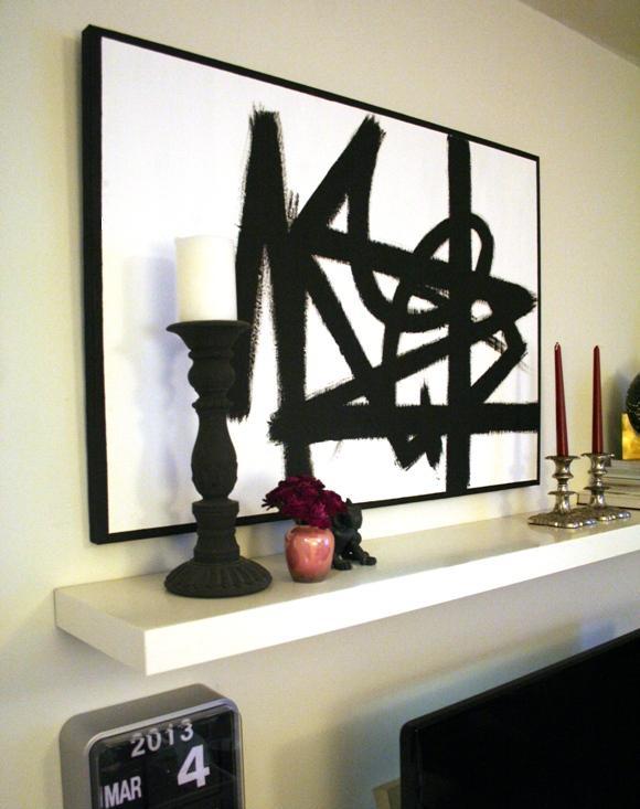
12. Family treasures – my parents have given us a few pieces over the years and I love displaying them. This is a serving bowl my parents used. They also gave us the teapot you can see at the beginning next to number 1, which was one of their engagement presents back in the day.
13. Bottoms up – some of my thrifted pride and joy, my delicate decanter collection alongside our pretty gold tumblers. Displaying drinks in decanters like this will never go out of fashion. And if it does, I’ll take pride in being unfashionable.
14. Knowing when to fake it – it would just be wrong if there weren’t any hydrangeas on these shelves. These are the ones fiance {then ‘boyfriend’} got me for Valentine’s day last year. You can see my post all about them here.
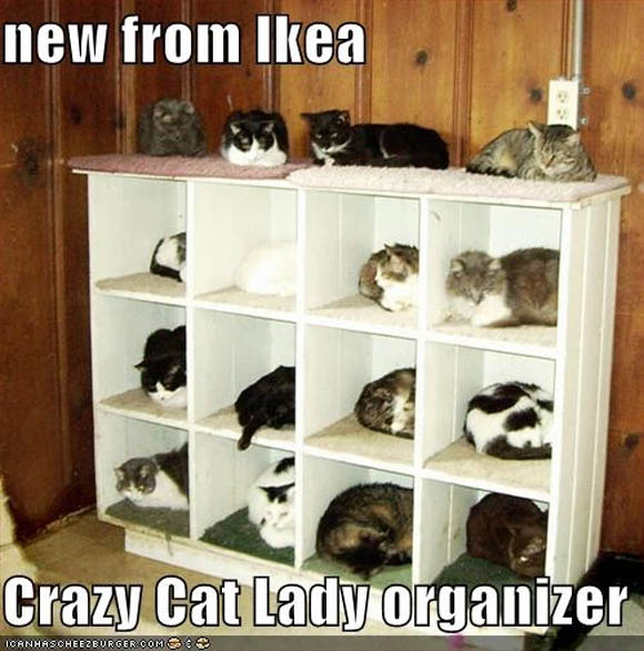
When I was taking these pictures the other day, Toshi and Juniper got in on the action in their cubbies. But you know what it reminded me of? This. FML.


