My IKEA Family Live feature!

Heart palpitations at the ready. Back in July you may {or may not, I won’t be offended} remember I shot and submitted pictures of our apartment to IKEA after receiving some rather exciting e-mails from them asking me if I’d like to be a featured IKEA member for their IKEA Family Live online magazine. UMM, yes please with a körsbär on top. 
After some trials and tribulations {which by the way, I received a camera stand for my birthday, ha!}, I submitted all the pictures safe and sound and met my deadline. Sigh of relief. Then the waiting game went down. It wouldn’t be until November until I’d be featured {having submitted the photos in July}, but it was just enough time for the dust to settle and for me to get excited about it all over again!  

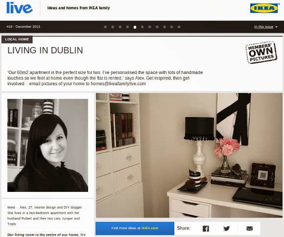
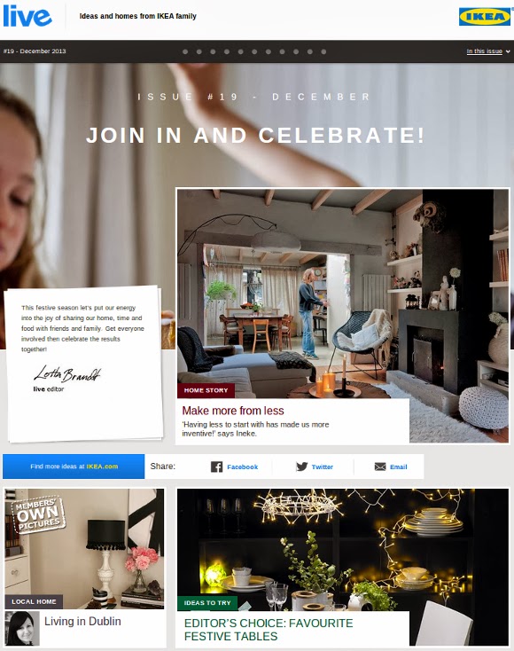
Me on the IKEA Family Live  homepage. No biggie. 

I know, slight overkill with the screenshots and whatnot, but how often do you see yourself on an IKEA website? Of course, to see the full feature, click on over here to read all about it and gawk at a couple more pictures of our apartment if you’d like 🙂 
And if you’re a fellow IKEA fiend and would like to also be a featured member, just send an e-mail on over to homes@ikeafamilylive.com with a couple of pictures and details on your home! You know you wanna. xx A

Kitty corner

This weekend I gave some special attention to our kitties. To wind it back a bit, it all started with a cross stitch. I’ve wanted for years to create a little something for our cats and hang it down low; for their visual purposes only. All the fancy stuff doesn’t have to be hung up high for human benefit.
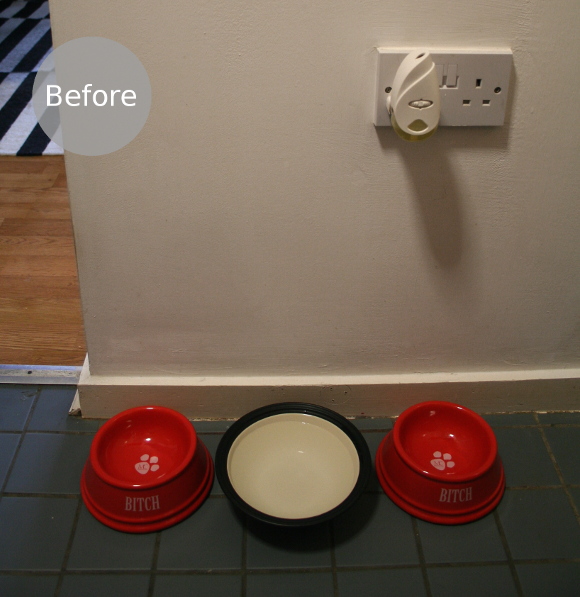
Their previous feeding spot was a bit meh. They had some cheeky bowls which I heart very much, but they didn’t fit in with anything and it was time for a change. I set my budget low, and aimed to makeover their space for under €20.

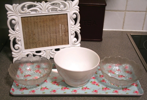
I picked up this frame for €8 from Dunnes Stores, a little serving tray for €5 at Tesco, two vintage glass bowls for €1 each at the Merchants Market and I had an existing white water bowl which was a perfect fit. I will be the first to say, the above looks incredibly cute and I wouldn’t mind keeping them like this {I know Maria and Janine will agree!}, but I wanted more of a bespoke feel, and you know me – I can’t leave anything alone.
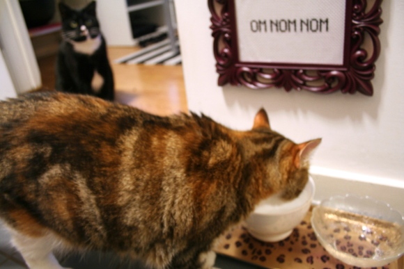
I spray painted the frame with my all time fav, ‘winegum’ spraypaint from Montana. The tray got a lot more attention and was a challenge I set myself. With some Montana goldchrome spray paint, a bit more winegum paint and a Sharpie, I was able to magic up a pimpin’ leopard print tray. Perfect for any inner wild cat.

I’m really happy with how this little project turned out. And all for under €20. All kinds of winning. And more importantly, kittehs approve. xx A

Behind the scenes – Nigel Slater’s kitchen

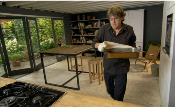
One of my most viewed posts to date is a blog post I wrote almost two years ago about Nigel Slater’s kitchen. It’s been a hit for good reason; because his kitchen is awesome. Beautiful charcoal hues, a strong presence of wood, clean lines and those bi-fold floor to ceiling windows. I still want and need all of that in my life.
It came as a complete shock when one day I got an e-mail from Rudi Thackray – the man and genius behind designing Nigel’s set. And for good measure, he also designed Lorraine Pascal’s Fast Fresh and Easy Food set, the Aquatics Centre Entrance for the 2012 London Olympics, Heston Blumenthal’s Perfection set and The Jonathan Ross Show set to name but a very small few. Um, woah. 

Rudi saw the hype on my site about his kitchen, and got in contact looking to share some inside info and crack the illusion behind the set. I couldn’t pass up the opportunity, so I built up some courage and asked if he had any sneaky behind-the-scenes stuff. He did.

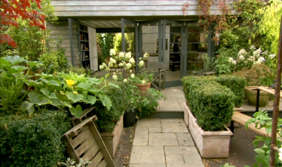
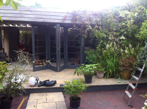
Just for you guys, here are a few exclusive behind the scenes pictures and a slight insight into Nigel’s kitchen …

What looks like a relatively small set {in terms of TV shows}, contained within an existing back garden outside of London, Rudi and his team have us all fooled. In the picture above, you can see the step that carries through into the ‘garden’ below. 

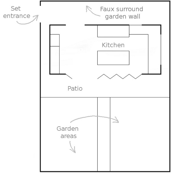
Below I did a mock-up of what I think to be roughly the layout of the set.  I took a stab and guessed the guy in the red shirt {in the 5th picture} was standing at the set entrance. From here, the rest is guess work and that the timber walls you see in the 4th and 5th picture are faux stone walls which you can see in the doorway of the 2nd picture. 
Here I was, utterly convinced such a place actually existed. I will forever attempt to figure out TV sets now. A massive thank you again to Rudi for sharing his exclusive pictures, and for anyone curious, you can check out my original post on Nigel’s kitchen here
xx A