Cheeky mention – Confetti magazine

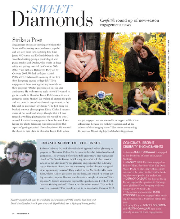
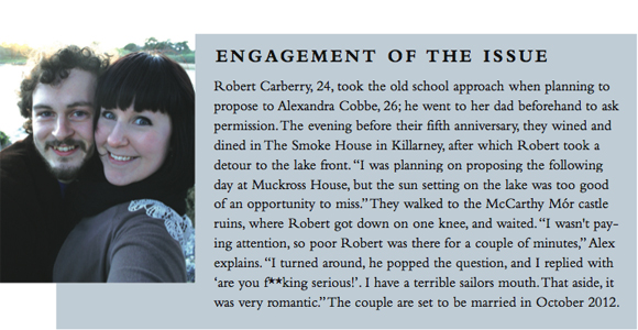
This is a very special and kind of silly mention for me/us. The lovely editor of Confetti magazine asked me a little while ago if we had an interesting engagement story, and would we like to share it and potentially have it feature in the magazine. I was super excited, but I immediately said “well, there are some bad words in our story” to which said editor replied “don’t worry – that’s what asterisks are for”. So, asterisks I wrote. 

A closer look …

And that’s how it happened. We took that picture mere moments after Robert proposed. You can’t really tell, but the sun was setting. Very romantic. With my fat head and severe potty-mouth taking up most of the picture.
I take pride in knowing I may have been the first asterisk culprit / contributor to such a glamorous and delicate magazine. That’s how I roll. 

I won’t want to toss it

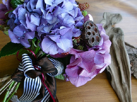
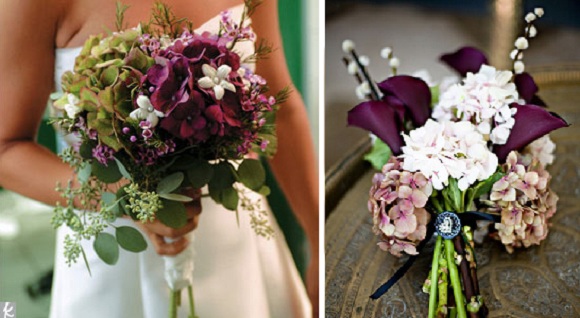
Anyone want to take a wild guess at what flowers I’d love my bouquet to consist of? I’m warning you now to prepare yourself for some serious hydrangea porn. This stuff is hardcore.
We have a colour scheme, but no theme per se {yet?}. Fiance is a typical Irish teaholic, and I heart tea cups, so there might be something there. We also love deep, dark colours – antiqued burgundies, deep plums and strong wines against black and white for a strong contrast.

At the moment I am completely fixated on having a bouquet with black and white striped ribbon detailing. I love the contrast, and I also think it brings a more snappy and up-to-date/current/modern feel to it.

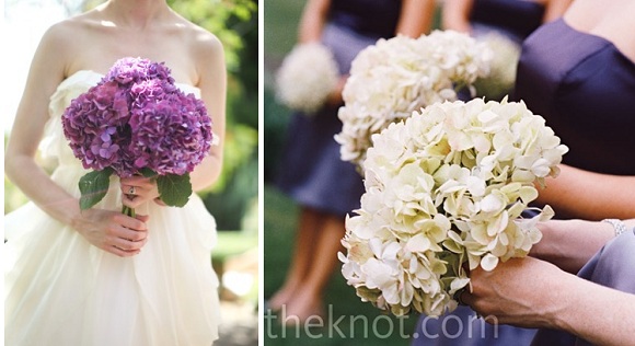
I really like the idea of myself being in  white with a dark bouquet, and have my bridesmaids wearing lovely deep hues while holding contrasting white hydrangeas. Opposites attract!

Lastly, I’m entertaining the idea of mixing hydrangeas with other flowers. I’m still a bit unsure, but combining with pussy willow in that pic – amaze-balls. If only I could have all my hydrangeas -ever- to be that deep plum colour = heaven.
Those are my only notes I’ve made about bouquets. I’m trying to keep things simple, that way there’s less to worry about if something goes wrong. I’m into the idea of reusing bridesmaids and my bouquet as center pieces {save a bit of €?}, and that way I’ll have the perfect excuse to not throw my bouquet recklessly into a crowd of drunk single women. Back off, bitches.

Image cred 1, 2, 3, 4, 5.

That’s just like, your opinion, man

I’ll start off by stating that we are a household of regular Dude references. When it came to making something for fiance for his birthday last week, I knew I wanted to make a pop-culture/cult reference. For fiance, that would be either Star Wars, Call of Duty/Battlefield, or The Big Lebowski.

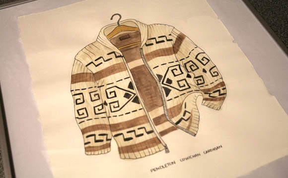
While scrawling through Honestly WTF a couple weeks back, and saw this post about the seriously talented Mark Hall-Patch and his watercolours, where he delicately paints and draws clothing. There was one particular cardigan that immediately reminded me of the Dude’s cardigan from The Big Lebowski, also known as a Pendleton Cowichan Cardigan, and I knew I had to make a Mark Hall-Patch-inspired version for fiance.
I drew up an image of the Dude’s cardigan, and for the first time in eight years, I used watercolours. A little scary, but watercolours are quite safe and very forgiving, luckily for me. I’m not madly in love with the final piece {it’s a little cartoony, I could have chosen better paper, and I should have spent more time on it; the ush}, but those with a keen movie interest shouldn’t have too much trouble deciphering it. I hope.

Image 2 image cred!